By the end of this article, you’ll know how to optimize landing pages that convert like crazy! So, grab a coffee, sit back, and let’s dive into the topic and explore the top killer tips and tricks.
The 4 types of eCommerce landing pages
Personalizing landing pages to fit visitors’ interests is not enough. They should also match their position in the sales funnel. A landing page for first-time visitors who are browsing will differ significantly from those who have already visited your site and started shopping.
Each type of eCommerce landing page will have a specific goal, ranging from increasing brand awareness to encouraging customers to make additional purchases. Consequently, the content, particularly the CTA, will differ.
Here are the four types of eCommerce landing pages explained.
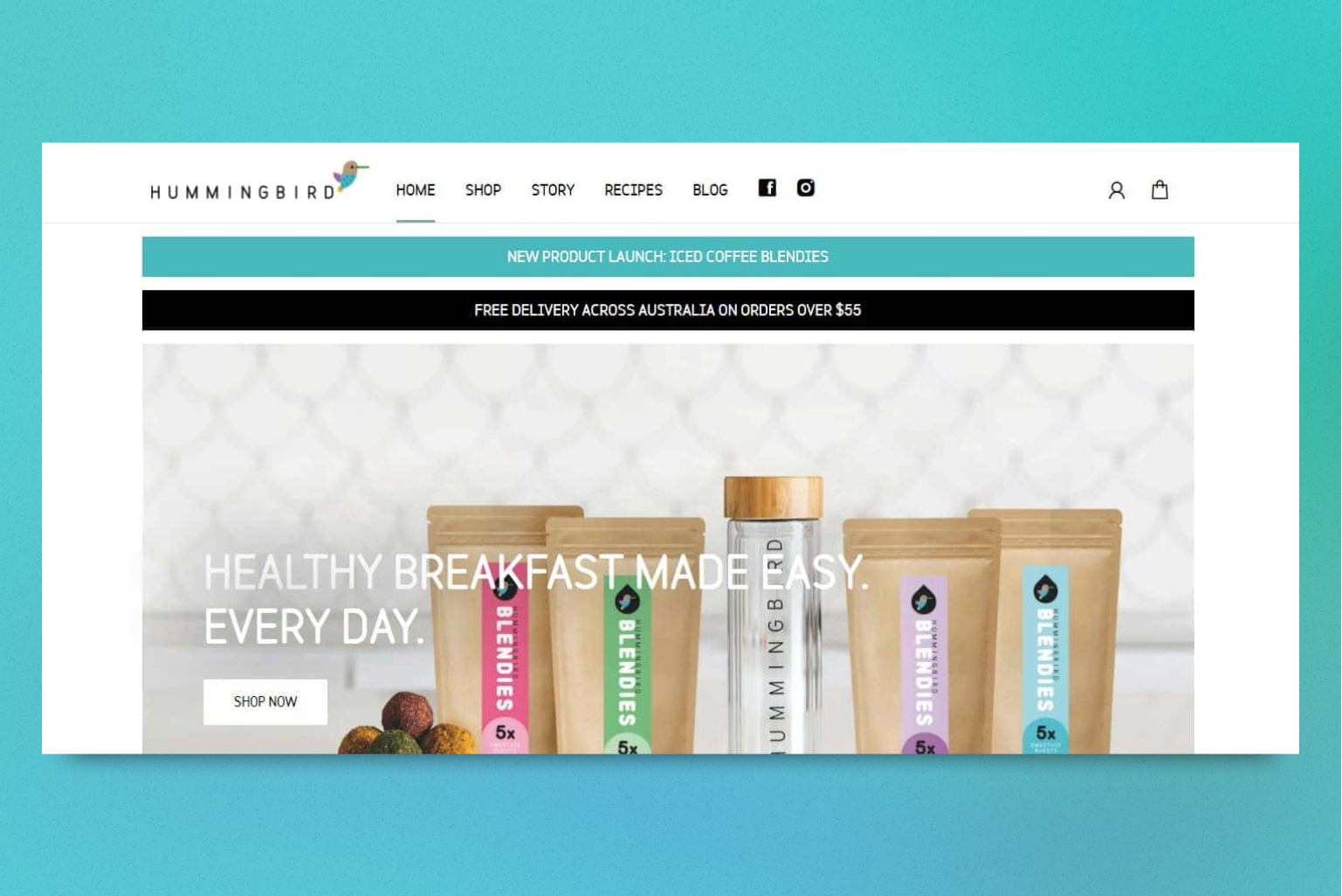
Top-of-funnel LP
The goal of this page is introducing your eComm site to visitors. Since it serves as your first impression, it should contain content such as your brand story, the solutions your products offer, and social proof to establish credibility. At this point, website visitors are likely not yet prepared to make a purchase, so it’s important that the call-to-action is geared towards building a connection and generating leads.
As an example, consider offering a discount of 20% on a customer’s first purchase in exchange for signing up for your newsletter. This will encourage them to come back and provide you with their email address, allowing you to reach them again without having to spend on ads.
Middle-of-funnel LP
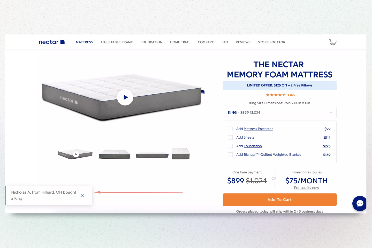
This page should focus on giving customers a nudge to make a purchase by showcasing content related to specific products, social proof from other customers who have bought the product, and a sense of urgency or limited time offers. The call-to-action on this landing page should prompt the customer to make a purchase, typically through a button with text such as “Buy Now”. This helps make the purchasing process seamless and efficient, encouraging the customer to complete their purchase quickly and easily.
Bottom-of-funnel LP
This type of page is designed for customers who have added items to their cart but have not yet completed the purchase. This page is used for upselling campaigns and offers an opportunity to sell additional products to customers who are already in a buying mindset.
The content on this page should encourage customers to not only complete their purchase but to buy more by offering bundle offers, related products, and discounts related to cart abandonment such as free shipping. The CTA for this page should focus on closing the deal first and then promoting additional products with a higher average order value.
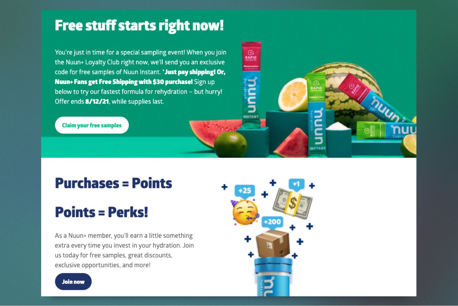
After-purchase LP
This is a landing page for those who have already purchased something from you. It is aimed at keeping existing customers happy and encouraging them to come back to your store. As this landing page is aimed at current customers, there’s no need to provide extensive information about your business and offerings. Instead, concentrate on creating content that encourages customer loyalty, like incentives for continued patronage, early access to upcoming products or sales, exclusive deals, category pages that relate to their previous purchases, and opportunities for customer referrals. The objective is to retain their loyalty and keep them coming back.
The CTA for this page should focus on building a strong, lasting relationship with your customers by making them feel valued and special. For example, giving existing customers access to a sale before it is available to the general public with the CTA saying “Start Shopping Early”.
Now that you understand the types of eCommerce landing pages, explore the must-try conversion-boosting tricks to optimize your pages and get them ready for more sales.
#1 Keep it simple and focused
When it comes to eCommerce landing pages, simplicity is key. Your landing page should be focused and easy to navigate, so visitors can quickly find what they’re looking for and not get confused or lost. You wouldn’t want to miss out on a potential conversion because your visitors couldn’t find the “Buy Now” button, right?
Keep in mind that visitors may only spend a few seconds on your page before deciding to stay or leave, so make sure your message is clear and concise. Stick to one primary call-to-action (CTA) that encourages shoppers to take a specific action, e.g., making a purchase or signing up for your newsletter. And remember, a cluttered and confusing landing page can lead to confusion and frustration, which may cause visitors to bounce away from your site.
#2 Focus on benefits not features
When it comes to creating a winning landing page, one key factor is often overlooked: the headline. Too often, businesses focus on listing product features rather than highlighting the benefits for the user. That’s why a benefit-oriented headline is crucial. It captures the user’s attention and showcases how your product can transform their life, home, or atmosphere.
Jakub Linowski, a conversion coach, conducted a test comparing a regular headline to a benefit-oriented one. Ready to know the result? The latter boosted conversion by 4.3. So an important eComm landing page optimization tip — remember to focus on the value provided to the user.
#2 Stick to the rule “One page — one offer”
It’s natural to want to provide as much information as possible about your products or services, but including too much can overwhelm the visitor. To maintain focus, it’s better to have one specific offer for each landing page. By simplifying the page and removing elements that compete for the customer’s attention, you create a laser-focused landing page that is more likely to convert. One important design tip is to ensure that the call-to-action (CTA) stands out by using a contrasting color scheme.
#3 Optimize your CTA
When optimizing a landing page, the CTA is a crucial element that triggers the conversion. That’s why you need to make the offer as attractive as possible. Similar to creating a headline that emphasizes benefits, your CTA text should communicate benefits as well. You don’t want to use generic phrases like “Click here” or “Get access”, which require extra effort from the user to guess where the link goes.
Instead, make your CTA buttons and links more descriptive and highlight why the user should click them. For example, compare “Buy now” to “Add to cart and save 15%”. The latter is more informative and specific about what the button does, increasing your chances of higher conversions. By using descriptive language and clearly indicating the benefits, you can make your CTA more effective and persuasive.
#4 Focus on your copy
Effective copy is crucial for your landing page to convert visitors into customers. To ensure your copy hits the mark, it’s important to:
- Focus on your customers’ wants and needs. Ensure the copy addresses their concerns and tells them what they want to know.
- Use emotional language to elicit a response. According to Nielsen, ads that evoke an above-average emotional response generate a 23% increase in sales.
- Determine the job to be done (JTBD) that brought visitors to your landing page, and highlight how you can serve them.
- Use an appropriate length for your copy. Depending on your offer, your landing page may need just a few sentences or more descriptive content.
- Avoid jargon and proofread your copy to ensure it’s easy to digest.
- Make your copy skimmable by breaking up paragraphs, using bullet points, and highlighting key thoughts. And ensure you only focus on one idea/claim per paragraph.
#5 Keep the layout logical
Visitors to your landing page are often pressed for time and tend to skim the content rather than read it in detail. To ensure that they find the information they need, such as product benefits, key features, pricing, shipping, and other essential details, you need to organize your information in a logical and easily digestible format. This can be accomplished by incorporating section breaks, headers, and bullet points to keep potential customers engaged on the page.
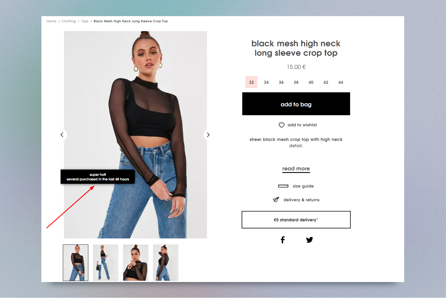
#6 Highlight social proof
Online reviews impact purchasing decisions. That’s true for 93% of customers according to the report. In today’s digital age, consumers have greater access to information and rely heavily on reviews to make informed purchase decisions. Incorporating social proof into your ecommerce landing page can be a powerful strategy to increase conversions and sales.
To optimize your landing page for maximum impact, consider including various forms of social proof:
- customer testimonials
- expert reviews
- influencer/celebrity endorsements
- Images
- ratings and reviews
- certifications
- trust badges
- real-time stats
- social share count
- customer count
#7 Opt for short forms with minimum fields
Asking for too much information in your checkout forms creates unnecessary friction and can turn off potential customers. It’s best to only ask for the minimum information needed, such as shipping and payment details, to ensure a seamless experience.
While marketers may want additional information for their own purposes, it’s important to prioritize the user experience. Customers don’t want to give out personal details just for the sake of receiving ads on social media.
Before adding more fields to your forms, ask yourself if the information is truly necessary and why it’s needed. Remember that you can always gather more information at a later time. During landing page testing, prioritize a great user experience over collecting as much information as possible from visitors.
#8 Ensure an appealing design
The visual design of a landing page plays a crucial role in creating a lasting impression on visitors. A well-designed landing page not only attracts users but also reflects the quality of the brand and its products. To achieve this, it’s essential to hire a professional designer who can effectively communicate your brand’s values through the design.
Remember that certain elements on a landing page can lead to high bounce rates, such as pop-ups, surveys, music, and auto-playing videos. These interruptive elements can result in a negative reaction and a poor user experience. Therefore, during landing page testing, it’s important to try out different designs and identify the one that users prefer, while ensuring that the design is free of any annoying or intrusive elements.
#9 Use promotions wisely
Limited time offers have become one of the most effective marketing strategies today. The reason for this is that users are more likely to take action when there is a sense of urgency, and scarcity can create that urgency. When a product or service is only available for a limited time, customers feel a greater sense of value and importance attached to it. This can lead to increased sales and conversions, as customers are motivated to take advantage of the offer before it expires.
However, having too many “great deals” and “limited offers” can make your brand appear cheap. If you decide to include promotions on your landing page, make sure to call them out immediately. But don’t just focus on the discount percentage; highlight the specific benefits your customers will receive when making a purchase. For instance, instead of saying just “30% off,” you could say, “Get your favorite dress at 30% off and add some sparkle to your wardrobe”.
By doing so, you communicate the discount while also emphasizing the value the customer will receive.
#10 Optimize for mobile
Online shoppers nowadays use their mobile phones and tablets for their shopping experiences. A negative mobile experience can result in a significant loss of potential customers, as 62% of shoppers will not consider a brand in the future. To tap into the vast sales potential of mobile users, it is essential to create a seamless ecommerce landing page that works flawlessly on mobile, desktop, and tablet devices.
To ensure an excellent user experience, your landing page should be responsive and optimized for mobile devices. This means adjusting copy, forms, images, videos, and CTA buttons to fit the screen size perfectly.
#11 Make the page load fast
You can lose up to 19% of customers if your eCommerce landing page loads longer than 2-3 seconds. This statistic makes your landing page’s loading speed your top priority.
To ensure your landing page loads quickly on both desktop and mobile devices, it’s important to optimize it for speed. This not only enhances customer experience but also helps your page rank higher on Google search results, especially now that mobile-friendliness is a ranking factor.
One quick win is to compress all of your images to reduce file sizes, as larger files take longer to load.
If your landing page includes graphics, such as GIFs and product shots, it may take longer to load. Therefore, it’s essential to check your page’s load speed using tools like Google PageSpeed Insights to identify areas for improvement.
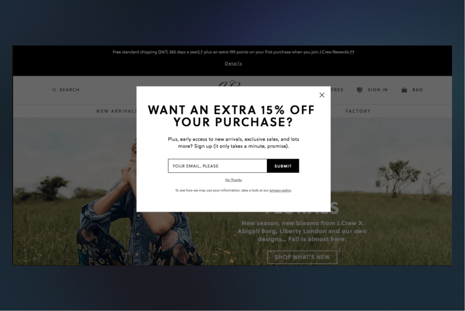
#12 Consider adding an exit pop-up
An effective strategy is to implement page tracking to anticipate when a visitor is about to leave or has become inactive. This presents an opportunity to display an exit-intent pop-up that features the same call-to-action as your landing page, but with an added incentive. For instance, you could offer a complimentary gift or a discount for making a purchase today.
To make your exit pop-ups more engaging, consider using vivid colors, graphics, or videos to make it stand out from your primary landing page.
#13 Don’t forget to thank your customers
Make sure you don’t forget the importance of the confirmation message on your landing page. Even though it comes after the conversion, it’s still a crucial part of your visitor’s experience.
If someone follows your CTA and makes a purchase, use the thank you page to let them know that you’ve received their order and that it’s on the way. This is also an excellent opportunity to provide them with more information, like when they can expect a confirmation email or a tracking number.
Don’t miss the chance to add a secondary CTA on your thank you page, too. For instance, you could ask your customer if they’d like to sign up for email updates.
Wrapping up
So there you have it! By leveraging these eCommerce landing page best practices practices, you’ll be well on your way to creating landing pages that drive results and boost your revenue. But don’t stop there. Continuously test and optimize your landing pages to improve your customer experience and engagement.