Your entire online store is built to drive customers to conversions. And your eCommerce homepage is critical for achieving this goal. It serves both as the first touchpoint for new customers who begin their browsing journey here and as a safe fall-back option or a navigation guide. Thus, your homepage should be designed to help new and repeat customers find what they came for and convince them to stay, browse, and make a purchase. Otherwise, you risk losing customers and — consequently — revenue.
In this article, we gathered 6 effective homepage best practices with UX/UI in mind so you can:
- offer the best website experience,
- prevent customers from bouncing off your store,
- and drive more sales.
Enjoy.
#1 Clearly state your value proposition
In the US only, the number of digital buyers amounts to 268 million in 2022. This translates to almost 81% of Americans. An impressive figure, right? That’s simultaneously a huge opportunity and a tough challenge for merchants. Just imagine Amazon being the US leading eComm retailer holds a market share of less than 50%. By communicating the value proposition digital shoppers are seeking, you can earn a slice of this huge pie, stand out, and become the top-of-mind retailer for customers.
Your value proposition is actually a reason for a shopper to choose your store over others, stay on it, browse, make a purchase, and come back later again. Ensure your value proposition is effective. It should:
- be easy to understand
- be targeted at your audience
- indicate the value you provide
- offer a clear promise
Remember your value proposition shouldn’t be limited to a one-sentence statement — use visuals to strengthen it. A hero image will help highlight the proposition and make a positive first impression. We’ll talk about it below.
Also, ensure you include any brand or value proposition boosters that might influence customers’ decision to buy from you. “Vegan-friendly”, “eco-friendly”, “24/7 support”, “20,000 products successfully shipped and delivered this month alone” — demonstrate any benefits of shopping on your online store and showcase what your brand values to attract customers who share the same beliefs.
#2 Design a clear & user-friendly header
A header is in front of your customers’ eyes all the time, no matter what page they landed on. As soon as it impacts every single store visitor, it’s imperative to design a clear header with enough information to encourage people to stay on your site and explore it further.
Let’s take a look at what makes for a good eComm website header.
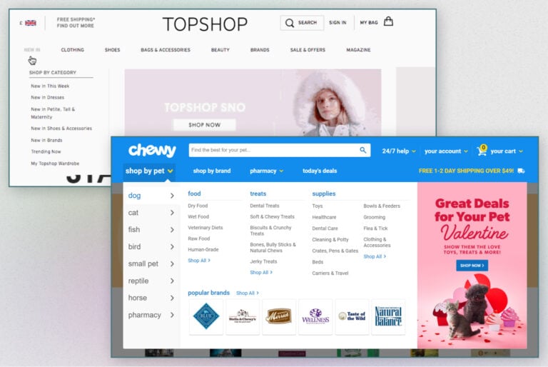
Navigation menu
The site navigation menu helps store visitors discover and interact with your products. Your navigation menu structure should follow a strict hierarchy and be understandable. Split your catalog into categories and subcategories. Don’t forget to create a drop-down menu based on them. This will enable a simpler and more intuitive search process for your customers. In case of a large number of categories and subcategories (say over 1,000 products), think about a mega menu with a noticeable View All link.
The way you order categories and subcategories is no less important. Ensure you allocate prime navigation space to the most popular of them.
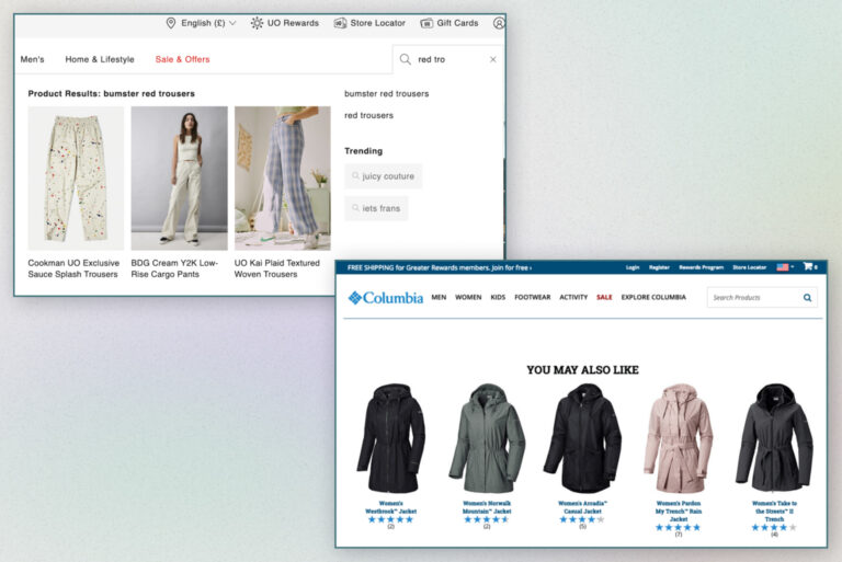
Search bar
Visit Amazon, IKEA, Etsy, or any other large world-known eCommerce store, and you’ll see they all offer a visible search bar in the header. A prominent search box is vital for an online store. A report by Forrester states that over 40% of retail website customers go right to the search bar. By failing to offer seamless internal site search, you can literally kill your conversion rates. An intelligent autocomplete feature of the search box will add much to shoppers’ convenience. That’s a great helper and time saver for visitors and a great conversion booster for your store.
Also, it’s a good idea to offset the search bar in a color that differs from your overall website color scheme. This will catch visitors’ eyes and help them start browsing more quickly. Add some text inside the bar (“Search products”, “I want”, “What are you looking for”, etc.) and a “Find” or “Search” button or simply an icon of a magnifier – and you’re set for a great start.
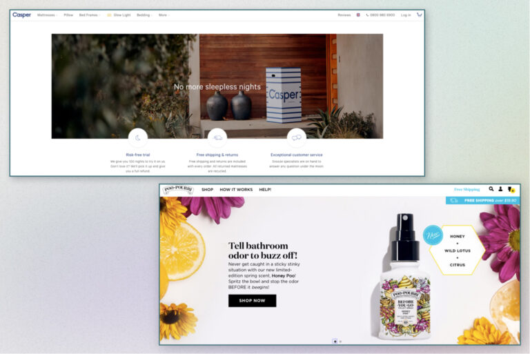
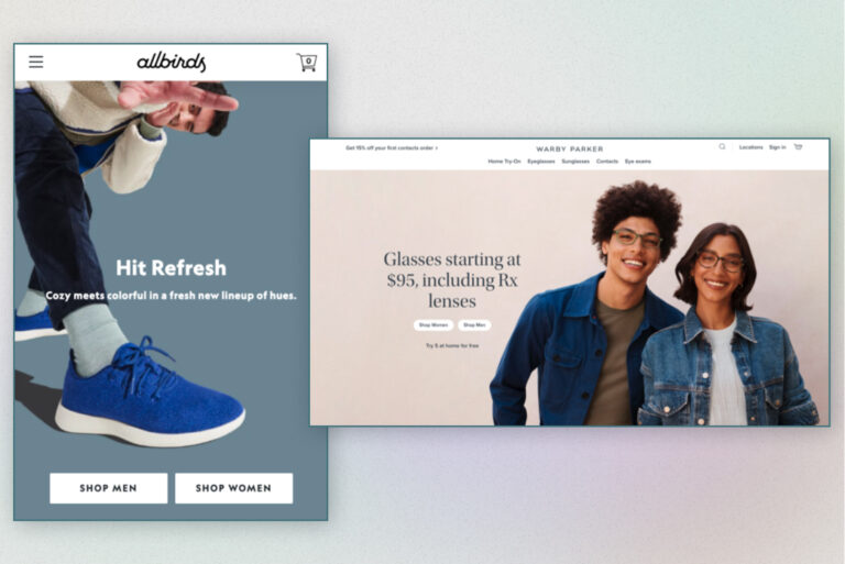
Hero image
A hero image, or a hero header is a full-width banner placed on the top of the website. It’s a significant homepage element since it serves as a landmark of your offering. This is the very first thing customers are going to see when landing on your web store’s homepage.
A hero image helps create the first impression about your brand and build associations with your mission, beliefs, and values. Thus, you should be very careful when picking a hero header. It can either draw customers in or cause them to leave. And when you’ve allocated so much effort and time for marketing campaigns to bring customers to your website, you can’t afford to let people bounce off your store quickly.
Here are some tips for an effective hero header.
- Ensure the chosen image is simple, not cluttered, confusing, or overwhelming
- Check whether it communicates a clear message
- Provide a clear call to action to let visitors go directly to the category or product page you offer and start shopping. And don’t forget to link it to the necessary website page. Test whether it looks properly on every screen size
- Don’t offer more than 3 hero images to prevent customers from analysis paralysis
- Make sure your hero header is easy to swap out when the holiday’s coming, or you’re planning a seasonal sale, etc., without needing to wait for a developer to do this quick fix
- Include relevant details about what the hero image is featuring (when the sale ends, coupon code, etc.)
A well-thought out intentional hero image can make a big difference to your conversions and sales especially during promotions.
Contacts
Always display your contact information prominently on the homepage. This will help boost conversions. Let your customers easily find a way to contact you to find answers to questions that might hinder their decision to make a purchase or provide their feedback about customer service. This section can include not only your address (if you have a physical location), phone number, and email but also links to social media accounts. In short, provide all possible ways to contact you and show you’re easily accessible.
Shipping and Return Information
Sufficient information on shipping and returns is a critical factor in establishing trust with your customers. Basic delivery policies such as shipping times, charges, and methods, minimum order value, etc., as well as conditions for returns and exchanges let visitors know what to expect. Withholding these details until customers reach checkout or making it difficult to find this information on your website potentially leads to lost sales.
Shopping cart
An easy-to-access shopping cart is a critical part of your online store in general. It should be a fixed element on your homepage as well as other pages so that shoppers can go to it quickly and make a purchase.
Also, check whether your shopping cart remains intact. Imagine you browse a catalog, add several items to your cart, then interrupt your shopping for some reason to come back later and make a purchase. You visit the store and realize your cart is empty. Will you be frustrated? Sure. So will your customers. Will you return to this store again? Not likely. So will your customers. Buyers tend to leave their cart and proceed their journey later, sometimes from a different device. Don’t let them have a negative shopping experience and leave your site without making a purchase.
The “My Profile” button
Many retailers offer customers to register at the online store to improve their shopping experience. Registration allows users to have easier and quicker access to their orders, check their status, form their wishlist, have a faster checkout process with subsequent purchases, etc. If you offer such an option, ensure the My Account button is prominent on the header for visitors’ convenience. It would be great if you offered customers to log in with their social media accounts to streamline the process.
A currency/language switcher
If you sell internationally, customers will appreciate it if they can read the content in their language and see prices in the convenient currency.
The “Download the App” button
If you have your app, highlight that you can provide an excellent shopping experience to your customers on mobile devices.
Planning to build a native app for your online store? Wait. Consider leveraging the power of PWA — a synergy of a responsive website and a native app offering far more capabilities to your business.
Eager to learn more? Read our article.
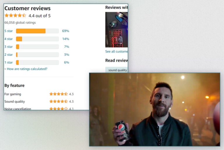
#3 Highlight social proof
The power of social proof can’t be overestimated. The number of customers reading reviews before deciding to buy something is huge and surpasses 90%. By highlighting social proof on your homepage, you get a chance to inspire your customers’ trust.
Social proof shouldn’t be limited to customer testimonials and ratings only. There are other ways to show you’re a reliable and trustworthy vendor:
- Add trust badges
- Show reviews from authoritative review sites
- Leverage user-generated content
- Display industry expert proof
- Show visitor counters
- Display the number of your social media followers
- Add celebrity/influencer endorsements
- Show 3d-party certifications/awards
- Highlight logos of well-known brands
By demonstrating social proof on your homepage, you can skyrocket conversions and turn browsers into buyers and repeat customers.
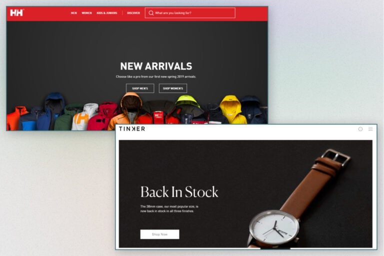
#4 Add a powerful CTA
A strong and clear call to action is an integral part of your online store as it impacts conversions directly. Ensure it is visually prominent and tells customers exactly what to do. We recommend that you don’t overload your homepage with multiple CTAs making it difficult for shoppers to browse through the site. Start by crafting a primary CTA to get their maximum attention. For example, “Shop now” will be a perfect option as it will help take visitors to the desired product pages.
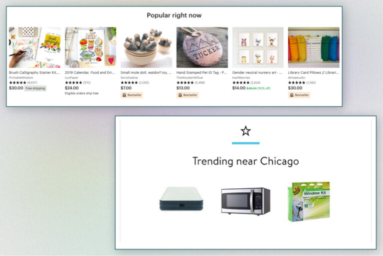
#5 Offer product recommendations
Did you know that 45% of online shoppers are likely to make a purchase on a store offering personalized recommendations? A relevant and timely product recommendation on an eCommerce homepage can boost sales significantly. For example, over 35% of Amazon purchases are a result of product recommendations.
The best idea would be to provide a few recommendations to catch customers’ attention. These could include:
- Bestsellers
- Last arrivals
- Seasonal products
- Last purchased
- Top reviewed products
- Top rated products
- Sales
- Special offers
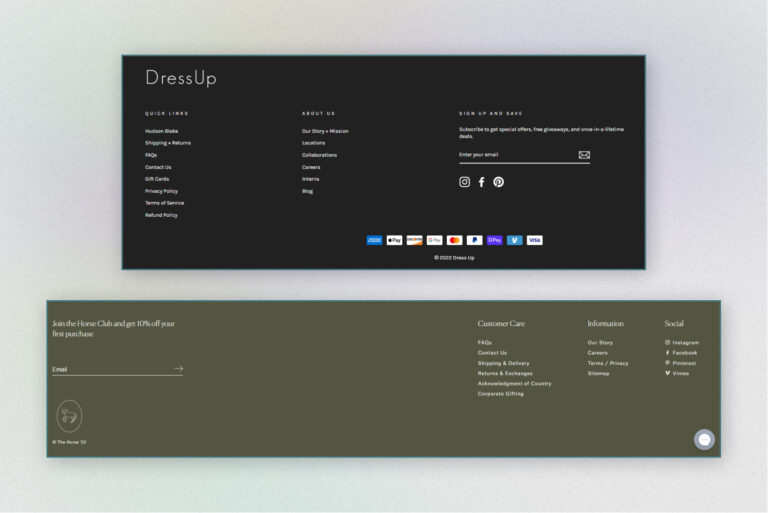
#6 Design a well-informed footer
A website footer is often neglected by merchants. However, it’s another chance to grab visitors’ attention. We’d even say the last chance. Of course, not all of your customers will get there. But those who will are usually looking for something they couldn’t find upper on the page. Your footer can serve as a gateway to other content or pages. You can leave there:
- A link to your blog to build trust with your customers and help them find questions to their answers
- Social media icons to let people join your community and
- A live chat button to let customers immediately contact you
- Contact details just to let them phone or email you without scrolling back to the header where you provided contact info
- A link to the About Us page to offer customers learn about your brand
- A link to Help Center to enable visitors to find any information about shopping on your online store
- Your location and opening hours if you have a physical location
- Payment icons to allow customers check whether their preferred payment is available
A properly-designed website footer with goals in mind can increase conversions and boost your revenues.
A final word
For any eCommerce store, a homepage is often a page with the highest traffic. Just think — one single page is responsible for facilitating the shopping experience, driving sales, and establishing lifelong relationships with your customers. With this in mind, you can’t underestimate the importance of good UX/UI design for this page.
It might be rather challenging to create a homepage that showcases all of your products without being overwhelming. A messy, cluttered homepage without intuitive navigation and unclear structure will simply scare store visitors away while negatively impacting conversions. Implement the top UX/UI design tips we gathered for you to enhance your customers’ shopping journey, boost conversions, drive more sales, and skyrocket your revenues.