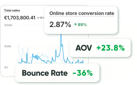
Around 70% of online shoppers tend to abandon their carts, as reported by the Baymard Institute. Essentially, only three out of ten customers who start filling their carts end up completing their purchases at checkout. Online shoppers should find it as effortless to handle their digital shopping carts as if they were using a physical basket in a store. Effective shopping cart design focuses on enhancing the user experience to minimize abandonment rates.
Let’s take a look at what you can do to optimize your shopping cart page.
#1 Ensure the shopping cart icon is prominent
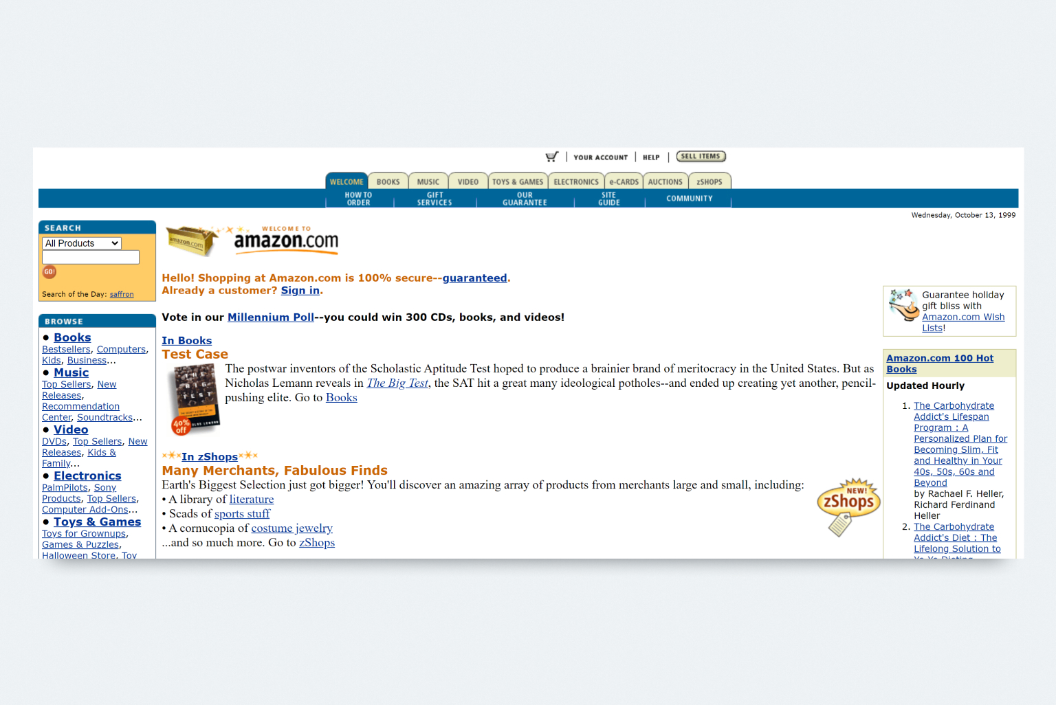
This might seem like a simple detail, but having a prominent shopping cart icon ensures that users can easily spot and access their cart, streamlining the shopping process. The “rule” of placing the shopping cart icon in the top right corner was set by Amazon.
Back in the late 1990s, Amazon introduced the concept of a shopping cart to its online platform. In the early days, the shopping cart icon was prominently placed in the middle of the navigation bar, as depicted in a screenshot from Wayback Machine’s archive in 1999.
Over the years, as Amazon expanded its offerings, the shopping cart icon found its home in the upper right corner, a placement that has become ingrained in users’ expectations. Today, Amazon’s modern website maintains the tradition of situating the shopping cart in the top-right corner as a familiar and user-friendly design choice.
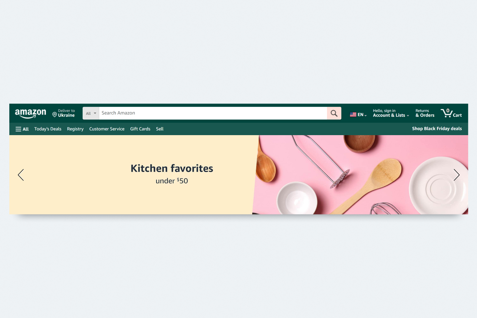
When aiming for peak performance and an exceptional user experience, going against established habits and muscle memory can create an uncomfortable experience for visitors. Therefore, it’s advisable to position the shopping cart or bag icon at the top right corner – exactly where users are accustomed to finding it.
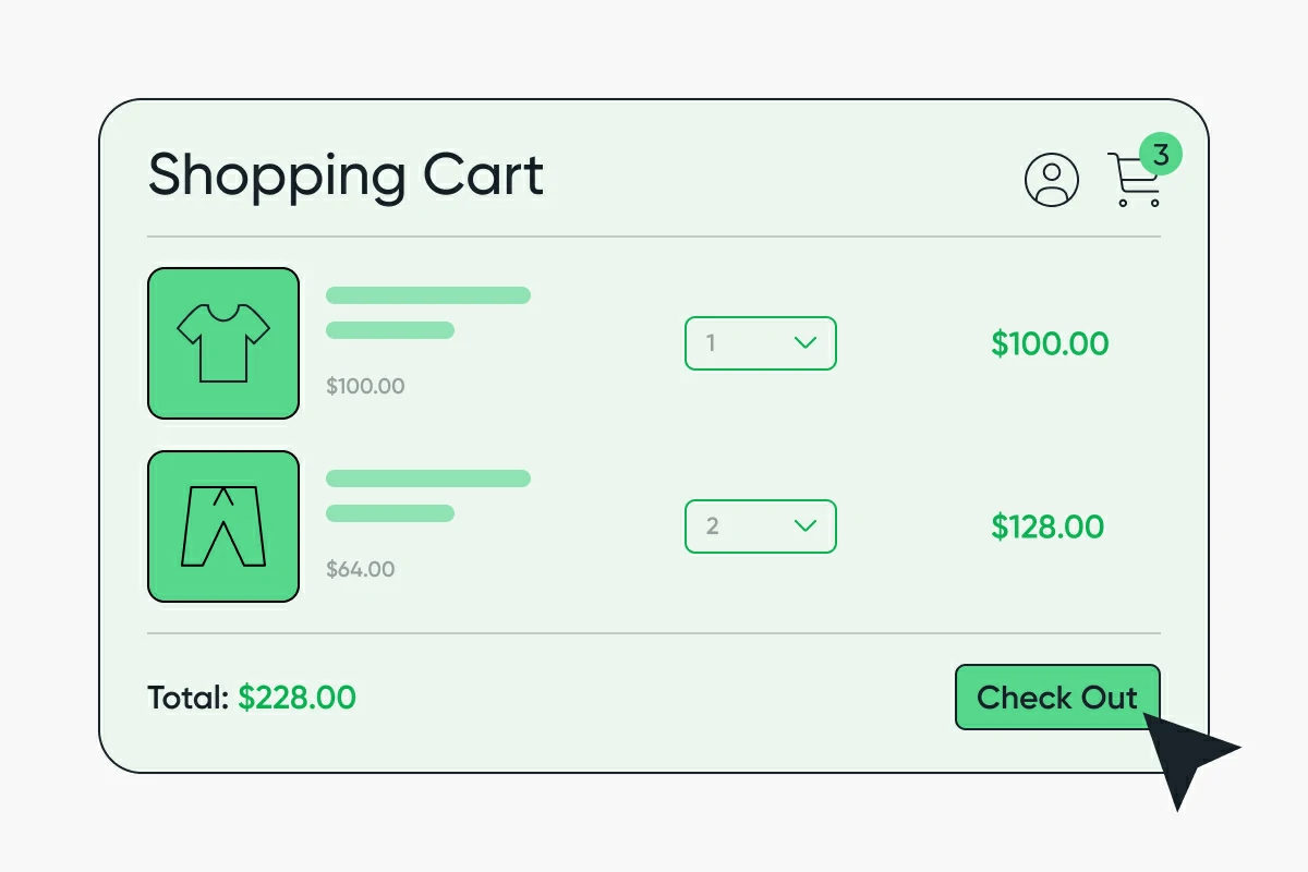
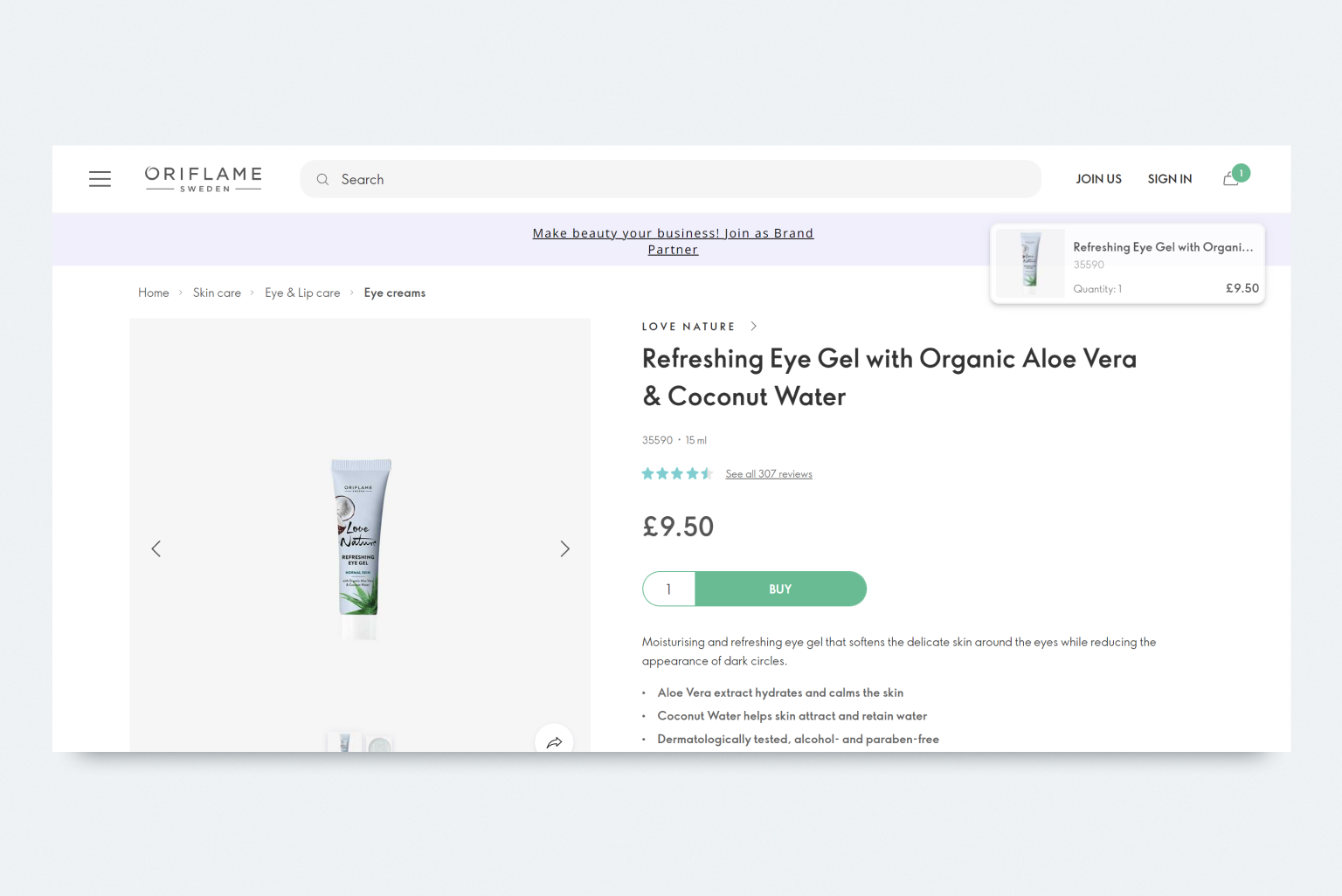
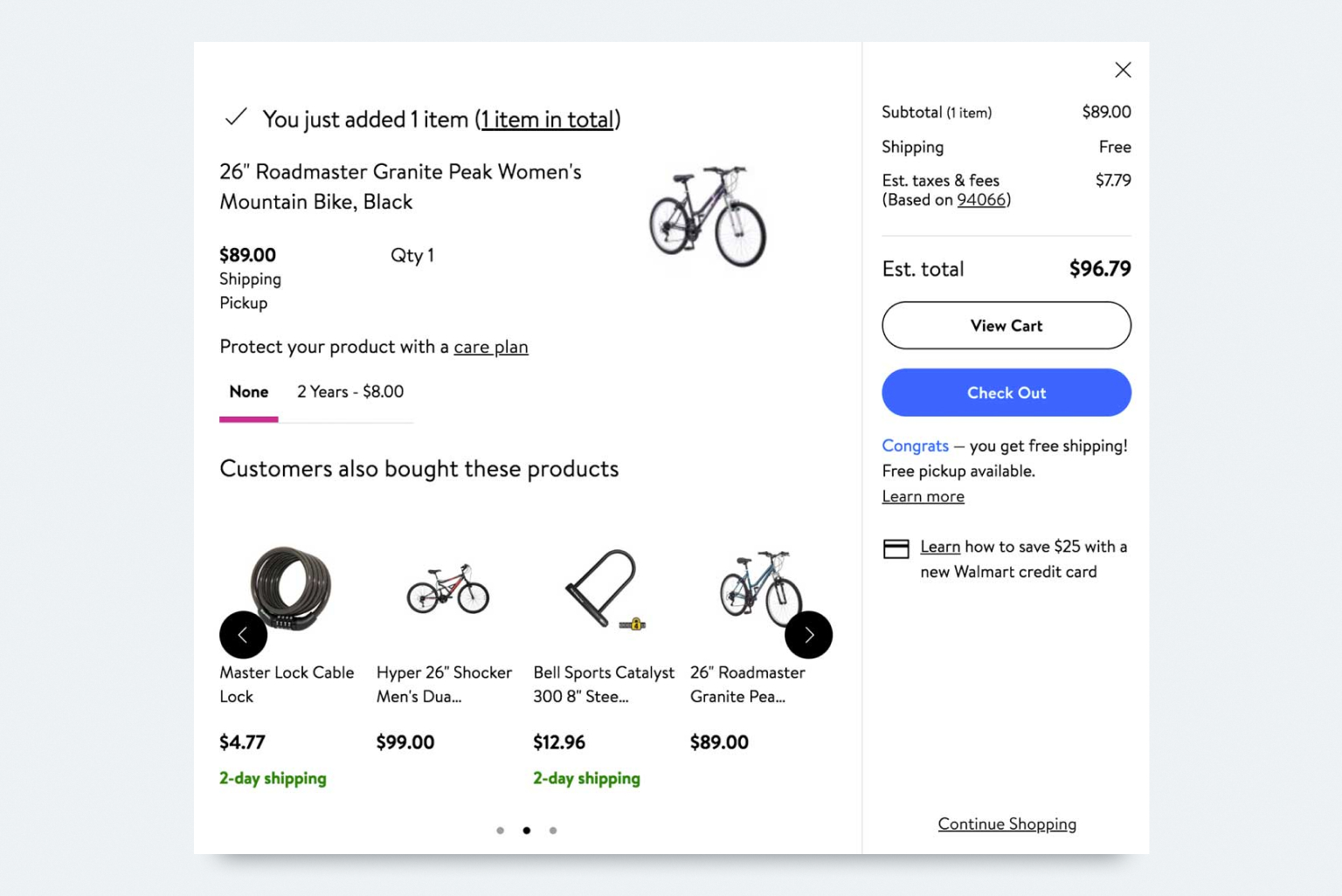
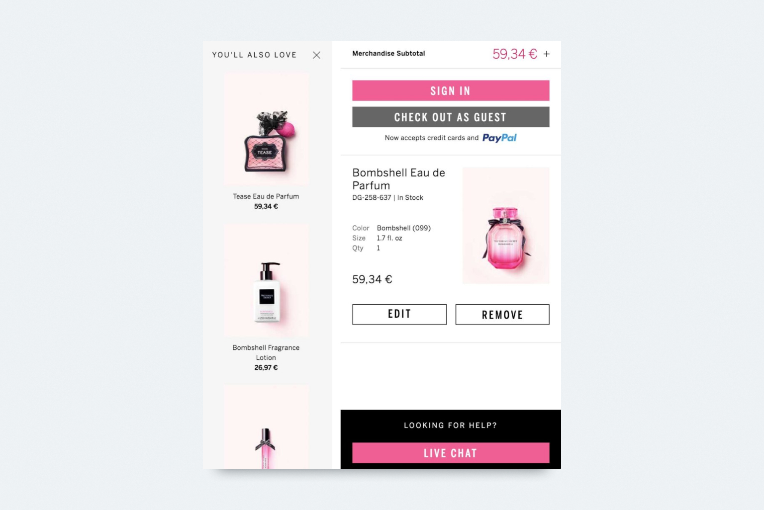
#2 Provide a detailed product summary
Right before your visitors make their final move to checkout, they’ll land on your cart page with a clear mission: guide them towards completing the payment. For most online shoppers, the cart serves as a last-minute review of their order. To assist them in this crucial step, your goal is to present all pertinent information about the product in a transparent manner.
A comprehensive product summary on the shopping cart page should include the following details:
- Thumbnail
- Name
- Specifications (size, features, color, etc.)
- Number (quantity)
Incorporating these elements into your cart page ensures that customers can swiftly review their order and feel confident in their purchase. By including all the relevant details, you can significantly reduce the likelihood of cart abandonment, often caused by a lack of precise information.
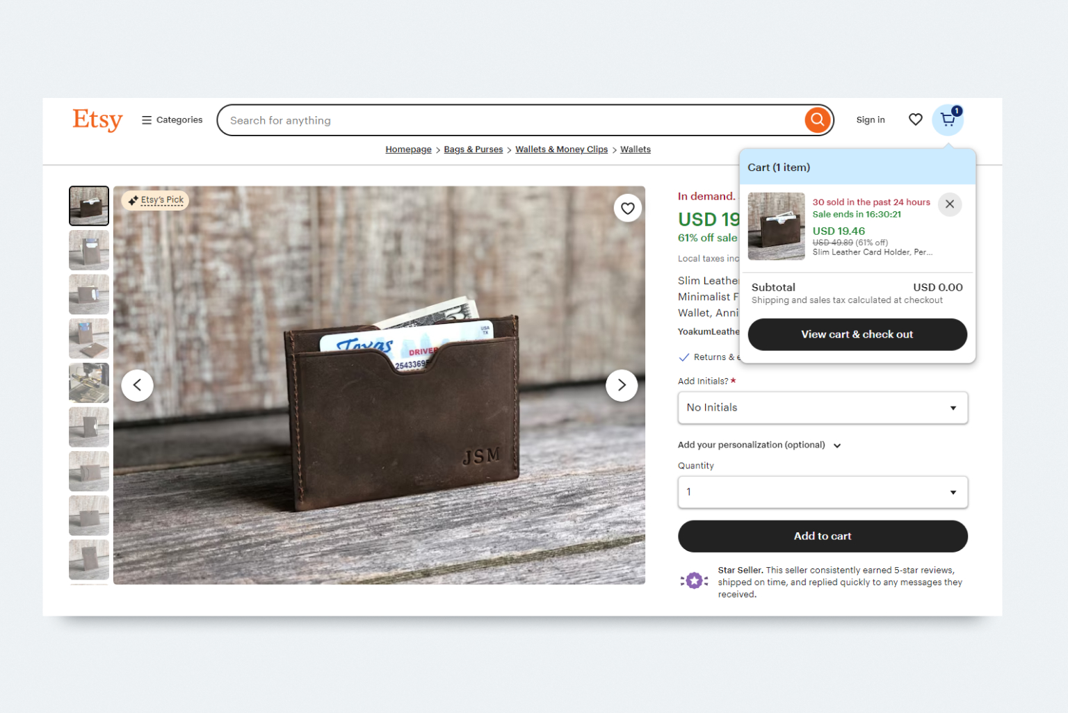
#3 Notify about added items
Informing customers about their selected items being added to the cart is crucial. It should be a clear “Added to Basket” message in vibrant green to ensure customers are aware of the product in their cart. Additionally, a prominently placed “Proceed to checkout” button will prompt shoppers to finalize their purchases.
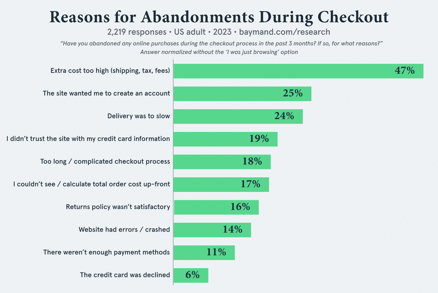
#4 Show shopping & return information
Make sure to prominently showcase comprehensive details about shipping and returns. The leading cause of shopping cart abandonment in the US? None other than concealed shipping expenses.
Online shoppers have a strong aversion to hidden or last-minute shipping costs. Baymard’s study, depicted in the image below, underscores that hidden shipping expenses significantly outweigh other factors as the primary reason for cart abandonment. To enhance the user experience and reduce abandonment rates, transparency in shipping costs is key.
#5 Allow shoppers to edit items in the cart
Ensure that your cart page includes options for customers to adjust quantities, update sizes, or remove items with just a few clicks. This not only enhances the overall user experience but also prevents frustration and encourages customers to explore different options without the fear of making a permanent mistake.
There are two major methods for enabling customers to edit their selections: inline editing and the use of a pop-up screen. Regardless of the approach, it’s crucial that any modifications made by the user are promptly reflected in the product image and details.
To enhance user understanding and interaction, incorporate clear labels or icons for actionable items. Universally recognized symbols like the plus (+) and minus (-) signs should be utilized to visually represent the addition or removal of items.
#6 Leverage mini shopping carts
When shopping online, there are two types of carts. One is the big cart that shows everything about what customers are buying. The other is a “mini” cart, like a small icon or shortcut to the main cart. Usually found on the side or top of a page, this mini cart works together with the big one.
Having both carts is a good idea. The mini cart shows important info without taking up much space. It stays in the corners or side of the page so it doesn’t mess up how the page looks, but it always reminds customers of what they’re doing. A mini cart pops up quickly to show what customers picked, like the item, how many, and the price. This way, your store visitors can keep shopping without going to a different page, which contributes to the overall experience.
#7 Cross-sell & upsell
At the cart page, savvy online retailers often leverage the powerful strategies of cross-selling and upselling to enhance the shopping experience. Cross-selling involves suggesting additional products that complement items already in the cart, enticing customers to consider related or complementary purchases. On the other hand, upselling encourages customers to choose a higher-priced or upgraded version of the product they originally selected.
Integrating these techniques at the cart stage is a strategic move to maximize the value of each transaction. By intelligently recommending items that align with customers’ preferences or gently nudging them towards premium alternatives, businesses not only increase their sales but also add a personalized touch to the customer’s journey, making the shopping experience more dynamic and tailored to individual needs.
#8 Promote reviews
Integrating customer reviews into the cart page is a valuable practice that adds a layer of transparency and trust to the online shopping experience. When potential buyers can view reviews right at the cart stage, it provides them with insights from real customers who have already made similar purchase decisions. This not only aids in their decision-making process but also instills confidence in the products within their cart.
Displaying customer reviews at the cart page serves as a final assurance before the checkout, offering shoppers a glimpse into the satisfaction levels and experiences of others. It’s a strategic move that fosters a sense of community and authenticity, reinforcing the credibility of the products in the customer’s mind as they finalize their choices and proceed to make a purchase.
#9 Provide support through phone or chat
Boosting your users’ trust level involves displaying a clear contact number and address details. Shoppers seek assurance that your business is authentic and not an online scam. Moreover, visitors want to sense the presence of real people behind your website. A fantastic way to build customer trust and humanize your brand identity is by offering live chat or phone assistance services directly on the cart page.
Wrapping up
In today’s competitive eCommerce landscape, a seamless shopping cart experience is paramount for driving conversions and increasing revenue. A well-optimized cart engages customers, streamlining the purchasing process and improving conversion rates. Neglecting cart optimization can lead to high abandonment rates, impacting revenue and customer retention.