Digital products rarely fail because technology is weak. Many fail because interfaces create hesitation. When screens contain too many elements competing for attention, people slow down. Navigation becomes uncertain. Decisions take longer.
Over time, even small delays influence behavior. A shopper who pauses too long might leave a product page. A user who struggles to find an action may abandon a task. For ecommerce and digital platforms, such moments accumulate into measurable losses.
For that reason, simple UI design and minimalist UI approaches continue gaining attention across product teams. Designers and product owners increasingly recognize that clarity drives engagement. In practice, clean interface design helps users move through experiences without friction.
Several UI trends 2026 point toward the same direction: fewer visual distractions, stronger hierarchy, and interfaces that guide decisions rather than overwhelm users.
Minimalism, in that context, operates as a performance strategy rather than a visual preference.
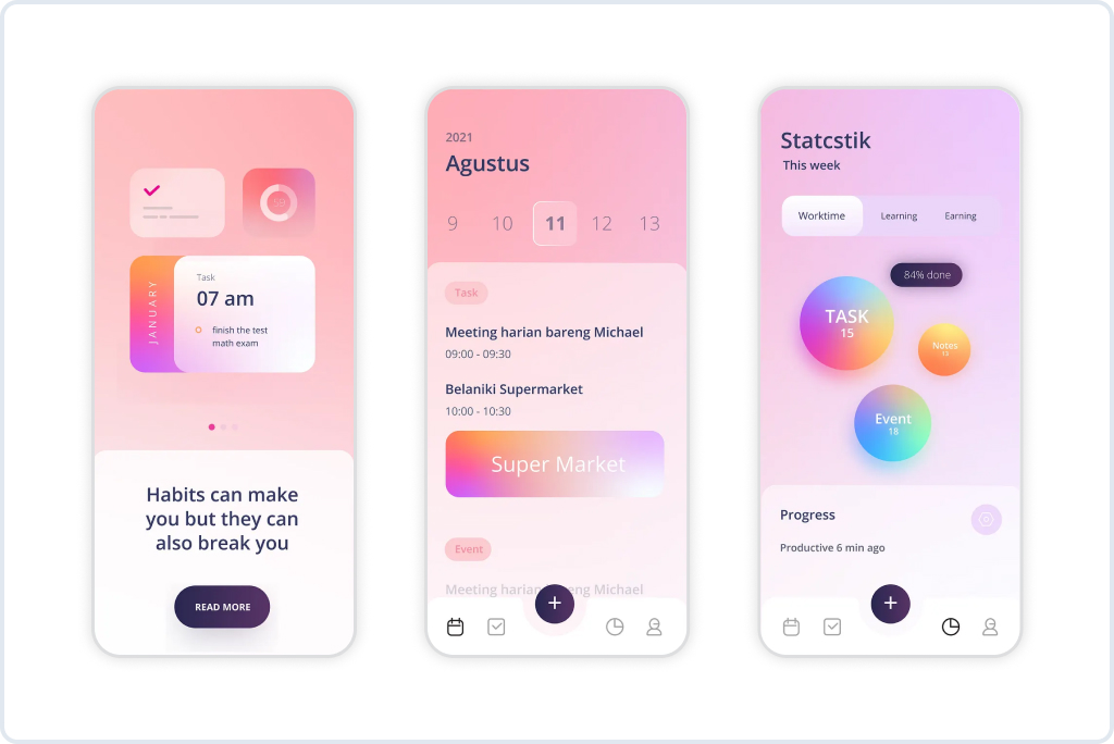
Minimalism as a Performance Strategy
A minimalist interface often looks calm and effortless. Behind that simplicity sits a deliberate product strategy.
Minimalist UI removes friction in three key areas: attention, navigation, and decision making. When each screen communicates a clear purpose, users respond faster. Actions feel intuitive rather than forced.
Consider a typical ecommerce scenario. A product page displays multiple promotional banners, several recommendation widgets, long technical descriptions, and numerous filters. Nothing appears technically incorrect. However, cognitive load increases quickly. Visitors must scan, interpret, compare, and decide.
A simpler layout works differently.
The main action stands out immediately. Supporting information appears in a logical order. Secondary content becomes accessible when needed rather than competing for attention at the same moment.
Product teams often notice measurable improvements when simplifying interfaces:
- Faster navigation through product catalogs
- Higher engagement with primary actions such as “Add to Cart.”
- Lower abandonment during checkout or account flows
One practical example appears in a navigation optimization project for an automotive parts retailer. The redesign focused on simplifying product discovery, reducing unnecessary interface elements, and improving hierarchy. Clearer navigation paths helped users find parts faster and reduced friction across the catalog. More details appear in the GoMage case study.
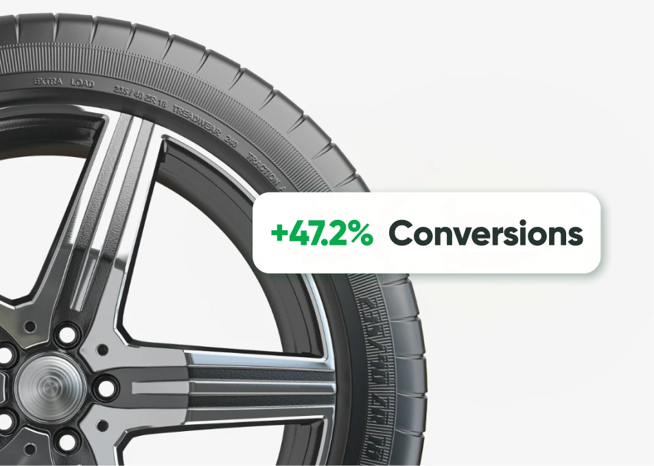
- +47.2% conversion rate from paid traffic
- –25% product page exits
- +30.3% user reviews, enhancing trust
Such results demonstrate that clean interface design contributes directly to measurable outcomes rather than visual aesthetics alone.
Why Simple UI Is Better Than Complex UI
Digital products accumulate complexity over time. New features appear. Marketing campaigns introduce additional banners. Integration requirements add new flows. Gradually, the interface becomes heavier.
From a user perspective, complexity creates a predictable chain reaction.
Attention fragments.
Confidence drops.
Decision speed slows.
Behavioral research explains several mechanisms behind such patterns.
Cognitive load
Human working memory handles a limited number of visual signals at once. A dense interface forces users to constantly evaluate options, interpret layout patterns, and determine priorities.
A simpler structure reduces cognitive load. Fewer competing elements allow attention to focus on meaningful actions.
Choice overload
A common mistake in digital product design involves presenting too many choices simultaneously. Multiple filters, banners, cross-sells, and options appear helpful at first glance. In reality, large sets of alternatives slow decision-making.
Minimalist UI reduces choice pressure by prioritizing essential actions first.
Pattern recognition
Users prefer predictable structures. When interface patterns repeat consistently across screens, navigation becomes effortless. Complex layouts often disrupt such patterns.
Simple UI design strengthens consistency. Once a user understands a pattern, the rest of the experience feels familiar.
Small differences accumulate. Over thousands of daily interactions, clarity becomes a competitive advantage.
A Short Scenario From Real Ecommerce Behavior
Imagine a customer searching for a pair of running shoes.
A dense interface displays several discount banners, category sliders, multiple filtering layers, recommended bundles, and subscription offers. The product grid appears halfway down the page.
The shopper scans the screen. Eyes move across several sections before locating the product list. By that moment, cognitive fatigue already begun.
Now imagine another version of the same page.
The category title appears clearly. Filters remain visible but unobtrusive. Product results occupy the main visual area. Sorting and filtering options remain accessible without interrupting browsing.
The second interface feels faster, even if page load speed remains identical. Clarity accelerates perception.
Many simple UI design examples for websites demonstrate similar patterns across ecommerce platforms.
Conversion and Ecommerce Impact
Interface simplicity strongly influences conversion rates. Ecommerce environments depend on quick decisions and minimal friction. Even small delays in understanding an interface can disrupt purchase momentum.
Several interface factors contribute to conversion improvements when minimalism guides design decisions.
- Clear action hierarchy
Primary buttons stand out without visual competition. When the “Add to Cart” action remains visually dominant, users respond faster. Secondary actions become less intrusive. - Reduced visual noise
Promotional elements often compete with product information. A minimalist UI balances marketing needs with clarity, ensuring promotional content does not interrupt decision-making. - Simplified checkout flows
Checkout pages benefit significantly from a clean interface design. Removing unnecessary fields and visual distractions increases completion rates.
Evidence appears across several ecommerce optimization projects. A global UX and CRO initiative focused on improving user flows, reducing friction, and simplifying interaction patterns across a complex ecommerce environment. Product pages and checkout steps became easier to understand, resulting in stronger engagement and measurable conversion improvements. More details appear in the case study.

- +42.6% product page engagement
- +35.9% international conversions
- -18% cart abandonment
A similar pattern emerged in a redesign for a women’s lingerie ecommerce brand. Simplified navigation and product presentation helped users move more confidently through product categories and purchase flows. The case study illustrates how clarity in interface design contributes to stronger shopping behavior.

- +51.4% conversions
- +59.1% revenue per visitor
- -26% cart abandonment
Each project highlights the same principle. How simple UI improves conversion rates often comes down to reducing hesitation.
Complexity Belongs in Architecture, Not on the Screen
Modern digital platforms handle enormous complexity behind the scenes. Inventory systems synchronize with warehouses. Pricing engines process dynamic rules. Recommendation algorithms analyze behavioral data.
None of such complexity needs to appear directly in the interface.
A strong product architecture separates internal capability from user experience. Complex logic operates behind the interface while the visible layer remains clear and predictable.
Successful digital products often follow a layered model:
- Data systems manage operational complexity
- Business logic orchestrates decisions
- Interfaces translate outcomes into simple interactions
From a user perspective, the result feels effortless. A shopper selects a product. Inventory availability updates instantly. Shipping options appear automatically.
Sophisticated infrastructure enables such experiences. Yet the interface remains simple.
Minimalist UI, therefore, does not imply reduced capability. Instead, minimalism protects usability by keeping complexity out of sight.
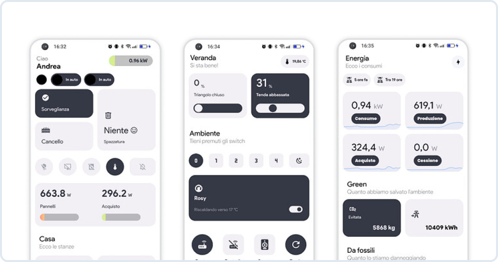
Benefits of Minimalist User Interface Design
Several operational benefits explain why product teams increasingly adopt minimalist UI strategies.
- Faster user comprehension
A screen with a clear hierarchy allows visitors to understand the purpose within seconds. Reduced cognitive effort accelerates engagement and decreases abandonment across product pages and forms. - Improved navigation confidence
Predictable layout patterns guide users through interfaces without uncertainty. Strong visual hierarchy clarifies relationships between actions, menus, and content sections. - Better mobile usability
Mobile interfaces require a stronger focus because screen space remains limited. Minimalist UI improves touch navigation and reduces scrolling fatigue. - Higher conversion stability during growth
As ecommerce platforms scale with additional features and integrations, minimalist interface principles help maintain clarity even when backend complexity increases.
A redesign project for an herbal supplement ecommerce brand illustrates such benefits. The interface improvements focused on clearer product pages, stronger hierarchy, and improved browsing flow. Visitors could explore product categories more comfortably while maintaining focus on purchase actions.

- +37.8% mobile conversions
- +28.4% product discovery efficiency
- +22% longer session duration
Minimalist UI Trends in 2026
Product teams planning future digital experiences already observe several evolving patterns in UI trends 2026.
Reduced visual density
Interfaces increasingly reduce element density. Designers allocate more space between components so users can process information comfortably.
Stronger hierarchy
Visual hierarchy receives stronger emphasis. Typography, spacing, and layout guide attention through a natural sequence rather than presenting all information simultaneously.
Progressive disclosure
Interfaces reveal complexity gradually. Advanced options appear only when users request additional details.
Adaptive UI layers
Modern interfaces adapt content visibility depending on context. Returning users might see condensed navigation structures while new users receive clearer onboarding guidance.
Mobile-first clarity
Mobile behavior continues influencing interface design decisions across desktop experiences. Simple layouts ensure interactions remain intuitive across devices.
Such patterns reinforce the central idea that minimalist UI trends in 2026 align with measurable usability improvements.
Practical Advice for Product Teams
Simplifying an interface rarely means removing elements randomly. Product teams usually follow structured analysis when refining digital experiences.
Several practical steps help guide that process.
- Audit visual competition across key screens
Product pages, dashboards, and landing pages often accumulate visual elements over time. Teams should analyze which components actually influence decisions and which only add noise. - Prioritize one primary action per screen
Each interface state benefits from a clear objective. When multiple actions compete visually, hesitation increases. Strong hierarchy clarifies the intended interaction. - Test simplified prototypes early
Usability testing often reveals how quickly users respond to simplified layouts. Early prototypes help validate design decisions before full development cycles. - Measure behavioral signals continuously
Conversion rates, session duration, navigation depth, and abandonment patterns reveal whether simplification improves user behavior. - Protect clarity during future feature additions
Product teams often reintroduce complexity during growth phases. Clear design guidelines help maintain interface discipline.
Successful digital products evolve constantly. Simplicity remains a moving target rather than a one-time design decision.
Clean Interface Design and Business Outcomes
Organizations increasingly recognize the strategic value of clean interfaces. Product clarity influences several operational areas:
Customer acquisition improves when first impressions feel intuitive.
Retention increases when returning users can complete tasks quickly.
Support costs decrease when navigation becomes self-explanatory.
Clarity also supports cross-team collaboration. Marketing teams launch campaigns more effectively when the interface structure remains consistent. Product teams introduce features without disrupting established interaction patterns.
Many companies discover that simplifying interfaces unlocks broader operational improvements beyond design alone.
Final Thoughts
Digital platforms continue growing in capability and complexity. At the same time, user expectations move in the opposite direction. People prefer interfaces that feel calm, predictable, and efficient.
Simple UI design, minimalist UI strategies, and clean interface design reflect that shift. When information hierarchy becomes clear, and interactions remain intuitive, users move through digital products with confidence.
Decision speed increases. Engagement improves. Conversion rates follow.
FAQ
Complex interfaces force users to stop and think. People scan the screen trying to understand where to start. Even a short pause can interrupt the flow. A simple UI removes that friction. The structure feels obvious, and users move directly toward the action they need.
No. Features usually stay in place. The difference lies in how they are presented. Secondary options often move into expandable sections or appear later in the flow. The interface stays clean while functionality remains available.
Clear product pages help shoppers decide faster. Price, images, and purchase actions appear immediately. When users do not need to search for basic information, hesitation drops, and purchase decisions happen more quickly.
Yes, and often it works better. Large catalogs and filters can overwhelm visitors if everything appears at once. A minimalist interface organizes those elements so users see the most important information first.
Not necessarily. Too many visual elements can actually reduce engagement. Clean layouts often hold attention longer because users understand the page quickly and feel comfortable navigating it.
Ecommerce platforms, SaaS products, and marketplaces benefit the most. In such environments, users perform tasks repeatedly. Clear navigation and predictable layouts make those tasks faster.
Design teams are reducing visual density and strengthening hierarchy. Important actions receive more space and attention. Interfaces also reveal complexity gradually rather than showing everything at once.
Yes. Personalized elements fit naturally into a clean layout. Recommendations or tailored offers feel more helpful when they appear in a calm, organized interface.
Usually not. Many improvements come from smaller adjustments. Navigation updates, clearer hierarchy, or removing unused elements can already make a noticeable difference.
Start with user behavior data. Analytics often reveal where users hesitate or leave a page. Those moments usually point to interface elements that create confusion and need simplification.