
Most website traffic comes from phones. For many businesses, it’s above 60 percent, often higher. Yet most sites still get built for wide monitors first, with mobile handled as a secondary consideration. That sequence produces sites that technically work on phones but weren’t made for them.
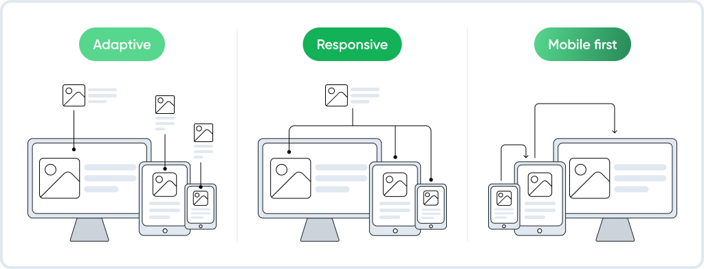
Mobile-first design reverses the process. You start at phone size, make every layout and content decision under that constraint, and expand outward to larger screens from there. The outcomes look similar in screenshots. They feel completely different from someone actually using a phone.
Responsive Design and Mobile-First Design Are Not the Same
Responsive design is a technical description. It means the layout adjusts to different viewport widths. A site can be fully responsive and still be terrible on a phone, because responsiveness only describes the mechanism, not the intent behind the design decisions.
Most responsive sites were designed for a wide screen. Breakpoints were added to prevent the desktop layout from completely breaking on smaller screens. The result is a phone experience that reflects a desktop design that was adapted, not a phone design that was built.
Mobile-first describes the intent and the sequence. You start at phone size. You make every decision under the constraint of a small screen with a touch interface and a cellular connection. The desktop layout is built afterward by expanding from that base. The difference in sequence produces a different product.
Google began indexing the mobile version of sites for search ranking purposes in 2019. This is often cited as a reason to care about mobile design, which it is, but it’s also slightly backward as a frame.
What Actually Goes Wrong on Phone-Unfriendly Sites
The problems tend to cluster around a short list. They’re not subtle when you’re looking for them.
Reading is harder than it should be.
Body text that was set for a wide column at a comfortable desktop viewing distance becomes small and dense on a phone held at arm’s length. This is the most common mobile UX problem and one of the least often fixed, because the people building the site are testing it on a computer where the text looks fine.
The fix on a mobile-first site is that the text size was decided for phone screens from the start. On a desktop-first site, fixing it requires going back and overriding typography decisions that were made in a different context.
Navigation that assumes a mouse.
Dropdown menus triggered by hovering over a parent item don’t work on touch screens. There is no hover state on a phone. Menus positioned at the top of the screen, standard for desktop, require an uncomfortable reach when the phone is held with one hand. Touch targets that work fine as small clickable areas with a precise cursor cause constant tapping errors when people are using thumbs.
Mobile-first navigation gets designed around the actual physical constraints of holding and using a phone: thumb zones, one-handed use, the absence of hover, and the reality that people are often in motion when they’re using their phones.
Navigation redesign is one of the highest-impact changes on mobile. An automotive parts retailer dealing with thousands of products across phones, tablets, and desktops improved conversion from paid traffic by 47.2% and cut product page exits by 25% after restructuring how navigation and filters worked on smaller screens.

- +47.2% conversion rate from paid traffic
- –25% product page exits
- +30.3% user reviews, enhancing trust
Forms that take too long.
A four-field checkout form on a desktop takes a minute. The same form on a phone, with a keyboard covering the bottom half of the screen, with inputs sized for clicking rather than tapping, with the wrong keyboard type for several fields, takes four or five minutes and usually results in abandonment somewhere in the middle.
Mobile-first form design starts by asking which fields are truly necessary and removing the rest. It specifies the correct keyboard for each input type. It makes inputs large enough to tap without error. It puts clear, accessible error messages close to the field they describe rather than at the top of the page, where they require scrolling to find.
The difference in completion rates between forms designed for desktop and forms designed for phone is large. This is one of the most direct revenue connections in mobile UX.
A global ecommerce CRO project focused on improving layout hierarchy across product pages saw a 42.6% increase in product page engagement and a 35.9% rise in international conversions. The pages didn’t look dramatically different. The content hierarchy was easier to follow on smaller screens, and visitors reached purchase decisions with less effort.

- +42.6% product page engagement
- +35.9% international conversions
- -18% cart abandonment
The load time reads as disrespect.
People’s tolerance for slow load times on phones is lower than on desktops, not higher. Partly this is because cellular connections are less consistent than home broadband. Partly it’s because a slow page signals that the site wasn’t built for the device you’re using, which is an accurate signal in most cases.
Desktop-first sites carry desktop-weight assets to mobile connections. Images sized for 1400-pixel screens, JavaScript loaded for interactions that don’t exist on mobile, CSS that describes desktop layouts the phone will never display. Mobile-first sites don’t have that overhead because the assets were sized for mobile from the start. The desktop version gets the larger assets, not the phone.
Overlays and popups before content.
A full-screen email capture, cookie consent overlay, or app download prompt before someone has seen anything they came for is the fastest route to an immediate exit. On a phone, these overlays cover more of the screen proportionally, are harder to dismiss, and tend to appear before the visitor has any investment in staying. Google specifically penalizes intrusive interstitials on mobile in its page experience evaluation. Whether or not the ranking penalty is the primary concern, the behavioral outcome is the same: people leave.

Mobile Design and Search Rankings
The relationship between mobile experience and search performance runs through several mechanisms, not just one.
Speed is a direct ranking input.
Google measures page loading performance from real Chrome user data on real mobile devices. These measurements feed into ranking calculations. A site that loads quickly on a phone has a direct ranking advantage over a slower site targeting the same keywords, assuming comparable content. The speed score in a desktop browser tool is not what gets measured. The speed that real mobile users experience, on real phones, on real connections, is what matters.
Desktop-first sites adapted for mobile tend to underperform on mobile loading metrics because the asset decisions were made without mobile constraints in mind. Mobile-first sites tend to perform better because speed was a constraint from the start.
Session behavior accumulates over time.
Pages with high mobile exit rates, where people arrive and leave quickly without engaging, trend downward in rankings over months compared to pages where mobile visitors stay, read, and take actions. Google doesn’t publish a direct explanation of how this works, but the pattern is consistent and observable. A site that mobile users find genuinely usable builds better long-term search performance than one they find frustrating, even if the content is comparable.
A herbal supplement brand whose desktop site looked acceptable but felt crowded on mobile saw a 22% increase in session duration and 37.8% rise in mobile conversions after improving the mobile layout and readability. The content didn’t change. How easy it was to read and navigate on a phone did.

- +37.8% mobile conversions
- +28.4% product discovery efficiency
- +22% longer session duration
What Google crawls is the mobile version.
When Google indexes your content for search, it looks at the mobile version of each page. Content that is hidden on mobile, collapsed behind an expandable section to save screen space, or simply absent from the mobile layout, is not seen. It doesn’t rank. Product descriptions that only appear on desktop, supporting text that gets collapsed on phone screens, category copy that was trimmed for mobile to keep things clean: none of this contributes to search visibility if it’s not accessible on the mobile version.
Mobile-first design treats the phone as the primary content container. Everything that needs to rank is visible and accessible by default, because the mobile version is the version that was designed, not adapted.

What Mobile-First Design Looks Like When Done Well
It’s easier to describe in terms of specific decisions than abstract principles.
Content priority gets decided before layout.
On a phone, one or two things can be prominent at a time. The decision about which things those are needs to be made before any visual design starts. What did this person come here to do? What information do they need to do it? What’s the one thing this page is trying to communicate or accomplish?
On a desktop-first site, these questions sometimes get answered by the layout: the things that fit prominently get priority. On a mobile-first site, the priority has to be explicit because the screen doesn’t have room for ambiguity.
Navigation works with one hand.
The default human posture for phone use is one hand. Thumb reach in that grip doesn’t extend easily to the top of the screen, which is where desktop navigation conventionally lives. Mobile-first navigation puts frequently accessed destinations in positions the thumb can reach, keeps the structure shallow enough that two taps at most get anywhere, and doesn’t rely on hover states or interactions that don’t exist on touch screens.
There’s no single correct solution to mobile navigation. Bottom navigation bars, simplified header menus, and gesture-based patterns all work in different contexts. What they share is that they were chosen because they work for phone users, not because they adapted gracefully from a desktop pattern.
Images are sized for the device receiving them.
A product photo displayed at 350 pixels wide on a phone does not need to be a 2400-pixel file. Serving appropriately sized images for mobile rather than loading large files and scaling them down visually makes a meaningful difference in load time. The visual quality difference at phone screen size is imperceptible. The file size difference is often three to five times.
This decision is also much easier to make at the beginning of a project than to retrofit. On a desktop-first site, the image decisions were made for desktop. Making them work better on mobile requires either re-uploading assets or adding infrastructure that serves different sizes based on device, which adds complexity. On a mobile-first site, the mobile image sizes are the base from which desktop sizes are added.
Forms ask for less.
Every field in a form is a point where someone might decide it’s not worth continuing. This is true on desktop. It’s more true on mobile, where typing is slower and more error-prone, where fields are harder to tap accurately, and where the keyboard occupies a significant portion of the visible screen while filling something out.
Mobile-first form design starts with a question: What is the minimum information needed to complete this transaction? Then it removes everything that doesn’t meet that bar. Optional fields, nice-to-have information for marketing purposes, questions that can be answered after purchase: these have a cost on mobile that they don’t have at the same magnitude on desktop.
Performance is treated as a hard constraint from day one.
The sites that stay fast over three years are the ones where performance was a design constraint, not a goal to work toward. When every feature addition, every new image, every third-party script installed through a tag manager gets evaluated against an established performance standard, the accumulation of performance debt is slower. When performance is something that gets addressed after the product is built, it accumulates steadily and becomes expensive to fix later.
This is particularly relevant for mobile because the cost of each addition is higher. A JavaScript bundle that adds 50ms of interaction delay on a desktop with a fast processor adds 200ms on a mid-range phone. The threshold for noticeable sluggishness is lower on mobile, and the consequences, higher exit rates, are more direct.
Visual consistency across screen sizes.
A responsive interface should feel like the same product on every device. Typography, spacing, and layout structure should stay recognizable even when elements reorganize for smaller screens. Predictable visual patterns let users focus on content rather than on figuring out how the interface works. A redesign for a women’s lingerie brand demonstrated this directly: consistent visual language across responsive layouts contributed to a 51.4% increase in conversions, 59.1% more revenue per visitor, and 26% lower cart abandonment.

- +51.4% conversions
- +59.1% revenue per visitor
- -26% cart abandonment
Common Mistakes on Sites That Weren’t Built Mobile-First
These appear repeatedly on desktop-first sites and are largely absent from well-executed mobile-first ones.
- Touch targets sized for cursors. Buttons and links designed to be clicked with a mouse pointer are often too small to tap reliably with a thumb. The tapping error rate on small targets produces frustration that most users don’t report. They just leave.
- Text that requires zooming. Body copy set for comfortable desktop reading at desktop sizes is often too small on a phone. People zoom in, read a paragraph, zoom out to scroll, zoom in again. This is not a good reading experience. Most people don’t persist with it.
- Navigation that requires multiple taps. A menu that requires tapping a parent category, then a subcategory, then the destination, totaling three or four taps to get anywhere, is significantly more friction than it appears on desktop, where hover states make the structure visible immediately.
- Pages that shift while loading. Images and ads that load after the text and push content down the page as they arrive cause the page to visually jump. Reading a sentence, having the page shift under you, losing your place, finding it again: this happens multiple times per session on pages with this problem and is one of the clearer signals that a site was not built with phone users in mind.
- Popups that appear before content. An overlay before the visitor has seen anything they came for produces exits. On mobile, the exit rate from this pattern is particularly high because the overlay covers more of the screen and is harder to dismiss accurately.
- The same large images on every device. Loading desktop-resolution images on phones is the single most common cause of slow mobile load times. It’s also one of the most straightforward to fix, which makes it notable that so many sites still have it.
How to Evaluate Your Current Mobile Experience
The most reliable method is personal and manual. Open your site on a phone, not in a browser’s device emulation mode on a computer. Go through the most common visitor paths: read a piece of content, find a product, complete a checkout or inquiry form. Pay attention to what requires extra effort. Anything that requires zooming, precise tapping, noticeable waiting, or multiple attempts is a problem that mobile visitors are encountering at scale.
Beyond personal testing:
Google’s Mobile-Friendly Test checks any individual URL for specific rendering problems: text too small, tap targets too close, and content overflowing the viewport. It’s quick and useful for a first pass, though it only covers one page at a time and doesn’t measure performance.
Search Console’s Mobile Usability report covers the full site. If the same problem is affecting forty pages, it’s almost always a template issue that gets fixed once. This report shows the scope of mobile issues without requiring page-by-page manual testing.
Analytics segmented by device. The comparison between mobile and desktop session duration and bounce rate is a useful diagnostic. A site where mobile session time is significantly shorter and bounce rate is significantly higher than desktop has a mobile experience problem that is affecting behavior at scale. The gap size indicates the severity. A small difference is normal and expected. A large gap is a measurable revenue and rankings problem.
User session recordings on mobile. Tools that record actual user sessions on phones show where people tap, where they hesitate, where they try to interact with something that isn’t working, and where they leave. Watching real phone sessions for ten minutes usually surfaces more actionable information than hours of desktop analytics review.
A professional UX and UI design process considers mobile behavior from the beginning rather than retrofitting it. That approach typically produces cleaner interfaces across all screen sizes, not just on phones.
FAQ
Mobile-first means designing for the phone screen before designing for any larger screen. The sequence matters because constraints shape decisions. Designing under the constraint of a small screen, touch input, and cellular connection produces different choices than designing for a wide monitor with a mouse and fast broadband, then adapting for mobile afterward. The phone version of a desktop-first site reflects a desktop design that was compressed.
Directly, through page speed on mobile devices. Google measures loading performance from real phone users and uses those measurements in ranking calculations. Also, through content visibility, content hidden on the mobile version of a page doesn’t get indexed. And indirectly through the behavioral patterns that result from good or poor mobile experience accumulating over time in ways that correlate with ranking performance.
High mobile bounce rate compared to desktop. Short mobile session duration. Low mobile conversion rate on forms or checkout flows. Complaints or support requests mentioning mobile experience. Text that requires zooming. Navigation that requires multiple taps to reach common destinations. These signs don’t require analytics expertise to identify. The most reliable signal is using the site on a phone and noticing what’s hard.
Doing it at the start of a project adds minimal cost compared to a desktop-first approach. The process is similar in scope. Retrofitting an existing desktop-first site is more expensive because it often requires rethinking navigation, restructuring layouts, and redesigning forms rather than making minor adjustments. The cost comparison that matters is between retrofitting later versus doing it correctly now.
The impact varies by the type of conversion. For forms and checkout flows, the difference between a mobile-optimized and a non-optimized experience is often large: completion rates on mobile-first forms are substantially higher because the friction has been reduced. For content engagement, better mobile reading experiences produce longer sessions and more pages per visit. For e-commerce, mobile-first product pages with appropriate image sizing and clear calls to action convert at higher rates than pages where those elements were adapted from desktop layouts.
Load speed and readability. If the page is slow or the text requires zooming, visitors leave before encountering anything else. Nothing else on the page matters if people are gone before seeing it. After those two, navigation and form usability. Then, the finer details of touch target sizing, content layout, and interaction design. The priority should follow the order in which problems are encountered: load time first, then the first-screen experience, then the paths toward action.
No. Mobile-first doesn’t mean building two separate sites. It means the design process starts with phone screens, and the implementation serves appropriate experiences to different devices. Most well-implemented mobile-first sites are single codebases where the phone layout is the base from which desktop layouts are built, not a separate product maintained in parallel.