Open a website on a phone during a commute. Later, the same page appears on a laptop at work. In the evening, someone scrolls through the product catalog on a tablet while relaxing on the couch.
Users rarely think about what happens behind the scenes during those transitions. They simply expect the experience to work.
Navigation should reorganize itself automatically. Text should remain readable without zooming. Images should scale properly. Buttons should stay large enough to tap comfortably.
When that happens, the experience feels natural.
When it does not, visitors leave almost immediately.
Responsive web design exists to prevent that moment of friction.
In 2026, responsive design no longer belongs only to front-end development discussions. It directly affects SEO performance, engagement metrics, and how credible a digital product appears to new visitors.

The First Signal Users Notice
People often assume that content determines whether visitors stay on a page. Content matters, but structure matters first.
Users form impressions quickly.
A page that loads correctly on a mobile device signals professionalism immediately. Navigation works. The layout feels balanced. Scrolling reveals content gradually instead of breaking the structure.
A page that fails on mobile creates a different impression. Elements overlap. Text becomes difficult to read. Navigation requires zooming or horizontal scrolling.
That experience communicates something about the brand before the user reads a single sentence. Responsive design, therefore, influences perception as much as usability.
Why Responsive Design Is Important for SEO
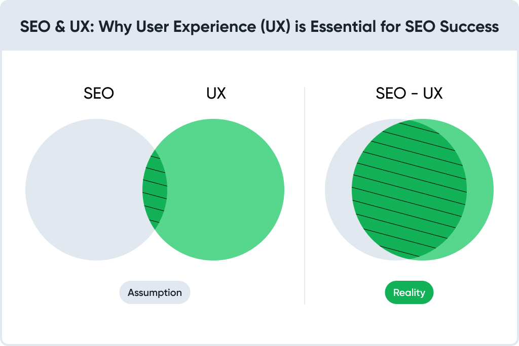
Search engines increasingly rely on user behaviour as a ranking signal.
If visitors arrive on a page and quickly leave because the layout feels difficult to use on mobile devices, search engines interpret that behaviour as a negative quality indicator.
Responsive websites reduce several SEO problems simultaneously.
- mobile-friendly layouts improve indexing
- one URL structure avoids duplicate content issues
- consistent page structure improves crawl efficiency
- lower bounce rates send positive engagement signals
Those factors explain why responsive design is important for SEO.
Search engines want to promote pages that deliver useful experiences. Responsive design helps meet that expectation.
A Simple Scenario
Imagine two online stores selling identical products.
The first website looks impressive on a large desktop monitor, but becomes difficult to navigate on a phone. Product images extend beyond the screen. Filters require horizontal scrolling. Checkout buttons appear below long sections of content.
The second website adapts instantly. The layout rearranges itself. Product images scale naturally. The purchase button remains visible.
Both stores sell the same items.
Most customers buy from the second store.
The difference comes from responsive design.
Responsive Design Is More Than Flexible Layout
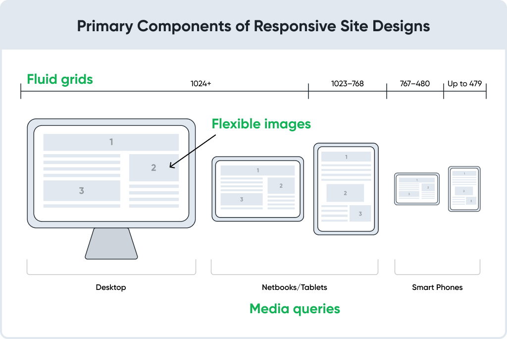
Early discussions about responsive web design focused on screen width. Designers created flexible grid systems that allowed content to expand or shrink depending on the device.
Modern responsive interfaces adjust far more than layout.
A responsive system often modifies several elements at once:
- navigation behaviour
- typography size
- image resolution
- spacing between components
- interaction patterns
Those changes allow a single website to function naturally across phones, tablets, laptops, and large monitors.
Developers implement the technical side. Designers ensure the experience still feels coherent.
Mobile First Thinking
The rise of smartphones changed how many teams approach responsive design.
Instead of designing for desktop screens first, many projects begin with the smallest screen available.
A mobile-first responsive design strategy forces teams to focus on the essentials.
What information must appear immediately?
Which actions do users perform most often?
Which navigation elements matter most?
Limited screen space removes unnecessary complexity.
Once the core experience works well on mobile devices, expanding the layout for larger screens becomes easier.
That process often produces cleaner interfaces overall.
A Case from Ecommerce Navigation
Large product catalogs often reveal responsive problems quickly.
An automotive parts retailer faced exactly that situation. Thousands of products existed in the catalog, and customers searched for components across phones, tablets, and desktop computers.

- +47.2% conversion rate from paid traffic
- –25% product page exits
- +30.3% user reviews, enhancing trust
Navigation redesign improved product discovery dramatically.
Filters became easier to notice. The category hierarchy became clearer. The layout adapted smoothly across different screens.
Customers could locate compatible parts faster, regardless of the device used to access the catalog.
Responsive Design and User Behaviour
When responsive design works well, users rarely notice it.
The opposite is also true.
Poor responsive behaviour changes how people interact with a site. Visitors scroll less, explore fewer pages, and abandon sessions earlier.
Three behavioural patterns often appear when responsive design fails:
- Navigation hesitation
Users spend extra time searching for menus or filters. - Reading fatigue
Text becomes difficult to read on smaller screens. - Checkout abandonment
Purchase processes feel complicated on mobile devices.
Each of those problems reduces engagement. Responsive design addresses them by simplifying interaction patterns across devices.
Benefits of Responsive Web Design
Several practical benefits explain why responsive design remains central to modern web development.
Better search performance
Search engines favour websites that perform well on mobile devices. Responsive structures support consistent indexing.
Stronger engagement
Visitors stay longer on websites that remain comfortable to use on any device.
Higher conversion rates
Ecommerce stores often see stronger conversions when checkout processes remain mobile-friendly.
Lower maintenance effort
Maintaining a single responsive website is usually easier than managing separate mobile and desktop versions.
Together, those advantages explain the growing importance of responsive web development.
What High-Performing Responsive Websites Have in Common
Strong responsive websites share several design characteristics.
Flexible grid systems
Content reorganizes smoothly without breaking the layout.
Touch-friendly interactions
Buttons and navigation elements remain easy to tap.
Readable typography
Text scales appropriately for different screen sizes.
Optimized media
Images load efficiently without sacrificing visual quality.
A professional web designer’s responsive design approach considers all those elements during the design process.
Conversion Optimization and Responsive Design
Responsive improvements often appear during broader conversion optimization initiatives.
One global ecommerce CRO project focused on improving layout hierarchy across product pages. The visual structure became easier to scan on smaller screens, even though the overall page design remained similar.

- +42.6% product page engagement
- +35.9% international conversions
- -18% cart abandonment
Visitors moved through product information faster and reached purchase decisions with less effort. Responsive design frequently improves conversions simply by reducing friction.
When Content Becomes Easier to Read
Another ecommerce redesign involved a herbal supplement brand.

- +37.8% mobile conversions
- +28.4% product discovery efficiency
- +22% longer session duration
The original website looked acceptable on desktop monitors but felt visually crowded on mobile devices. Product descriptions appeared dense and difficult to read.
Simplifying the layout and improving responsive behaviour allowed content to breathe.
Visitors could scan ingredients, benefits, and instructions comfortably across devices.
Sometimes, responsive design improves comprehension more than aesthetics.
Common Responsive Design Mistakes
Even experienced teams occasionally overlook details that affect responsive usability.
Several issues appear frequently during UX audits:
- navigation designed only for mouse interaction
• images optimized for desktop resolution only
• tap targets too small for mobile devices
• layout hierarchy optimized only for wide screens
Responsive design must consider real user behaviour rather than only visual adaptation.
Responsive Design and Brand Consistency
A responsive interface should feel like the same product regardless of device.
Typography, colours, and layout structure should remain recognizable even when elements reorganize.
A redesign for a women’s lingerie brand demonstrated how visual consistency across responsive layouts improved browsing comfort. Predictable visual language allowed users to focus on products rather than interface adjustments.

- +51.4% conversions
- +59.1% revenue per visitor
- -26% cart abandonment
Responsive Website Best Practices for 2026
Responsive design continues evolving as new devices and interaction patterns appear.
Several practices remain widely recommended:
- prioritize mobile usability early in the design process
- test layouts on multiple screen sizes regularly
- simplify navigation for touch interaction
- optimize images and media for performance
- maintain clear content hierarchy
Following those principles helps create responsive websites that remain usable over time.
Designing Responsive Systems for Ecommerce
Modern ecommerce platforms contain far more than product pages.
Catalog navigation, filters, checkout flows, user accounts, and support sections all require responsive behaviour.
Design systems help maintain consistency across those components.
Companies looking to improve their digital experience often invest in structured UX design frameworks that support responsive development.
A well-designed system keeps interfaces clear even as product catalogs grow.
Final Thoughts
Responsive web design has evolved from a technical adjustment into a core element of digital strategy.
Websites must adapt smoothly to different devices, screen sizes, and interaction patterns. When responsive behaviour works well, users barely notice it.
They simply navigate, explore, and purchase without friction.
That invisible success represents the true value of responsive design in modern digital products.
FAQ
Search engines want to send users to pages that work well on mobile devices. If a site looks broken or difficult to use on a phone, visitors leave quickly. That behaviour shows up in analytics, and search engines see it too. Responsive layouts help avoid those problems because the same page works properly on every screen.
The biggest benefit is consistency. People open websites on many different devices during the day. A responsive layout keeps the experience stable whether someone uses a phone, tablet, or laptop. Businesses also avoid maintaining two different versions of the same site.
Many purchases today begin on mobile devices. If product pages feel hard to read or buttons are difficult to tap, customers often postpone the purchase or leave completely. A responsive interface removes those small obstacles and makes the buying process smoother.
Mobile-first design means starting with the smallest screen instead of shrinking a desktop layout later. Designers decide what content really matters when space is limited. After that, larger screens simply provide more room for additional elements.
Users do not want to zoom, scroll sideways, or hunt for navigation menus. A responsive layout adjusts content automatically so everything remains readable and easy to interact with. The interface simply behaves the way people expect.
One common mistake happens when layouts technically resize, but usability stays poor. Buttons remain too small, navigation hides important sections, or images slow down mobile loading. Responsive design should solve interaction problems, not only resize the page.
Teams usually review pages on different screen sizes and check analytics data for mobile behaviour. High bounce rates or short sessions from mobile visitors often reveal usability issues. Real device testing often shows problems that automated tools miss.
Not really. Responsive websites work well for browsing and purchasing. Mobile apps usually focus on frequent interactions such as messaging, loyalty programs, or notifications. Many companies use both depending on how customers interact with their products.
Online stores often receive more mobile traffic than desktop traffic. Product discovery, filtering, and checkout all need to function well on smaller screens. When the experience feels smooth, customers move through the catalog without frustration.
Flexible layouts help the most. When the structure adapts easily to different screen sizes, new devices rarely cause major problems. Good responsive design also relies on reusable components, so the interface stays consistent as the site grows.