You don’t need to blow up your entire website to sell more. We’ve seen too many store owners spend months and thousands of dollars on redesigns when simple tweaks would have done the job.
The reality is that most eCommerce sites are already 70-80% there. They have decent products, reasonable prices, and functional layouts. What they’re missing are the small details that push hesitant visitors over the line into becoming customers.
Here’s what works: focus on the friction points that actually matter to buyers to increase eCommerce conversion rates.
The best part? You can implement most of these changes in a few days, not months. Unlike a full redesign, you can test each one individually to see exactly what moves the needle for your specific audience.
High-Impact Tweaks That Convert Better
Start With Your Product Pages
This is where people decide to buy or leave. Get these basics right:
- Show the price clearly: Sounds obvious, but you’d be surprised how many stores bury their pricing. Put it where customers expect to find it, right under the product name. Make it big enough to read without squinting.
- Better product photos: Customers can’t touch your products, so photos have to work extra hard. Include close-ups, different angles, and shots of people actually using the item. If you sell clothes, show them on real people, not just flat on a bed.
- Display your inventory: “2 left in stock” works because it’s true scarcity. Don’t fake it with those countdown timers that reset every day, customers notice, and it kills trust.
- Move reviews up: Put customer feedback near the top of the page. People read reviews before they read your product description. Work with that behavior, not against it.
Fix Your Checkout
Shopping cart abandonment happens for predictable reasons. Here’s how to stop it:
- Skip forced registration: Let people buy as guests. You can always ask them to create an account after they’ve paid. Requiring an account upfront just creates another barrier.
- Show the steps: “Step 2 of 4” tells customers what to expect. Nobody likes surprises during checkout.
- Be upfront about shipping: Hidden shipping costs are order killers. Show these costs on the product page or early in checkout. Better yet, build shipping into your product prices and offer “free” shipping. Partnering with a 3PL company can also help you streamline fulfillment, lower shipping costs, and improve delivery times—all of which reduce cart abandonment and increase customer trust..
- Add more payment options: Not everyone wants to type their credit card number. PayPal, Apple Pay, Google Pay – these options let customers pay in one click.
Write Like a Human
Your website copy probably sounds like every other eCommerce site. Stand out by being specific:
- Ditch generic headlines: “High Quality Products” tells customers nothing. “Handmade in Portland, Ships Same Day” gives them actual information.
- Improve your buttons: “Add to Cart” works fine, but “Get Yours Now” or “Start My Order” feels more personal.
- Focus on benefits: Don’t just list features. If your jacket is waterproof, explain what that means: “Stay dry in heavy rain” hits harder than “100% waterproof material.”
- Build trust obviously: Security badges, guarantees, contact info – make it clear you’re a real business that stands behind its products.
The Non-Design Approach to Higher Conversions
Let Data Guide Your Decisions
Install Google Analytics and a heatmap tools and tips for project managers like Hotjar or Crazy Egg. Don’t just look at overall conversion rates, dig into the behavior patterns that reveal where customers get stuck:
- High bounce rate pages: If people leave immediately after landing on certain pages, those pages aren’t meeting expectations. Maybe your ad copy promises something the page doesn’t deliver, something an AI ad copy generator can help you refine to better match user intent. Maybe the page loads too slowly or looks broken on mobile.
- Scroll maps: See how far down your pages people actually scroll. If important information like pricing or your main call-to-action is below where most people stop scrolling, move it up.
- Click maps: Watch where people click versus where you want them to click. If customers are clicking on images that aren’t linked, make them clickable. If they’re ignoring your main button but clicking something else, rethink your layout.
- Form analytics: See where people start filling out forms but don’t finish. Maybe one field is confusing, or the form feels too long. Sometimes moving a required field earlier or later in the sequence makes a big difference.
- Customer journey analysis: Track the path customers take through your site. Do they visit your FAQ before buying? That might mean your product pages need more information. Do they check your shipping policy multiple times? Make shipping details more prominent.
Test One Change at a Time
Pick something specific and test two versions. Maybe your main headline, your checkout button color, or how you display customer reviews. Run tests for at least two weeks with meaningful traffic before deciding which version wins.
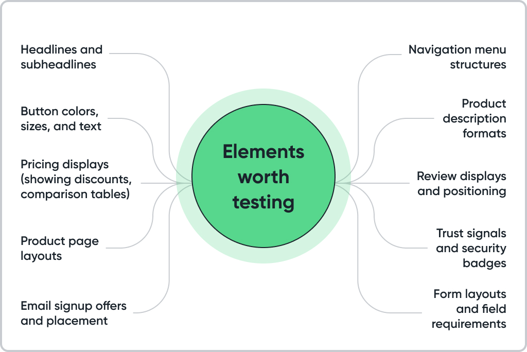
Testing methodology: Don’t test multiple changes simultaneously unless you’re using advanced statistical tools. If you change your headline and button color at the same time and see improvement, you won’t know which change caused it.
Start with tests that could have the biggest impact. Testing button colors might give you a small lift, but testing your value proposition could transform your results.
Give tests enough time: A week isn’t long enough unless you have massive traffic. Account for weekly patterns – B2B sites often see different behavior on weekends, and consumer sites might vary by day of the week.
Speed Matters More Than You Think
Slow sites lose sales. Period. Every extra second of loading time costs you customers. Amazon found that every 100ms of delay costs them 1% in sales. For smaller sites, the impact can be even larger.
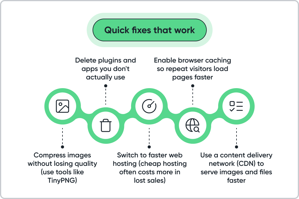
Measure your speed: Use Google PageSpeed Insights to identify specific problems. Focus on the suggestions that say “high impact” first. And if your current infrastructure is still struggling under load, moving your store to Fast VPS hosting can give you more resources and stable performance without a full platform change.
Mobile speed matters even more: Mobile users are often on slower connections and have less patience. If your site loads slowly on phones, you’re losing most of your potential customers.
Test your site speed on an actual phone using cellular data, not WiFi. The experience might be worse than you think.

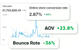
- +51.4% conversions
- +59.1% revenue per visitor
- -26% cart abandonment
Conversion Wins Without Full Website Revamp
Make Search Actually Work
If customers can’t find your products, they can’t buy them.
- Add autocomplete. Suggest products as people type. This helps them find items faster and discover things they didn’t know you sold.
- Include filters. Let people narrow results by price, brand, size, whatever makes sense for your products.
- Fix empty search results. Instead of showing “No results found,” show related products or your bestsellers.
Make Help Easy to Find
- Add live chat. Even a basic chat widget helps. Customers like knowing they can reach someone if they have questions.
- Create a real FAQ. Answer the questions customers actually ask about shipping, returns, sizing, whatever comes up repeatedly.
- Display contact info. Put your phone number and email somewhere obvious. Some people want to know if a real person is behind the website.
Create Real Urgency
- Run actual sales. Limited-time offers work when they’re genuine. Don’t run a “24-hour sale” that’s been going for three months.
- Highlight new items. “New arrival” badges create natural urgency without manipulation.
- Show recent activity. “Someone in Austin just bought this” works if it’s true. Fake social proof backfires when customers catch on.
Don’t Ignore Mobile
Most of your traffic comes from phones. Make sure your site works there:
- Bigger buttons. Make them easy to tap without accidentally hitting something else.
- Cleaner navigation. Hide less important menu items. Keep your main categories visible and easy to reach.
- Mobile payments. Apple Pay and Google Pay eliminate the pain of typing credit card numbers on a small screen.
If you want the bigger picture behind the tactics in this guide, read Why Conversion Rate Optimization (CRO) Is Crucial for Website Success. It explains how CRO turns traffic into revenue, which metrics to track first, and how small wins compound over time.
Getting Started: Your 30-Day Action Plan
Week 1: Quick Wins
- Add customer reviews to your top product pages
- Enable guest checkout if you don’t have it
- Display shipping costs prominently
- Install Google Analytics and a heatmap tool
- Test your site speed and fix obvious slowdowns
Week 2: Content Improvements
- Rewrite your top 5 product descriptions to focus on benefits
- Improve your main headlines to be more specific
- Add more product photos, including lifestyle shots
- Create or update your FAQ section
- Add trust signals (security badges, contact info, guarantees)
Week 3: Process Optimization
- Simplify your checkout process by removing unnecessary fields
- Add more payment options (PayPal, mobile payments)
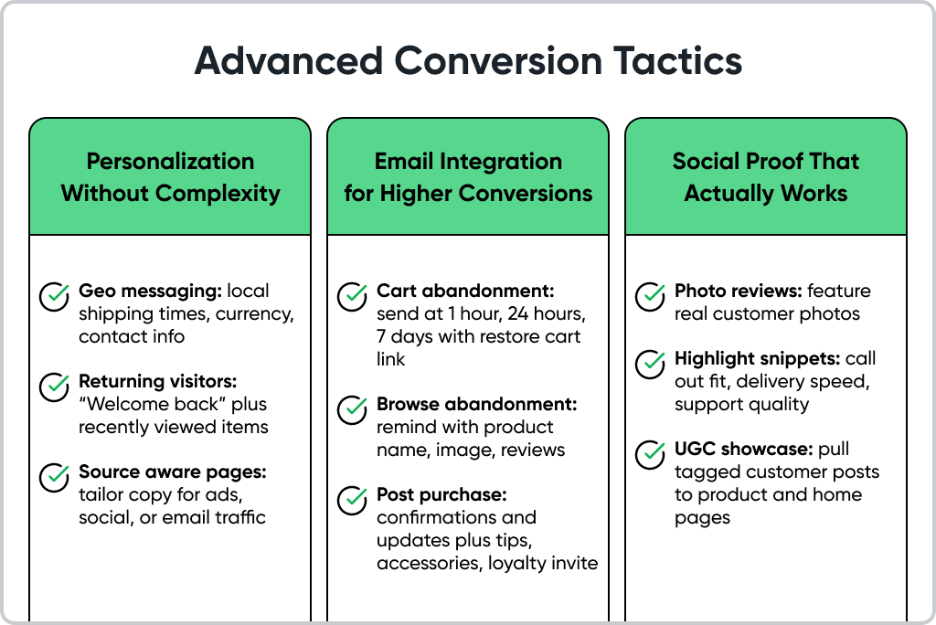
- Implement cart abandonment emails
- Test different versions of your main call-to-action buttons
- Optimize your site for mobile users
Week 4: Testing and Analysis
- Set up A/B tests for your homepage headline
- Test different product page layouts
- Analyze your heatmap and analytics data
- Survey recent customers about their experience
- Plan your next round of improvements based on results
Don’t expect overnight transformations. Small, consistent improvements compound over time into significant results. A 0.5% improvement in conversion rate might not seem like much, but it can add up to thousands of additional sales over a year.
Final Thoughts
Do not expect overnight transformations; small, consistent improvements compound into real gains, and even a 0.5 percent lift in conversion can add thousands of additional sales over a year. Your website does not need perfection, it needs progress. The teams that grow fastest remove friction from the path to purchase and tackle the biggest leaks first.
If you want help accelerating this work, GoMage runs fast CRO audits, prioritizes high impact fixes, and ships improvements without a redesign. The team aligns analytics, copy, product pages, checkout, and performance so you see measurable lift in weeks, not quarters. Start today by requesting a quick CRO audit and turn your current store into a higher converting one.
FAQ
Yes, slow pages lose impatient shoppers. Improve Core Web Vitals by compressing images, lazy loading content that is below the fold, removing heavy apps and scripts, and serving the right image size for each device. Faster first interaction usually brings more ads to cart and more completed orders.
Remove surprises and extra work. Show full costs early, allow guest checkout, support digital wallets and pay later, and keep forms short with clear error messages. Follow up with abandoned cart emails within a few hours and include a one-click return to the cart.
The biggest wins come from fewer steps and clearer guidance. Use autofill where possible, validate fields in real time, keep progress obvious, and place trust cues close to the pay button. These changes reduce hesitation and increase completion rate.
Test the elements that decide the purchase. Start with headline clarity, the placement and wording of the primary button, the visibility of delivery time and returns, and the order of the image gallery. If fit or sizing matters, make that guidance easy to find.
Plan on two to four weeks or until results are stable with enough samples. Do not stop early because of a short-term spike. If traffic is very low, group similar pages so you reach significance.
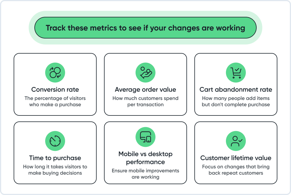
Focus on conversion rate, revenue per visitor, cart abandonment, checkout completion, and average order value. Segment by device and traffic source to see where gains come from and where leaks remain.
Yes, they reduce uncertainty at the moment of decision. Show the rating count and photo reviews near the price and the add to cart button, and include short snippets that address common worries such as fit, delivery speed, and support quality.
Begin with simple rules that respond to context. Show recently viewed items, highlight category bestsellers, greet returning visitors with a link to continue, and adjust landing copy to match the referral source. Geo cues like local shipping times and currency also help.
Design for thumbs and for spotty networks. Keep pages light, use a sticky add to cart button, make tap targets comfortable, simplify filters, and limit popups that interrupt the flow. Always test changes on real mid-range phones.
Choose a redesign only when incremental work cannot solve core issues. That includes platform limits around security or performance, a major brand shift that the current system cannot express, or an information architecture that blocks catalog growth even after repeated fixes.
Let winning on-site ideas power your channels. Reuse headlines and images from successful tests in ad creative, trigger browse and cart emails from funnel events, and mirror clear product messaging in meta titles and article headings. This keeps every channel aligned with what actually converts.