Colour lands before anything else. Not the headline. Not the logo. The colour. In web design, by the time a user reads the first word on a page, a judgment about the brand already exists, and colour drives a large part of that judgment.
Nobody teaches users to process colour that way. The brain simply does it automatically and quickly.
Why Colour Matters More Than Most Design Briefs Admit
Many design discussions treat colour as the final decision. Layout first. Copy second. Palette last.
That order usually works backwards.
Colour defines the emotional environment that every other element sits inside. A palette can reinforce credibility or quietly undermine it. Strong copy may feel convincing or questionable depending on the visual tone surrounding it.
The effect becomes even stronger in ecommerce.
Colour affects whether a product page feels premium or cheap. It affects whether a purchase button looks clickable or invisible. It affects whether a first-time visitor explores further or leaves the site within seconds.
What Different Colours Actually Communicate
Certain colours have developed strong associations through decades of brand use.
Blue became the default trust colour largely through repetition. Major banks adopted blue decades ago. Technology companies followed. Over time, users learned to associate blue with reliability simply because reliable institutions used it so consistently.
The association still works today, although habit plays a role alongside psychology.
Green behaves differently depending on context. On a supplement brand, it signals health and natural ingredients. On a financial dashboard, it suggests growth or positive returns. On a sustainability platform, it communicates environmental responsibility.
The colour remains the same. The meaning shifts with context.
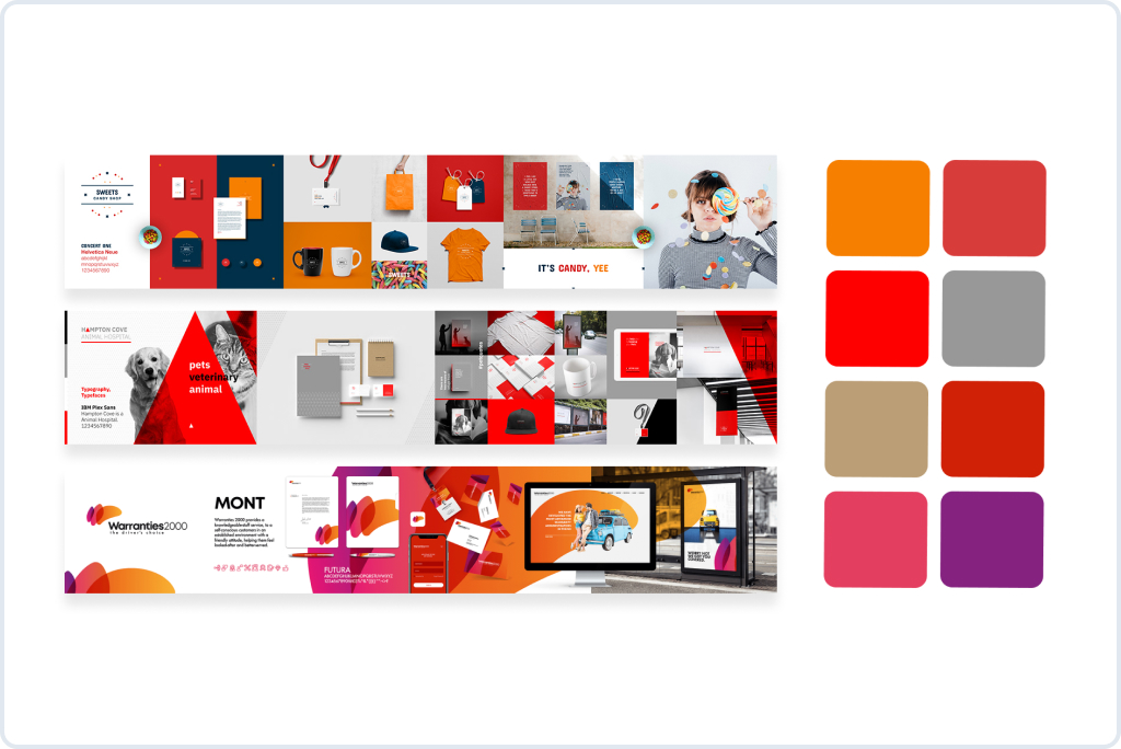
Red tends to attract attention instantly. Designers often use it for urgency. Promotions, limited stock messages, or countdown offers benefit from that signal.
However, large red areas across an entire interface can feel stressful rather than persuasive.
Yellow introduces energy but requires restraint. Bright yellow works well as a highlight colour on neutral backgrounds. As a dominant colour across an interface, it often creates visual fatigue.
Black functions differently. Luxury brands rely on black not because black automatically signals luxury, but because black paired with generous white space creates a sense of restraint. The interface stops competing for attention.
That restraint becomes its own signal.
What Colour Represents Trust in Branding
Blue remains the most reliable answer in many industries.
Yet trust rarely depends on colour alone. Consistency matters more than the exact hue chosen.
A brand using five different blues across its website, email templates, and marketing assets feels less reliable than a brand using a single distinctive orange applied consistently everywhere.
Predictability creates trust. Colour helps reinforce that predictability.
What Colour Means Hope in Branding
Brands trying to communicate optimism or recovery often gravitate toward green or light blue.
Green suggests growth and renewal. Environmental organizations and sustainability platforms rely on it heavily because the colour implies something positive emerging or developing.
Light blue tends to communicate openness and calm optimism. Healthcare platforms often rely on it to create reassuring environments.
Yellow sometimes appears in campaigns that need optimism combined with energy. Education initiatives and nonprofit organizations use yellow accents when hope should feel active rather than passive.
Handling remains delicate. Too much yellow can feel naive rather than optimistic.
Colour Hierarchy Is a Usability Tool
Colour hierarchy often determines whether a product interface feels intuitive or confusing.
When every element on a page competes for attention visually, users slow down. They need extra time to decide what deserves attention and in what order.
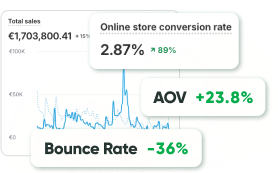
That friction appears quickly in analytics. Higher bounce rates. Shorter sessions. Lower conversion.
A clear hierarchy changes the experience immediately.
One dominant colour highlights primary actions. A secondary colour supports navigation. Neutral backgrounds allow product images and content to carry visual weight without interference.
An automotive parts retailer with thousands of SKUs applied that approach during a navigation redesign. Customers had struggled to find compatible components in a large catalog. Stronger colour contrast around filtering tools and navigation elements improved product discovery dramatically.

- +47.2% conversion rate from paid traffic
- –25% product page exits
- +30.3% user reviews, enhancing trust
Colour and Ecommerce Conversion
Colour contrast often becomes part of broader conversion optimization work.
A global ecommerce CRO project focused on visual hierarchy across product pages. The structure of the pages remained similar, yet the colour system changed.
Product information became easier to scan. Calls to action became easier to locate. Visitors moved through the product evaluation process faster.
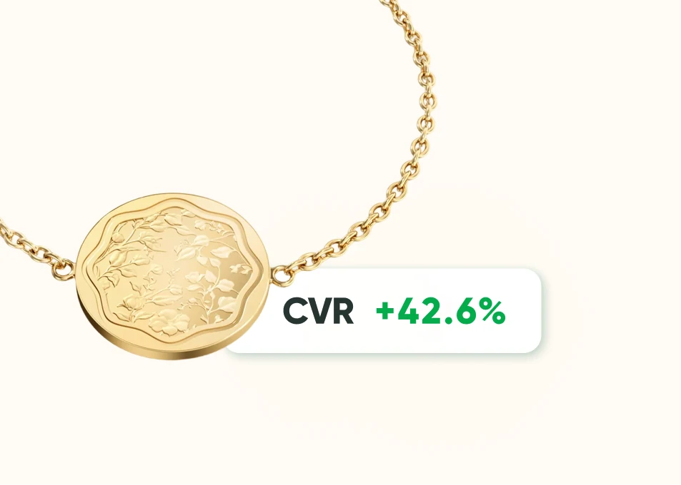
- +42.6% product page engagement
- +35.9% international conversions
- -18% cart abandonment
Another example appeared in a redesign for a herbal supplement brand. The original interface used several strong colours that competed with product descriptions. Simplifying the palette and reducing visual noise allowed the content to become clearer.
Visitors who wanted to understand ingredients and benefits before purchasing could finally do so without distraction.

- +37.8% mobile conversions
- +28.4% product discovery efficiency
- +22% longer session duration
Colour Systems vs Colour Palettes
A palette simply lists colours. A system explains how those colours behave.
The difference becomes critical in large products.
A palette gives designers a selection of colours. A system defines rules. What colour represents success? What colour indicates an error? Which colour highlights primary actions? How disabled states appear.
Users gradually learn those signals through repeated interaction.
After a short time, colours communicate meaning instantly without requiring explanation.
A redesign for a women’s lingerie brand demonstrated how consistent colour rules across product pages made the browsing experience feel calmer and more predictable.

- +51.4% conversions
- +59.1% revenue per visitor
- -26% cart abandonment
Interpretation of Colours in Marketing
Colour meaning rarely exists in isolation. Context shapes interpretation.
Technology startups frequently use gradients because gradients signal modernity and experimentation to their audiences.
Corporate brands often rely on restrained palettes because restraint communicates reliability in those markets.
Luxury brands often limit colour entirely. Black and white dominate because minimalism signals exclusivity.
A palette that works perfectly in one industry may feel completely wrong in another.
The interpretation of colours in marketing always depends on the audience and category.
What Modern Design Trends Are Actually Solving
Minimalist colour palettes became common in ecommerce and SaaS not because designers suddenly preferred simplicity, but because user research repeatedly showed that complex interfaces reduced conversions.
Simpler palettes improved clarity.
Gradients returned for different reasons. After years of flat design, gradients began to feel visually distinctive again. Technology companies looking for modern visual signals adopted them quickly.
Muted palettes inside productivity tools solve another problem entirely. People use those products for hours every day. Highly saturated colours create fatigue at that level of exposure.
Muted tones reduce visual stress and allow longer sessions. Those decisions remain functional rather than stylistic.
How Colour Connects With Design Systems
Colour rarely works in isolation. It functions inside a broader design system that includes typography, spacing, layout structure, and interaction patterns.
A strong design system ensures that every element feels consistent across the entire product experience.
Ecommerce platforms that invest in design systems often see improvements in usability and conversion simply because clarity accumulates.
Each element that becomes easier to understand makes the surrounding interface easier to navigate as well.
The Part That Actually Matters
Colour works mostly below conscious attention.
Users rarely think, “This interface uses blue, therefore I trust it.” Instead, they simply trust it, or they do not.
The colour quietly influences that reaction.
When colour works well in a design, nobody notices it. Users simply feel comfortable navigating the interface and confident making decisions.
That quiet effect represents the real goal of colour psychology in web design.
Not a visually impressive palette.
An experience that feels right to the person using the product, even if they never consciously notice why.
FAQ
In most cases, colours work as signals rather than strict meanings. Designers use them to guide attention and create a certain emotional tone around the interface. Blue often feels stable, green feels calm or balanced, and red draws attention quickly. Visitors usually react to those signals instinctively rather than consciously thinking about them.
Because colour often determines where the eye goes first. When everything on a page uses similar tones, people spend extra time figuring out where to look. A clear colour hierarchy removes that effort. Users immediately notice the important elements and move through the page faster.
Blue appears most often in brands that want to communicate stability. Banks, SaaS companies, and enterprise tools rely on it heavily. That does not mean other colours cannot build trust. Consistency usually matters more than the exact shade. When a brand applies colours the same way across the whole experience, the interface starts to feel reliable.
Green and light blue are the most common choices. Green tends to suggest growth or renewal, which is why environmental organizations and wellness brands often use it. Light blue creates a calmer sense of optimism that works well in healthcare or educational platforms.
Colour contrast helps important actions stand out. When purchase buttons or product filters clearly differ from surrounding elements, visitors find them faster. That small change can reduce hesitation and make the buying process feel easier.
Yes, although usually in subtle ways. A balanced palette and consistent colour usage make a website look organized. When colours feel random or overly aggressive, the interface can appear less professional, even if the product itself is strong.
A palette simply lists the colours used by a brand. A colour system defines how those colours behave inside the interface. For example, one colour might always represent the main action, another might indicate success messages, and another might signal errors.
Most modern interfaces rely on a small number of colours. One primary colour usually highlights the main actions. One or two supporting colours help organize navigation or secondary elements. Neutral backgrounds keep the layout readable and allow content to stand out.
Not completely. Some associations appear frequently across cultures, but context still matters. A colour that feels professional in one industry may feel unusual in another. Designers usually test palettes with real users before finalizing them.
The process usually begins with brand identity and audience expectations. Designers explore several palettes, test them against real interface screens, and evaluate readability, contrast, and emotional tone. The goal is not simply to find attractive colours, but colours that support usability and brand perception at the same time.