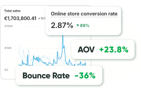
Every website owner has faced the same situation: traffic is coming in, ads are running, visitors browse a few pages, and then leave without buying. It can feel frustrating, especially when you have done everything “right.” The truth is, success online is about how people behave once they land on your site.
That is why conversion psychology has become so important. It looks at the way people think, what motivates them, and why they take action. When you understand those patterns, you can shape your website to match human behavior instead of fighting against it. Visitors feel more comfortable, trust you faster, and are more likely to buy.
Understanding User Behavior: The Basics
One of the clearest ways to think about online behavior is with the Fogg Behavior Model. According to it, three things must come together for an action to happen:
- Motivation – the person must want or need the outcome.
- Ability – the action must be easy enough to complete.
- Prompt – there must be a clear trigger or nudge.
Think about it like this: imagine you are hungry (motivation). A restaurant offers delivery in one click (ability). You see a push notification saying “Your favorite burger is 20% off” (prompt). The chance of you ordering is high.
The same happens online. If one element is missing, the action rarely happens. If checkout is too complicated, ability drops. If motivation is weak, even a perfect design may not help. And if no clear call-to-action exists, the user never knows what to do next.
Social Proof: Trust Is Non-Negotiable
One of the strongest psychological triggers is social proof. People naturally look to others for reassurance before making decisions. Think about the last time you bought something on Amazon. Did you read at least a few reviews? Probably yes.
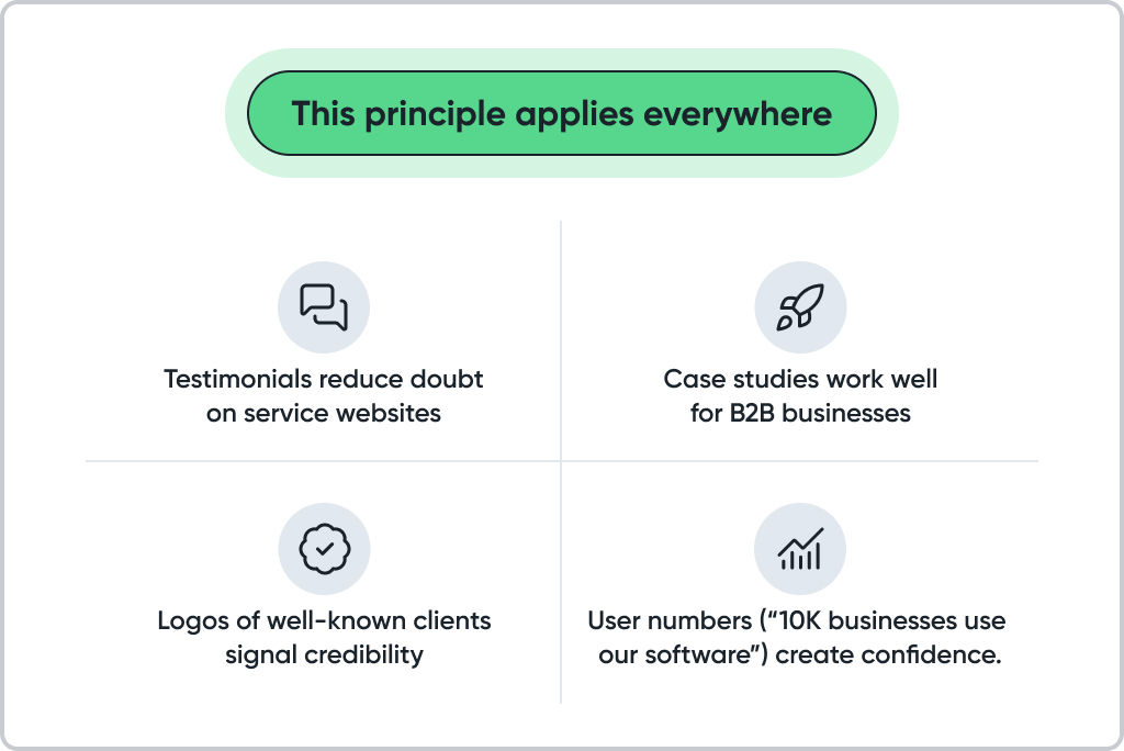
Another subtle but powerful trust signal is a clear product return policy. When users know they can easily send something back if it doesn’t meet expectations, their hesitation to purchase drops dramatically – it reinforces the sense of safety and fairness that underlies every buying decision. 3PL companies like Green Wave Electronics can help brands manage this process effectively by handling the complex reverse logistics and returns side of the supply chain.
If your site does not show why others trust you, users will hesitate = hesitation often means lost sales.
Using Color and Contrast to Influence Decisions
Design is not decoration. It is a silent conversation with the user. Color psychology plays a big role here:
- Blue makes people feel safe (why so many banks and tech firms use it).
- Red creates urgency and grabs attention (common in clearance sales).
- Green signals success and progress (“Add to cart” or “Start now”).
- Orange often suggests friendliness and excitement.
But it is not only about color. Contrast matters even more. A call-to-action button that blends into the background is invisible. A high-contrast button becomes a natural next step.
For example, HubSpot tested button colors and found that higher contrast boosted conversions by more than 20%. That small change turned into significant revenue.
Seven Principles of Conversion Psychology You Can Apply Anywhere
Here are the 7 conversion psychology principles for increasing website sales:
- Clarity wins every time – Users leave if they do not understand what you offer within a few seconds.
- Trust through social proof – Reviews, testimonials, or client success stories make your offer believable.
- Urgency and scarcity – Limited-time discounts or “only 3 items left” push faster decisions.
- Consistency – Align your ads, landing pages, and checkout so visitors do not feel misled.
- Authority – Awards, certifications, and expert backing reduce hesitation.
- Color and contrast – Highlight the most important actions visually.
- Micro-commitments – Make big actions feel smaller (start with a free trial, not a purchase).
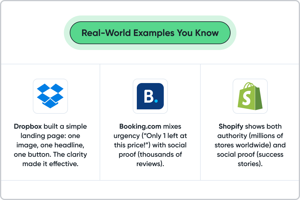
The lesson is simple: none of these brands rely on design alone. They use psychology, layered in multiple ways, to create trust and urgency while keeping the process easy.
How to Put This into Practice on Your Site
Theory is great, but testing is better. Here are some practical ideas:
- Run A/B tests on button wording (“Get started” vs. “Start free trial”).
- Move testimonials closer to your checkout page.
- Test urgency messages on popular products.
- Use heatmaps to find where people get stuck or lose interest.
Conversion psychology gives you the reasons behind human decisions. Your testing shows which specific triggers resonate with your audience. Together, they form a cycle of continuous improvement.
Common Mistakes People Make with Conversion Psychology
- Overusing urgency – If every single item says “Only 2 left,” users stop believing it. Urgency works best when it feels authentic.
- Forgetting mobile users – On mobile, long forms and small buttons kill conversions. Always check your design on a phone.
- Ignoring emotional triggers – People don’t only buy for logic. They buy because it feels right.
- Cluttering the page – More information doesn’t always help. Sometimes fewer words and more white space convert better.
Quick Checklist for Your Own Website
Here’s a simple checklist you can walk through:
- Is it crystal clear what you offer in the first 5 seconds?
- Do you have at least one visible piece of social proof on every key page?
- Are your call-to-action buttons visible, with strong color contrast?
- Does your page create a sense of urgency without sounding fake?
- Do you provide small, low-risk steps before asking for a purchase?
- Is your design consistent from ad → landing page → checkout?
- Have you tested at least one thing (CTA text, button color, placement) this month?
Final Thoughts: Why Having the Right Partner Matters
When you work with conversion psychology in real projects, you quickly see that theory and practice are not the same thing. On paper, it all looks clear: add urgency, show reviews, keep things simple. But once you test it on a real store, the small details become the real challenge. Sometimes it is a button hidden too far down the page, sometimes it is a form that feels longer than it should. These “little things” quietly eat into sales without anyone noticing.
We’ve seen businesses spend months trying to fix this on their own, running in circles. That is why many of them turn to teams who live and breathe eCommerce. At GoMage, the focus is not only on building or migrating stores but on making them profitable. We spend time digging into the customer journey, testing ideas, and adjusting details until the numbers prove the change works.
FAQ
They are methods based on human behavior that help you design pages people act on. Examples include social proof, urgency, color psychology, and checkout simplification. These principles make your site clear and trustworthy which naturally increases sales.
Start with one area such as a product page or landing page. Add clear trust signals, simplify the call to action, and make the path obvious. Using psychology in CRO is about removing doubts and showing users the easiest way forward.
It is the foundation. Without studying user behavior such as clicks, ignored areas, or drop offs, you are guessing. Heatmaps, A/B testing, and session replays reveal behavior patterns and allow you to fix the points where conversions are lost.
Colors affect emotions. Blue builds trust, red creates urgency, and green signals progress. Contrast is crucial because your call to action button must stand out immediately. Testing different colors often reveals surprising results.
The Fogg Behavior Model explains that for someone to act, motivation, ability, and a prompt must come together. If motivation is high but the process is too complex, people give up. If the action is easy but motivation is missing, nothing happens. This model helps to identify why conversions stall.
Yes. Many businesses increased conversions simply by moving reviews higher on the page or adding photos of real customers. Trust signals reduce fear and hesitation which are the biggest blockers in online shopping.
Yes. Whether it is eCommerce, SaaS, or B2B services, people follow similar psychological patterns. Everyone looks for clarity, reassurance, and ease. The tactics may vary but the principles remain the same.
Check for high bounce rates, abandoned carts, or drop offs before checkout. If people visit but do not buy, it usually means motivation, trust, or clarity is missing. Conversion psychology directly addresses these gaps.
It is best to follow proven strategies such as social proof, urgency, and color psychology, while also testing with your own audience. What works for one brand may not work for another until it is adapted. Testing turns ideas into measurable results.