

In this article, we’d like to review the new interface of Grid pages, and show a unique approach to creating user interface elements in Magento ® 2.
Magento 2 UIGrid Tips
Review
Magento ® 2 has 2 types of UiGrid pages. The first one is what we are used to in Magento ® 1, and the second one is the page with Ui Components.
This is standard Grid page which is almost the same as in Magento ® 1. Further, we move on to the Ui Grid.
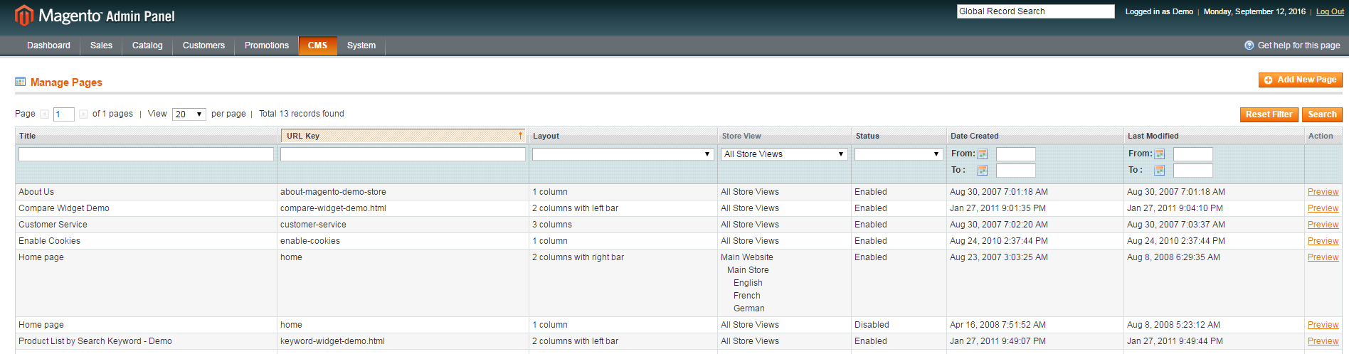
You may have noticed a lot of new elements on this page, while Magento ® 1 screen usually looks like this:
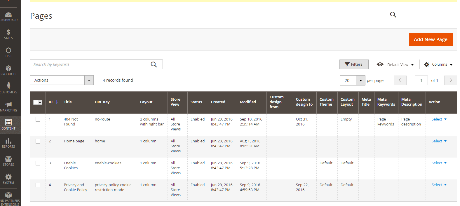
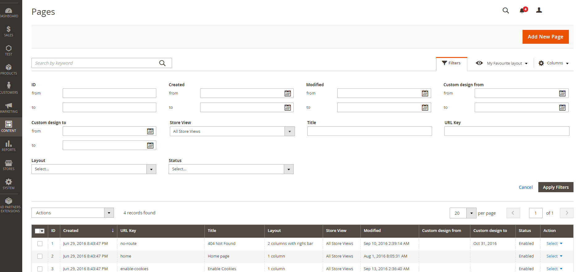
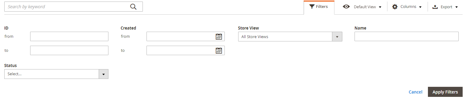
By default, the filters are hidden. To make them visible, you need to press the “Filters” button.
As an administrator, you can view the records from the database, as it was in Magento ® 1, and also modify the list of columns and their position, as well as the list of available filters, and perform other actions in the admin panel directly.
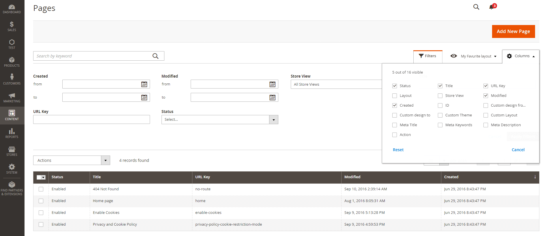
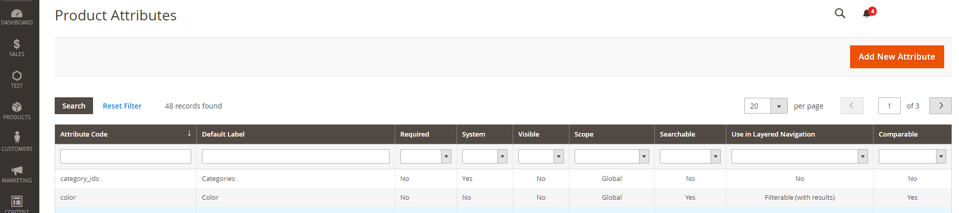
This also works on the EAV Grid pages (such as a list of products or a list of users). While adding a new attribute, you can include a column with its value.
If you have a page with a lot of records, and you scroll down farther, the field headings and the necessary buttons will be displayed at the top and will be available on the screen.
Another useful feature is full-text search on the Grid page (you can browse the CMS grid page or the page with a list of users).
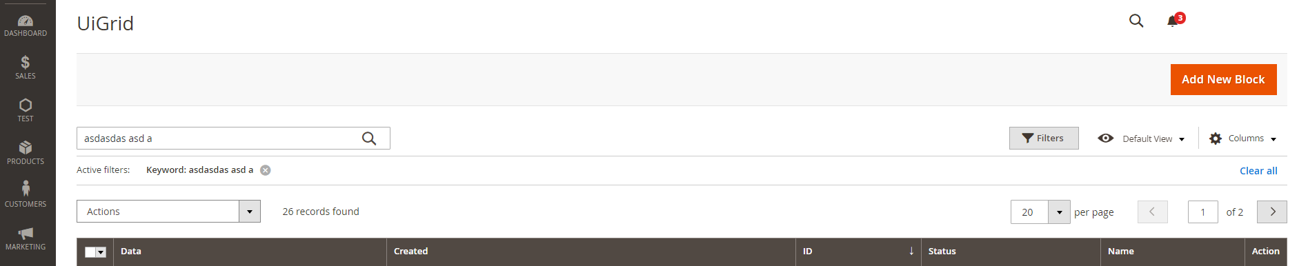
You can enter any text and, if at least one record with the same content has been found, it will be shown.
One more feature that deserves attention is columns with images. You can see an example of such a column on a products list page. Upon clicking on the image the full version of the product image will be shown.
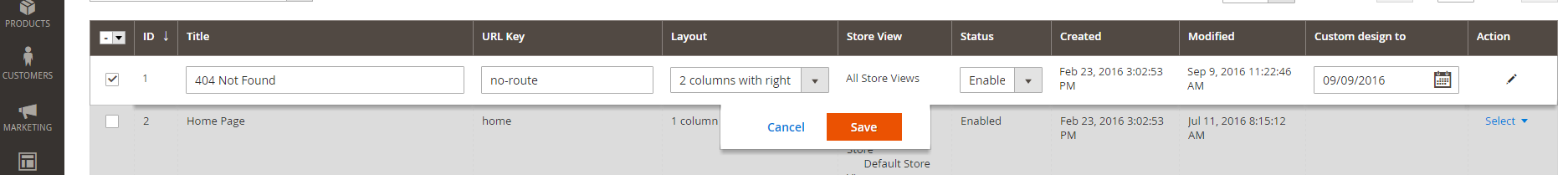
An inline editor is also useful functionality that you can use. If you click on a line, you can edit it without having to open the edit page.
You can also make it through to the editing of several records (mass action). Simply tick the required line and select “Edit” in the “Actions” menu.
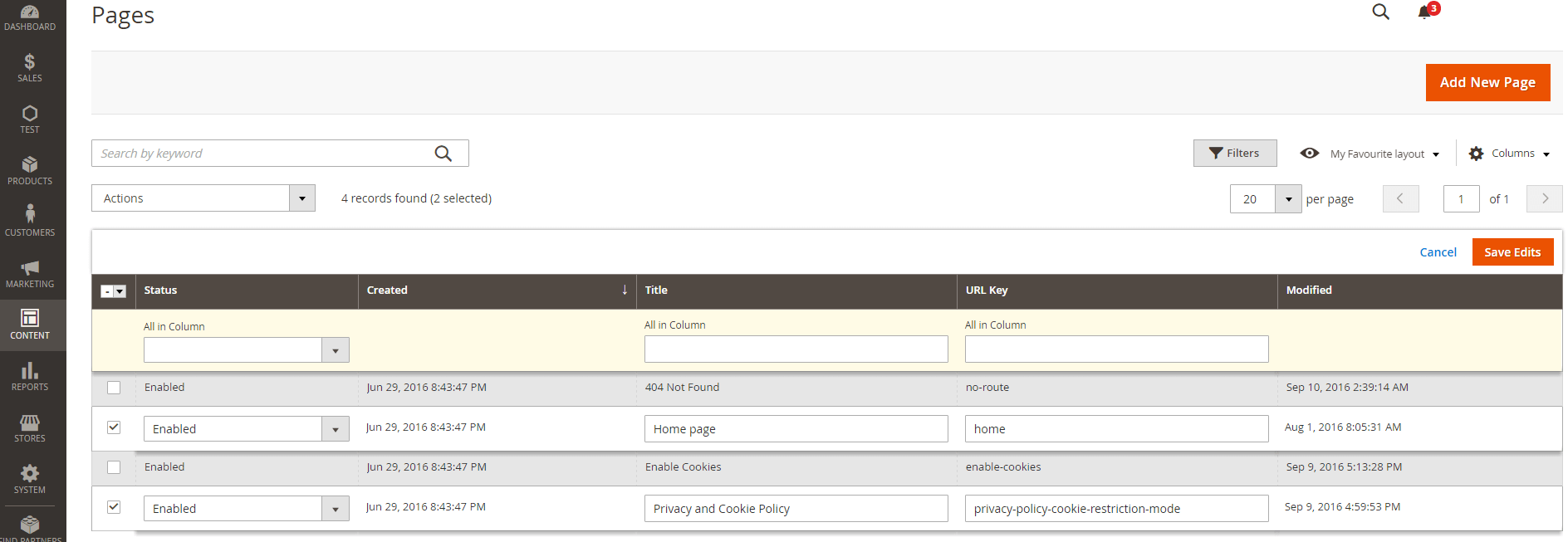
With the new architecture of the admin panel of Magento ®, these actions don’t require page reloading. This means that you will see the result of your actions almost instantly.
Creating UiGrid Extensions
All new features look promising, but how can you use them?
Let’s view the full process of Ui Grid implementation into an abstract extension. First of all, our extension should have the following structure:
- {NameSpace}/{ExtensionName}/registration.php
- {NameSpace}/{ExtensionName}/etc/module.xml
- {NameSpace}/{ExtensionName}/etc/di.xml
- {NameSpace}/{ExtensionName}/etc/acl.xml
- {NameSpace}/{ExtensionName}/etc/adminhtml/menu.xml
- {NameSpace}/{ExtensionName}/etc/adminhtml/routes.xml
- {NameSpace}/{ExtensionName}/Model/{Entity}.php
- {NameSpace}/{ExtensionName}/Model/ResourceModel/{Entity}.php
- {NameSpace}/{ExtensionName}/Model/ResourceModel/{Entity}/Collection.php
- {NameSpace}/{ExtensionName}/Model/ResourceModel/{Entity}/Grid/Collection.php
- {NameSpace}/{ExtensionName}/Setup/InstallSchema.php
- {NameSpace}/{ExtensionName}/Controller/Adminhtml/Index/Index.php
- {NameSpace}/{ExtensionName}/view/adminhtml/layout/{frontnameId}_index_index.xml
- {NameSpace}/{ExtensionName}/view/adminhtml/ui_component/{entity_grid_listing}.xml
* {Entity_grid_listing} is a unique identifier for your Ui component configuration. Magento ® merges XML files by name and it is a good idea to name them as {entity} _grid_listing, like it is done in the CMS pages (page_grid_listing).

Here is an example:
- {NameSpace} – Test,
- {ExtensionName} – UiGrid,
- {Entity} – Grid.
The list of files should be familiar to the developers for Magento ® and the new files are:
- {NameSpace}/{ExtensionName}/Model/ResourceModel/{Entity}/Grid/Collection.php
- {NameSpace}/{ExtensionName}/view/adminhtml/ui_component/{entity_grid_listing}.xml
And there are some new lines in the following file configuration:
- {NameSpace}/{ExtensionName}/view/adminhtml/layout/{frontnameId}_index_index.xml
- {NameSpace}/{ExtensionName}/etc/di.xml
Let’s look through the main files quickly.
Registration.php, module.xml should provide information to declare our module.
\Magento\Framework\Component\ComponentRegistrar::register(

\Magento\Framework\Component\ComponentRegistrar::MODULE,

'Test_UiGrid',

__DIR__

);
<config xmlns:xsi="http://www.w3.org/2001/XMLSchema-instance" xsi:noNamespaceSchemaLocation="urn:magento:framework:Module/etc/module.xsd"> <module name="Test_UiGrid" setup_version="0.1.0"/> </config>Acl.xml, menu.xml, routes.xml should have information about links and menu in the admin panel, so you can get to your Grid page.
<config xmlns:xsi="http://www.w3.org/2001/XMLSchema-instance" xsi:noNamespaceSchemaLocation="urn:magento:framework:Acl/etc/acl.xsd">
    <acl>
        <resources>
            <resource id="Magento_Backend::admin">
                <resource id="Test_UiGrid::test" title="Test" translate="title" sortOrder="30">
                </resource>
            </resource>
        </resources>
    </acl>
</config><config xmlns:xsi="http://www.w3.org/2001/XMLSchema-instance" xsi:noNamespaceSchemaLocation="urn:magento:module:Magento_Backend:etc/menu.xsd">
<menu>
<add id="Test_UiGrid::test" title="Test" translate="title" module="Test_UiGrid" sortOrder="20" dependsOnModule="Test_UiGrid" resource="Test_UiGrid::test"/>
<add id="Test_UiGrid::test_uigrid" title="UiGrid" translate="title" module="Test_UiGrid" sortOrder="10" parent="Test_UiGrid::test" action="uigrid" resource="Test_UiGrid::test"/>
</menu>
</config>
<config xmlns:xsi="http://www.w3.org/2001/XMLSchema-instance" xsi:noNamespaceSchemaLocation="urn:magento:framework:App/etc/routes.xsd">
    <router id="admin">
        <route id="uigrid" frontName="uigrid">
            <module name="Test_UiGrid" />
        </route>
    </router>
</config>
Index.php Controller – a usual admin controller that doesn’t have any special methods.
namespace Test\UiGrid\Controller\Adminhtml\Index;

use Magento\Framework\Controller\ResultFactory;
use Magento\Framework\App\Action\Action;
use Magento\Framework\View\Result\Page;

class Index extends Action
{
    public function execute()
    {
        return $this->resultFactory->create(ResultFactory::TYPE_PAGE);
    }
}
InstallSchema.php must have instructions in order to create the necessary tables, which your module will continue to use.
Your Model, ResourceModel and Collection model can only have usual methods to link your model to the resource model, the resource model – to the database and collection model – to both of them.
namespace Test\UiGrid\Model;

use Magento\Framework\Model\AbstractModel;
use Test\UiGrid\Model\ResourceModel\Grid;

class Grid extends AbstractModel
{
    protected function _construct()
    {
        $this->_init(Grid::class);
    }
}namespace Test\UiGrid\Model\ResourceModel;
use Magento\Framework\Model\ResourceModel\Db\AbstractDb;
class Grid extends AbstractDb
{
protected function _construct()
{
$this->_init('uigrid', 'entity_id');
}
}
namespace Test\UiGrid\Model\ResourceModel\Grid;

use Magento\Framework\Model\ResourceModel\Db\Collection\AbstractCollection;
use Test\UiGrid\Model\Grid;
use Test\UiGrid\Model\ResourceModel\Grid as GridResource;

class Collection extends AbstractCollection
{
    protected function _construct()
    {
        $this->_init(Grid::class, GridResource::class);
    }
}
How to prepare data for Ui Component
Uigrid_index_index.xml is the layout file. Pay attention to the container named “Content”. This is the most important thing in this file. The uiComponent tag name must match the name of your {entity_grid_listing}.xml file in the ui_component folder.
<page xmlns:xsi="http://www.w3.org/2001/XMLSchema-instance" xsi:noNamespaceSchemaLocation="urn:magento:framework:View/Layout/etc/page_configuration.xsd">
    <head>
        <title>UiGrid</title>
    </head>
    <body>
        <referenceBlock name="menu">
            <action method="setActive">
                <argument name="itemId" xsi:type="string">Test_UiGrid::test_uigrid</argument>
            </action>
        </referenceBlock>
        <referenceContainer name="content">
            <uiComponent name="uigrid_grid_listing"/>
        </referenceContainer>
    </body>
</page>
di.xml – contains information about the data source collection for your Ui Component.
<config xmlns:xsi="http://www.w3.org/2001/XMLSchema-instance" xsi:noNamespaceSchemaLocation="urn:magento:framework:ObjectManager/etc/config.xsd">
    <type name="Magento\Framework\View\Element\UiComponent\DataProvider\CollectionFactory">
        <arguments>
            <argument name="collections" xsi:type="array">
                <item name="uigrid_grid_listing_data_source" xsi:type="string">Test\UiGrid\Model\ResourceModel\Grid\Grid\Collection</item>
            </argument>
        </arguments>
    </type>
</config>
This information will be used by Magento ® to prepare the data for your Grid page. The class in di.xml is just a collection of several Magento ® methods to work with search criteria, and so on. Let’s look at this class closer.
namespace Test\UiGrid\Model\ResourceModel\Grid\Grid;

use Test\UiGrid\Model\ResourceModel\Grid\Collection as GridCollection;
use Magento\Framework\Search\AggregationInterface;
use Magento\Framework\Api\Search\SearchResultInterface;
use Magento\Framework\View\Element\UiComponent\DataProvider\Document;
use Test\UiGrid\Model\ResourceModel\Grid;
use Magento\Framework\Api\SearchCriteriaInterface;

class Collection extends GridCollection implements SearchResultInterface
{
    protected $aggregations;

    protected function _construct()
    {
        $this->_init(Document::class, Grid::class);
    }

    public function getAggregations()
    {
        return $this->aggregations;
    }

    public function setAggregations($aggregations)
    {
        $this->aggregations = $aggregations;
    }

    public function getAllIds($limit = null, $offset = null)
    {
        return $this->getConnection()->fetchCol($this->_getAllIdsSelect($limit, $offset), $this->_bindParams);
    }

    public function getSearchCriteria()
    {
        return null;
    }

    public function setSearchCriteria(SearchCriteriaInterface $searchCriteria = null)
    {
        return $this;
    }

    public function getTotalCount()
    {
        return $this->getSize();
    }

    public function setTotalCount($totalCount)
    {
        return $this;
    }

    public function setItems(array $items = null)
    {
        return $this;
    }
}
The collection should implement Magento\Framework\Api\Search\SearchResultInterface and expand your original collection (in fact, it is easier and you don’t have to implement many other methods). All methods and properties of except _construct can be copied from Magento\Cms\Model\ResourceModel\Block\Grid\Collection and you don’t need them anymore. “_construct” is a special method. You have to make sure that the collection is used in Magento\Framework\View\Element\UiComponent\DataProvider\Document object as your model and your resource model to communicate with the database.
Ui Component
Ui Component is ui_component/{entity_grid_listing}.xml file that provides information about the grid table and how the data should be presented in it.
From the beginning, you should look through the module-cms/view/adminhtml/ui_component/cms_block_listing.xml file.
<listing xmlns:xsi="http://www.w3.org/2001/XMLSchema-instance" xsi:noNamespaceSchemaLocation="urn:magento:module:Magento_Ui:etc/ui_configuration.xsd">

<argument name="data" xsi:type="array">

...

</argument>

<dataSource name="uigrid_grid_listing_data_source">

...

</dataSource>

<listingToolbar name="listing_top">

...

</listingToolbar>

<columns name="uigrid_grid_columns">

...

</columns>

</listing>
Ui Component is a new feature of Magento ® 2 and it is a mixture of knockoutjs and backend code. When you use the uiComponent tag in your layout, it is like a command that it is necessary to process a file with the specified name in a certain way. Magento ® reads the component file, creates certain classes, in order to collect the option for the component, and prepares jsLayout config, which will be transferred to the front end and processed by knockoutjs.
Magento_Ui is the extension that provides the majority of ready to use components (viewModels), which you can use in your code. You can find them in module-ui/view/base/web/js/*. The main config is module-ui/view/base/ui_component/etc/definition.xml, it contains a description and default option for all components, which you can use in your Ui Component. Any changes to this file (or to your definition.xml file) will be applied to all extensions.
Ui Component config
Let’s analyze Test/UiGrid/view/adminhtml/ui_component/uigrid_grid_listing.xml.
<listing xmlns:xsi="http://www.w3.org/2001/XMLSchema-instance" xsi:noNamespaceSchemaLocation="urn:magento:module:Magento_Ui:etc/ui_configuration.xsd">
    <argument name="data" xsi:type="array">
        <item name="js_config" xsi:type="array">
            <item name="provider" xsi:type="string">uigrid_grid_listing.uigrid_grid_listing_data_source</item>
            <item name="deps" xsi:type="string">uigrid_grid_listing.uigrid_grid_listing_data_source</item>
        </item>
        <item name="spinner" xsi:type="string">uigrid_grid_columns</item>
        <item name="buttons" xsi:type="array">
            <item name="add" xsi:type="array">
                <item name="name" xsi:type="string">add</item>
                <item name="label" xsi:type="string" translate="true">Add New Entity</item>
                <item name="class" xsi:type="string">primary</item>
                <item name="url" xsi:type="string">*/*/new</item>
            </item>
            <!--
            <item name="back" xsi:type="string">Magento\Cms\Block\Adminhtml\Block\Edit\BackButton</item>
            <item name="delete" xsi:type="string">Magento\Cms\Block\Adminhtml\Block\Edit\DeleteButton</item>
            <item name="reset" xsi:type="string">Magento\Cms\Block\Adminhtml\Block\Edit\ResetButton</item>
            <item name="save" xsi:type="string">Magento\Cms\Block\Adminhtml\Block\Edit\SaveButton</item>
            <item name="save_and_continue" xsi:type="string">Magento\Cms\Block\Adminhtml\Block\Edit\SaveAndContinueButton</item>
            -->
        </item>
    </argument>
    <dataSource name="uigrid_grid_listing_data_source">
        ...
    </dataSource>
    <listingToolbar name="listing_top">
        ...
    </listingToolbar>
    <columns name="uigrid_grid_columns">
        ...
    </columns>
</listing>
<item name=”js_config” xsi:type=”array”> contains information about the data provider on the front end. The provider format name must be {file_name}.{file_name}_data_source.
<item name=”spinner” xsi:type=”string”> contains a reference to the list of columns in the same file. The value must be identical to the name you specified for the columns of the tag. It is better to name it like {extension}_{entity}_columns. If you don’t set it or your settings are wrong, then Magento ® will not stop the spinner even if the data is already loaded.
<item name=”buttons” xsi:type=”array”> provides information about the top buttons. Please note that you can add other buttons with different classes, as shown below.

The button can be added not only via xml, but also through a separate class.
<listing xmlns:xsi="http://www.w3.org/2001/XMLSchema-instance" xsi:noNamespaceSchemaLocation="urn:magento:module:Magento_Ui:etc/ui_configuration.xsd">
    <argument name="data" xsi:type="array">
        ...
    </argument>
    <dataSource name="uigrid_grid_listing_data_source">
        <argument name="dataProvider" xsi:type="configurableObject">
            <argument name="class" xsi:type="string">Magento\Framework\View\Element\UiComponent\DataProvider\DataProvider</argument>
            <argument name="name" xsi:type="string">uigrid_grid_listing_data_source</argument>
            <argument name="primaryFieldName" xsi:type="string">entity_id</argument>
            <argument name="requestFieldName" xsi:type="string">entity_id</argument>
            <argument name="data" xsi:type="array">
                <item name="config" xsi:type="array">
                    <item name="component" xsi:type="string">Magento_Ui/js/grid/provider</item>
                    <item name="update_url" xsi:type="url" path="mui/index/render"/>
                    <item name="storageConfig" xsi:type="array">
                        <item name="indexField" xsi:type="string">entity_id</item>
                    </item>
                </item>
            </argument>
        </argument>
    </dataSource>
    <listingToolbar name="listing_top">
        ...
    </listingToolbar>
    <columns name="uigrid_grid_columns">
        ...
    </columns>
</listing>
This section contains important information about the render URL, the data provider class, the name of your collection, which provides the data and so on. The attribute name must follow the format {file_name} _data_source and must be identical to the one you used previously.
You need to change the following elements only:
<argument name=”name” xsi:type=”string”> must contain the name of your collection in di.xml, <argument name=”primaryFieldName” xsi:type=”string”>, <argument name=”requestFieldName” xsi:type=”string”>, <item name=”indexField” xsi:type=”string”> are the entity id, the key to your database table.
Other attributes may be the same as in the example. If the name is not set correctly, or the collection has not been described in di.xml you will get the following error.
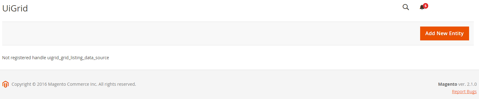
<listing xmlns:xsi="http://www.w3.org/2001/XMLSchema-instance" xsi:noNamespaceSchemaLocation="urn:magento:module:Magento_Ui:etc/ui_configuration.xsd">
    <argument name="data" xsi:type="array">
        ...
    </argument>
    <dataSource name="uigrid_grid_listing_data_source">
        ...
    </dataSource>
    <listingToolbar name="listing_top">
        <argument name="data" xsi:type="array">
            <item name="config" xsi:type="array">
                <item name="sticky" xsi:type="boolean">true</item>
            </item>
        </argument>
        <bookmark name="bookmarks"/>
        <columnsControls name="columns_controls"/>
        <filterSearch name="fulltext"/>
        <filters name="listing_filters">
            ...
        </filters>
        <massaction name="listing_massaction">
            ...
        </massaction>
        <paging name="listing_paging"/>
        <exportButton name="export_button"/>
    </listingToolbar>
    <columns name="uigrid_grid_columns">
        ...
    </columns>
</listing>
This element contains a list of the top menu items, such as Filters, Bookmarks, Column editor, Full-text search field, Mass Actions, Pagination, and so on.
Keep in mind that you can fill out this XML for several extensions at the same time. Simply place the ui_component file with the same name in the same scope or in the base scope. Also, check the order of the modules being loaded and the elements being added to the ui_component. If <listingToolbar> are loaded after the <columns>, you will get the following result:
The element name must be identical to the one in the example.
<listingToolbar name="listing_top">
    <argument name="data" xsi:type="array">
        <item name="config" xsi:type="array">
            <item name="sticky" xsi:type="boolean">true</item>
        </item>
    </argument>
    ...
</listingToolbar>
3.1. <item name=”sticky” xsi:type=”boolean”> is optional, you can skip it. The default value is “false”. This setting provides the fastest access to the top menu during page scrolling. It will follow the scrolling until you scroll back to the top of the page.
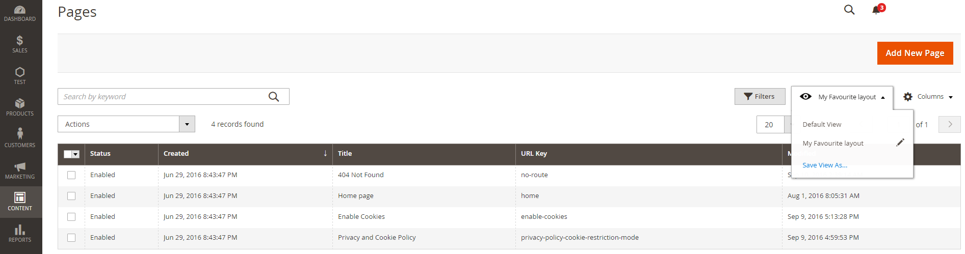
3.2. <bookmark name=”bookmarks”> is optional. It adds a button “Bookmark”. If you add this element, Magento ® allows administrators to save the state of the columns and their position for using them later. Each administrator has their own list.
3.3. <columnsControls name=”columns_controls”> is optional. It adds a button “Columns”. If you add this element, Magento ® allows administrators to add or remove some columns in your table grid.
3.4. <FilterSearch name = “fulltext”> is optional. It adds full-text search field.

The developers of Magento ® have implemented a useful feature – search by any field in the database without writing any additional code! All you need to do is add a full-text index to one or more columns in the database. You can add indexes to your installed scripts. Starting with MySQL 5.6.4, InnoDB tables support Full-text Index as well as MyISAM.
3.5. <filters name=”listing_filters”> is optional. This element can contain additional micro filter settings and their displays. In the example, you can see the <argument> and <filterSelect> elements.
<listingToolbar name="listing_top">
    ...
    <filters name="listing_filters">
        <!-- If you need to apply custom filter render you can use these tag -->
        <argument name="data" xsi:type="array">
            <item name="config" xsi:type="array">
                <item name="templates" xsi:type="array">
                    <item name="filters" xsi:type="array">
                        <item name="select" xsi:type="array">
                            <item name="component" xsi:type="string">Magento_Ui/js/form/element/ui-select</item>
                            <item name="template" xsi:type="string">ui/grid/filters/elements/ui-select</item>
                        </item>
                    </item>
                </item>
            </item>
        </argument>
        <!-- custom filter, Expected is one of ( filterInput, filterRange, filterSelect, containerConfiguration ) -->
        <filterSelect name="store_id">
            <argument name="optionsProvider" xsi:type="configurableObject">
                <argument name="class" xsi:type="string">Magento\Cms\Ui\Component\Listing\Column\Cms\Options</argument>
            </argument>
            <argument name="data" xsi:type="array">
                <item name="config" xsi:type="array">
                    <item name="provider" xsi:type="string">${ $.parentName }</item>
                    <!-- data that will be sent to server -->
                    <item name="dataScope" xsi:type="string">store_id</item>
                    <item name="label" xsi:type="string" translate="true">Store View</item>
                    <!-- default value -->
                    <item name="captionValue" xsi:type="string">0</item>
                </item>
            </argument>
        </filterSelect>
    </filters>
    ...
</listingToolbar>
Let’s start with the first one.
<Argument>
Sometimes you may need to change the template for a component or a specific type of filter. The most frequent case in Magento ® 2 code is a replacement of a standard component and a template of a select dropdown from select to select ui-select for filter status.

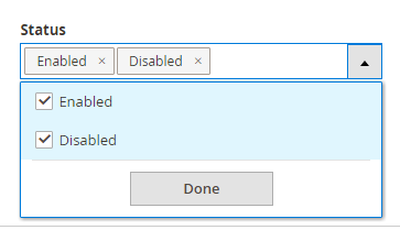
Please note that this change will affect all filters of <item name={type}> type.
<FilterSelect>
Element “filterSelect” is an example of the standard filter change for store_id column. Almost all columns have their own filters (text, textRange, date, select, etc.), but in some cases, you need to re-define the behavior/display of such filter for some columns. These are available types: filterInput, filterRange, filterSelect and containerConfiguration. The name must be identical to the name of the column of the filter that you want to re-define, otherwise the mapping will not work.
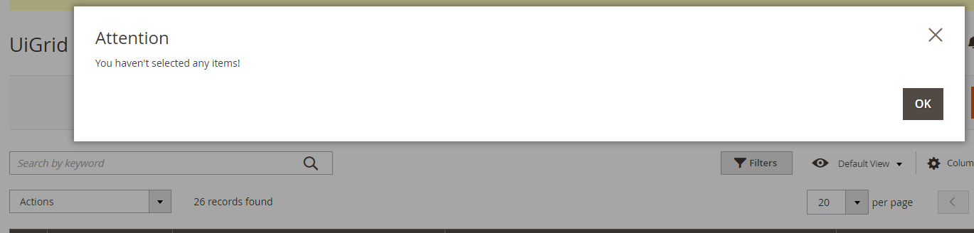
3.6. <massaction name=”listing_massaction”> element is optional. It adds massaction Dropdown and a pop-up message if the user has not selected any row to choose an action.
Typically, this element looks like a normal Dropdown, but you can replace a component on another type of menu.
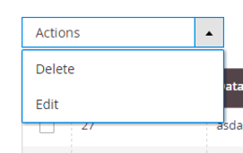
The example below shows how to add a new action in the Dropdown. It shows the action of “delete”, but you can add others as well.
<massaction name="listing_massaction">
    ...
    <action name="delete">
        <argument name="data" xsi:type="array">
            <item name="config" xsi:type="array">
                <item name="type" xsi:type="string">delete</item>
                <item name="label" xsi:type="string" translate="true">Delete</item>
                <item name="url" xsi:type="url" path="uigrid/index/massDelete"/>
                <item name="confirm" xsi:type="array">
                    <item name="title" xsi:type="string" translate="true">Delete items</item>
                    <item name="message" xsi:type="string" translate="true">Are you sure you want to delete selected items?</item>
                </item>
            </item>
        </argument>
    </action>
    ...
</massaction>
<action name=”delete”> – it must have a unique name, as Magento ® merges elements by name.
<item name=”type”> – it must be unique as well, otherwise, Magento ® will show these options in the Dropdown, but they all will perform the same action as it is described in the first element of this type since Magento ® caches configs by type. A good practice is to use the same name that you specified for the action.
<item name=”label”> – it is the name of the option.
<item name=”url”> – it is an action URL that will be used for processing of selected rows. An array of selected/excluded elements applied filters and applied full-text search terms are sent there. The difference between the transmitted parameters depends on the method of selection. If you press “select all”, the element “excluded” contains “false”. If you have chosen a few elements manually, the array “selected” contains the entity id of all selected records. If you press “select all”, but later uncheck several records manually, the array
“excluded” contains the entity id of all unchecked records. To see an example of the implementation of “massDelete” action and how these parameters are processed, look at the class Magento\Cms\Controller\Adminhtml\Block\massDelete.
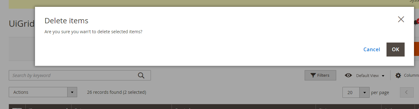
<item name=”confirm”> – it is an optional element. If it is specified, Magento ® will display a modal window to confirm the action with the “Ok” or “Cancel” button. Title and Message can be changed as shown above.
Now let’s consider the mass edit button.
<massaction name="listing_massaction"> ... <action name="edit"> <argument name="data" xsi:type="array"> <item name="config" xsi:type="array"> <item name="type" xsi:type="string">edit</item> <item name="label" xsi:type="string" translate="true">Edit</item> <item name="callback" xsi:type="array"> <item name="provider" xsi:type="string">uigrid_grid_listing.uigrid_grid_listing.uigrid_grid_columns_editor</item> <item name="target" xsi:type="string">editSelected</item> </item> </item> </argument> </action> </massaction>
The main difference between them is the <item name=”callback”> element. It is optional. Its parameters allow editing multiple rows at once. In fact, it uses “callback” to the selected row.
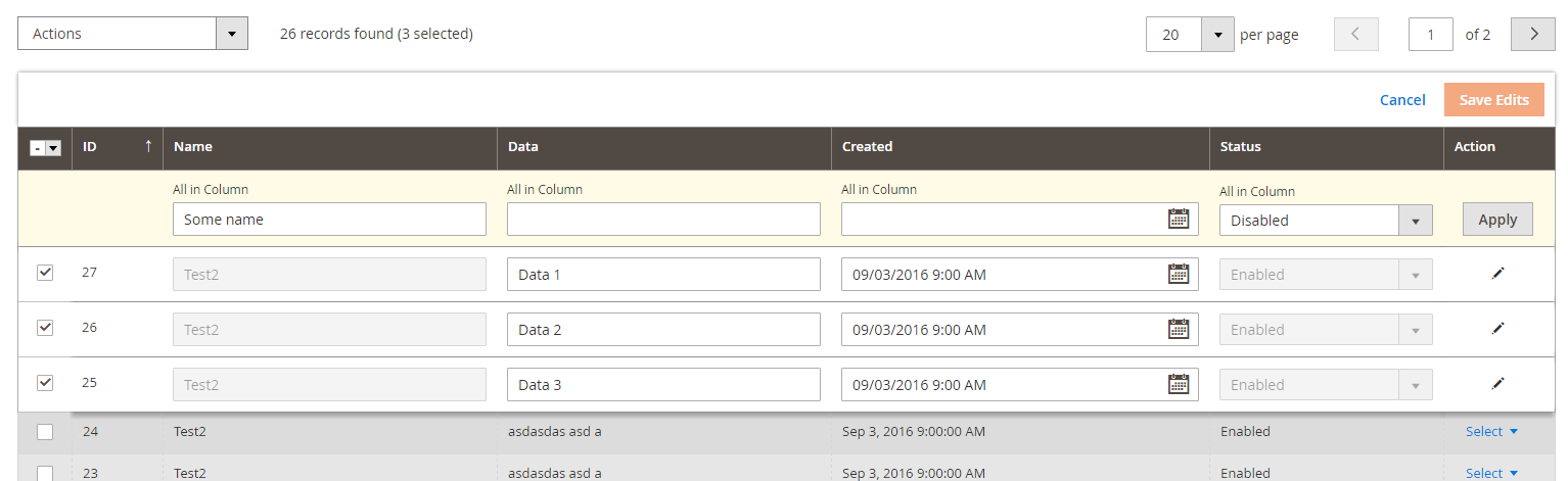
These are the grid changes if several lines are selected:
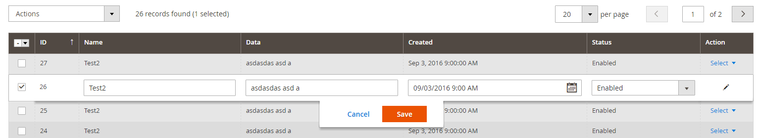
And if you only select one line:
Only the columns that have an “editor” attribute will be available for such editing (See further information below).
<item name=”provider”> – it is the path to the component. Pay attention to the line in
the example. The value must correspond to the following format {filename}.{filename}.{columns_element_name}_editor.
<item name=”target”> – it is the name of the method in the knockoutjs component, «editSelected» must be specified here.
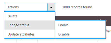
There are 2 option types available in the massaction Dropdown options. They are conventional (select) and tree-like options. Unfortunately, the “select” component doesn’t support the sub-menu, but “tree-massactions” supports it. To apply this component, you need to “tell” Magento ® to use the Magento_Ui/js/grid/tree-massactions component. Further, let’s take a look at minor changes in the following example.
<massaction name="listing_massaction">
    ...
    <argument name="data" xsi:type="array">
        <item name="config" xsi:type="array">
            <item name="component" xsi:type="string">Magento_Ui/js/grid/tree-massactions</item>
        </item>
    </argument>
    <action name="status">
        <argument name="data" xsi:type="array">
            <item name="config" xsi:type="array">
                <item name="type" xsi:type="string">status</item>
                <item name="label" xsi:type="string" translate="true">Change status</item>
            </item>
        </argument>
        <argument name="actions" xsi:type="array">
            <item name="0" xsi:type="array">
                <item name="type" xsi:type="string">enable</item>
                <item name="label" xsi:type="string" translate="true">Enable</item>
                <item name="url" xsi:type="url" path="uigird/index/massStatus">
                    <param name="status">1</param>
                </item>
            </item>
            <item name="1" xsi:type="array">
                <item name="type" xsi:type="string">disable</item>
                <item name="label" xsi:type="string" translate="true">Disable</item>
                <item name="url" xsi:type="url" path="uigrid/index/massStatus">
                    <param name="status">2</param>
                </item>
            </item>
        </argument>
    </action>
    ...
</massaction>
<argument name=”actions” xsi:type=”array”>
is optional. It contains an array of elements with names from 0 to N. If the names don’t follow the sequence of integers, then knockoutjs (javascript) will give an error.
<param name=”…”>…</param> is optional. When all information about the selected rows have been transferred through the body of a post request, these parameters will be passed as “get” parameters, and they depend on the selected option only. These parameters can be used with other mass actions.
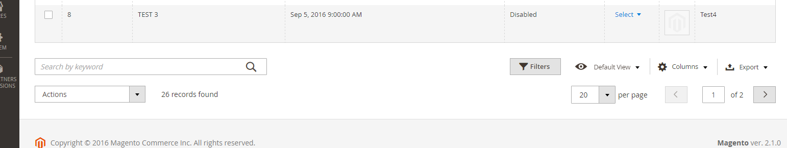
3.7. <paging name=”listing_paging”/> is an optional element. It adds pagination to your grid pages. If it has not been added, Magento ® will show all records on one page and will not show the number of records that have been found.
With an element:
Without an element:
3.8. <exportButton name=”export_button”/> is an optional element. This component adds an export button with 2 options: export as CSV and export as XML. You don’t have to implement any additional logic to make this feature work. It generates a feed file containing only available data according to the filters being applied. The file ignores the sort order and visibility of items on the screen. Magento ® always generates a file which includes all columns of ui_component file. The columns will be placed in the order of their appearance in this file, completely ignoring the other sort (including sorting attribute of the elements in the file). You can also add other formats to export. For more information, visit this page: http://devdocs.magento.com/guides/v2.2/ui_comp_guide/concepts/ui_comp_linking_concept.html
...
<columns name="uigrid_grid_columns">
    <argument name="data" xsi:type="array">
        ...
    </argument>
    <selectionsColumn name="ids">
        ...
    </selectionsColumn>
    <column name="entity_id">
        ...
    </column>
    <actionsColumn name="actions" class="Test\UiGrid\Ui\Component\Listing\Column\Action"/>
</columns>
This is the most interesting and important part to display the columns in the grid. This element contains a list of columns that should be available to the administrator.
<columns name=”uigrid_grid_columns”> – the name of the element should be in the format {extension}_{entity}_columns and be identical to what you have identified in <item name=”spinner” xsi:type=”string”>name_of_columns_element</item>. Normally, this tag only has the attribute “name”, but it can also have “class” as in vendor/magento/module-catalog/view/adminhtml/ui_component/product_listing.xml.
<columns name=”product_columns” class=”Magento\Catalog\Ui\Component\Listing\Columns”> – you need to use the class in the element columns only if you want to process any kind of data, such as dynamically sorting, visibility of some columns or dynamically adding new columns.
Editor
...
<columns name="uigrid_grid_columns">
    <argument name="data" xsi:type="array">
        <item name="config" xsi:type="array">
            <item name="editorConfig" xsi:type="array">
                <item name="selectProvider" xsi:type="string">uigrid_grid_listing.uigrid_grid_listing.uigrid_grid_columns.ids</item>
                <item name="enabled" xsi:type="boolean">true</item>
                <item name="indexField" xsi:type="string">entity_id</item>
                <item name="clientConfig" xsi:type="array">
                    <item name="saveUrl" xsi:type="url" path="*/*/inlineEdit"/>
                    <item name="validateBeforeSave" xsi:type="boolean">false</item>
                    <!--
                    <item name="validateBeforeSave" xsi:type="boolean">true</item>
                    <item name="validateUrl" xsi:type="url" path="*/*/checkData"/>
                    -->
                </item>
            </item>
        </item>
    </argument>
    ...
</columns>
If you want to add the “edit” massaction in the massaction list or make the inline editor available, you need to configure it.
<item name=”selectProvider” xsi:type=”string”> – it is the path to the column/component in the tree. You need to use the following format:
{filename}.{filename}.{columns_name}.{selectionsColumn_name},
In the example, it is uigrid_grid_listing.uigrid_grid_listing.uigrid_grid_columns.ids.
<item name=”enabled” xsi:type=”boolean”> – enable/disable the editor.
<item name=”indexField” xsi:type=”string”> – entity id, it is used for saving data.
<item name=”clientConfig” xsi:type=”array”> – configuration of “Save” action.
<item name=”saveUrl” xsi:type=”url” path=”*/*/inlineEdit”/> – it is a URL that knockoutjs uses to save the inline changes. Pay attention to the “path”, it is indicated like “*/*/inlineEditor”, to show that these URLs are also supported.
<item name=”validateBeforeSave” xsi:type=”boolean”> – it is a very interesting option. The default value is “true”, so if you missed this option and didn’t specify the following “validateUrl” parameter, knockoutjs will give an error. If this option is enabled, knockoutjs sends new values to the “validateUrl” and if the response is ok (for example, http code is 200), knockoutjs sends the same data to saveUrl, otherwise it will show an error message.
<item name=”validateUrl” xsi:type=”url” path=”*/*/checkData”/> — a URL for data validation.
Setting InlineEditor
If you want to activate the inline editor by clicking on the line (for example on the CMS page/block grids), you need to add the config in <argument> of your <columns> tag after “editorConfig”. The only parameter that you need to change is “provider”, it should be in the format {filename}.{filename}.{columns_name}_editor, all other parameters must be as in the example below.
...
<columns name="uigrid_grid_columns">
    <argument name="data" xsi:type="array">
        <item name="config" xsi:type="array">
            <item name="editorConfig" xsi:type="array">
                ...
            </item>
            <item name="childDefaults" xsi:type="array">
                <item name="fieldAction" xsi:type="array">
                    <item name="provider" xsi:type="string">uigrid_grid_listing.uigrid_grid_listing.uigrid_grid_columns_editor</item>
                    <item name="target" xsi:type="string">startEdit</item>
                    <item name="params" xsi:type="array">
                        <item name="0" xsi:type="string">${ $.$data.rowIndex }</item>
                        <item name="1" xsi:type="boolean">true</item>
                    </item>
                </item>
            </item>
        </item>
    </argument>
    ...
</columns>
If for some reason, the inline editor does not fit your needs you may want to perform other actions by clicking on the line. To do this, place the following code instead of inlineEditor call. You need to change only 2 parameters there: provider,0. The provider should follow the format {filename}.{filename}.{columns_name}.actions, the name of your action is from your “action” list.
...
<columns name="uigrid_grid_columns">
    <argument name="data" xsi:type="array">
        <item name="config" xsi:type="array">
            ...
            <item name="childDefaults" xsi:type="array">
                <item name="fieldAction" xsi:type="array">
                    <item name="provider" xsi:type="string">uigrid_grid_listing.uigrid_grid_listing.uigrid_grid_columns.actions</item>
                    <item name="target" xsi:type="string">applyAction</item>
                    <item name="params" xsi:type="array">
                        <!-- name of action from action class -->
                        <item name="0" xsi:type="string">view</item>
                        <item name="1" xsi:type="string">${ $.$data.rowIndex }</item>
                    </item>
                </item>
            </item>
        </item>
    </argument>
    ...
</columns>
Columns

<column|actionsColumn|selectionsColumn name="{unique_name}" class="{class_name}">
    <argument name="data" xsi:type="array">
        <item name="options" xsi:type="object">{source_model_class}</item>
        <item name="config" xsi:type="array">
            <item name="component" xsi:type="string">Magento_Ui/js/grid/columns/{date|select|thumbnail|column|*}</item>
            <item name="bodyTmpl" xsi:type="string">ui/grid/cells/{html|text|*}</item>
            <item name="add_field" xsi:type="boolean">{true|false}</item>
            <item name="sortable" xsi:type="boolean">{true|false}</item>
            <item name="filter" xsi:type="string">{textRange|dateRange|select|text}</item>
            <item name="sorting" xsi:type="string">{asc|desc}</item>
            <item name="label" xsi:type="string" translate="true">{label}</item>
            <item name="visible" xsi:type="boolean">{true|false}</item>
            <item name="draggable" xsi:type="boolean">{true|false}</item>
            <!-- <item name="editor" xsi:type="string">{text|date|select}</item> -->
            <item name="editor" xsi:type="array">
                <item name="editorType" xsi:type="string">{text|date|select}</item>
                <item name="options" xsi:type="array">
                    <item name="showsTime" xsi:type="boolean">{true|false}</item>
                </item>
                <item name="validation" xsi:type="string">{validation_rule}</item>
                <!--
                <item name="validation" xsi:type="array">
                    <item name="validate-xml-identifier" xsi:type="boolean">true</item>
                    <item name="required-entry" xsi:type="boolean">true</item>
                </item>
                -->
            </item>
            <item name="timezone" xsi:type="boolean">{true|false}</item>
            <item name="dataType" xsi:type="string">{dataType}</item>
            <item name="sortOrder" xsi:type="number">{position}</item>
            <item name="options" xsi:type="array">
                <item name="0" xsi:type="array">
                    <item name="value" xsi:type="string">{value}</item>
                    <item name="label" xsi:type="string">{option_label}</item>
                </item>
                <item name="1" xsi:type="array">
                    <item name="value" xsi:type="string">{value}</item>
                    <item name="label" xsi:type="string">{option_label}</item>
                </item>
            </item>
            <item name="has_preview" xsi:type="boolean">{true|false}</item>
        </item>
    </argument>
</column|actionsColumn|selectionsColumn>
<column|actionsColumn|selectionsColumn> – all these elements are located inside the <columns> tag, they have similar syntax. <Column> is used to add an ordinary column, <actionsColumn> is used to add an “action” column and <selectionsColumn> is used to add columns with checkboxes to select rows. <ActionsColumn> can be omitted if you want to use the inline editor only. The name of SelectionsColumn attribute must be the ids, it doesn’t have the class attribute and can be skipped if you don’t want to use export, inline editor, mass actions etc.
<column name=”{unique_name}”> – it is a mandatory attribute. This is a unique column name. Magento ® overwrites the columns by name. The column name may not be identical to the column name in the database (to the key in your collection), it is only the column name. If the column name is identical to the column name in the database, Magento ® is mapping the data from the collection in this field automatically, and the data will be available (visible) in the grid. Otherwise, you must use the attribute “class”, to obtain/prepare the desired value.
<column class=”{class_name}”> – it is an optional attribute. The main feature of this “class” is the format/preparation of the data from the collection for displaying in the column/using by the component. The class has access to the data collection for this line and can modify any value as well as add/delete some keys. The class Magento\Ui\Component\Listing\Columns\Date formats date parameter from the database, converts it into the desired format and applies the necessary time zone. Class Magento\Catalog\Ui\Component\Listing\Columns\Thumbnail provides the data for the Thumbnail component.
<argument name=”data” xsi:type=”array”> – it is a required tag if you want to provide additional data in your column class (all the data within the tag are available) or in its component (all the data within the internal “config” tag are available).
<item name=”options” xsi:type=”object”> – it is an optional element. It is used only with dataType “select” to display the options from the source models, but you can use this option to process the data in your class (they have full access to all data within the “data” tag, but the data are not available in the knockoutjs component). There are other ways to do the same thing.
<item name=”config” xsi:type=”array”> – it is required if you need to transfer any data to the class component or to the knockoutjs component. You can have full access to the data within your knockoutjs ViewModel. By default, the ViewModel doesn’t have access to the parameters outside the “config” tag.
<item name=”component” xsi:type=”string”> – it is optional. The components render values to display in the columns. For example, one of them is responsible for displaying “Oct 6, 2015 9:15:08 AM” instead of the date 06.10.2015 in the column. The default value is Magento_Ui/js/grid/columns/column and it is the default component for all columns. ViewModel for columns rendering is located in Magento_Ui/js/grid/columns/. The most commonly used values (components) are in this tag:
Magento_Ui/js/grid/columns/column – displays the value as text, i.e. as it is,
Magento_Ui/js/grid/columns/date – displays the date according to the specified format,
Magento_Ui/js/grid/columns/select – displays the value of a selected option with mapping values and their labels,
Magento_Ui/js/grid/columns/thumbnail – shows an image in the column,
You can also create your own components – just “inherit” the data from Magento_Ui/js/grid/columns/column.
<item name=”bodyTmpl” xsi:type=”string”> – it is optional. You can change the template (“view”) for the value that will be used in the column. Default value is ui/grid/cells/text. If the data cannot be converted to text and you need more opportunities to use HTML inside, use ui/grid/cells/html template (it is usually used in the Store Id columns) or any suitable one from ui/grid/cells (or from your extensions).
<item name=”add_field” xsi:type=”boolean”> – it is optional. You can see this tag in some ui_*.xml files, it requires further implementation in DataProvider/collection classes and it is mandatory for eav/ values from certain tables, because such columns may not be found in the main table without this call.
<item name=”sortable” xsi:type=”boolean”> – it is optional. The default value is “True”. It disables the ability to apply sorting by clicking on the column.
<item name=”filter” xsi:type=”string”> – it is optional. This option adds a filter to the column. It supports the following values: textRange, dateRange, select, text.
If you need to use a custom filter for a column, you can skip the filter parameter in the parameter list of your column and add a description of the filter in the <filters name=”listing_filters”>.
<Item name = “sorting” xsi: type = “string”> – it is optional. It applies sorting to the entire Grid by this field. The following options are available: asc, desc. Default sorting can be applied to one field only.
<item name=”label” xsi:type=”string”> – it is mandatory. It is the name of your column, it will be displayed in the header of your column. In fact, it is the text and it uses “ui/grid/columns/text” template that is specified in the «headerTmpl» parameter. You can change it if you want.
<item name=”visible” xsi:type=”boolean”> – it is optional. The default value is “True”. This option allows you to hide a column of the grid, but it will be available in the list of available columns.
<item name=”draggable” xsi:type=”boolean”> — it is optional. The default value is “True”. It makes columns static / non-movable.
<item name=”editor” xsi:type=”{string|array}”> – it is optional. It allows using an inline editor for the column. If the tag is missing, the value in this column can’t be edited by clicking on the line or through mass action menu. There are 2 ways to apply this tag. It may have a type of “string” and a type of “array”. If you need to enable the editor for this field, use the “string” and specify the type (mode) for this field, but if you want to configure the editor more accurately, use the “array” type. There are 3 options: text, date, select. You can choose one of them.
There is a setting list for the editor:
- <item name=”editorType” xsi:type=”string”> – it is the editor type. There are the same options as in the “string” version: text, date, select.
- <item name=”showsTime” xsi:type=”boolean”> – it is optional. Used only with the “date” type. It allows you to modify not only the date but the time, as well. The default value is “False”.
- <item name=”validation” xsi:type=”{string|array}”> – it is optional. It can be “string” or “array”. It applies the validation to the edit field. You can review all validation options in vendor\magento\magento2-base\lib\web\mage\validation.js. If you need to use more than one validation, you should use the “array” type and provide the necessary validation rules in the following format: <item name=”{validation_rule}” xsi:type=”boolean”>true</item>.
<item name=”timezone” xsi:type=”boolean”> – it is optional. The default value is “True”. This option only applies to the columns with the “date” type. It is used in Magento\Ui\Component\Listing\Columns\Date class. It allows you to adjust the time zone if the database and the admin panel you are using are in different time zones.
<item name=”dataType” xsi:type=”string”> – it is optional. It is useful only for the columns of the “select” type. The default value is “text”. The available values are any entities (tags) from /vendor/magento/module-ui/view/base/ui_component/etc/definition.xml.
<item name=”sortOrder” xsi:type=”number”> – it is optional. If sortOrder is missing, Magento ® shows the columns in the order in which they are described in ui_component file. If this option is present, Magento ® displays elements according to sortOrder parameter, but the export file column order is the same as the order of the elements in the ui_component file. Keep in mind that after the first time when the administrator opens your grid page, the order of the items will be saved in the database and any changes of sortOrder settings will not be applied. Moreover, the new column will always be added at the end.
<Item name = “options” xsi: type = “array”> – it is optional and it is an alternative method to render column with the “select” type. It can be used with “select” component.
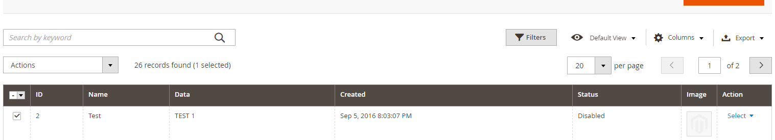
<item name=”has_preview” xsi:type=”boolean”> – it is optional and applicable only to “thumbnail” component/columns. The default value is “False”. If it is enabled, then upon clicking on a thumbnail, a modal window with a larger image and a link to the edit page will be shown in the grid.
It is necessary to remember
Once the administrator opens the grid page for the first time, Magento ® saves the order of all columns, sorting application of data, shown elements and so on in ui_bookmark table, and subsequent changes in ui_component.xml cannot influence this order. Even if you add a new column at the beginning of the list, or in the middle, Magento ® will display this column at the end of the list, even if the last column was “actions” and it was marked as not moved, ignoring sortOrder attribute. To reset the changes, you need to delete all the records that have Name Space identical to your Grid (file name) from the database (at least with “default” ID, which applies to new users, and “current” users if you want to reset the active user changes, as well).
The source that was used to prepare the article.


