

Merchants must meet these new requirements otherwise they will lose in the competitive environment. Here we will consider major trends and developments in the field of mobile shopping and will try to identify the essential factors that should be taken into account.
Mobile Responsive Design Statistics
Mobile-optimized online stores and special shopping apps make mobile shopping easier.
The results of a global survey show that 15% of the respondents who are smartphone owners bought different products using their mobiles at home or at work, and about 10% of the respondents shopped while on the go.
Further, the statistics show that the number of mobile shoppers will be increasing, but mobile commerce revenue growth will probably not be as significant as the growth of the buyers’ in this market.

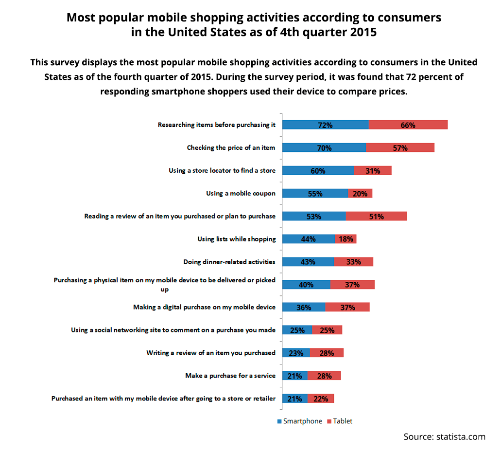
It is interesting to analyze the types of activities during online shopping. As you can see on the chart below, people do the same on mobiles as on their laptops or desktop computers.
So responsive design is not as much a recommendation as it is a requirement, otherwise, a significant percentage of customers will be lost. Further, we will provide some recommendations on how to improve the mobile version of your online store.
1. Image optimization
If the high-quality image is nice for desktop, it may have a negative impact on the site performance on mobile devices. Depending on the informational assignment, any image can be optimized, scaled or eliminated from the mobile version of the site.
To make the right decision you need to test the responsive design for usability. In actual practice, most website owners prefer to adjust images for mobiles and leave as much information available as possible.
2. Optimization of the navigation process
The most significant element of a mobile version of an online store is probably a comprehensible and functional navigation. Any shopping is impossible without the ability to search the site.
The majority of mobile clients use their devices to save time and they must be able to find a search bar quickly. They can be on the go and may be interested in the store location or a phone number to be able to contact the seller immediately. You can’t predict what people search for. So, to meet all the needs of such visitors, it is important to analyze mobile users’ behavior.
Using special tools and services it is possible to collect the information on what users do and how and what they search. Even Google Analytics which is free and available for all online store owners can give the clear picture.
This data can answer many questions concerning what elements are important and should be easy to get, and what type of navigation visitors prefer to use.
3. Pop Up Ads optimization
If a Pop-Up Ad annoys people when they use desktops, on mobile devices, it is simply intolerable. Any overlay completely blocks the mobile screen, obscures other content and makes it impossible to use online store features.
Think twice before you make a decision to include pop-ups in a mobile version. You must have a serious reason to do this. Besides, any pop-up only serves for information, so it is possible to come up with another way to deliver it to visitors.
4. Text optimization
With regard to text, it should be considered from all different sides. If the text works well on a desktop, the mobile device is another story. It can completely overlap other elements of the page or make them impossible to interact with.
The text is very important for SEO and there are some recommendations on how to create product descriptions and articles to make the site convenient for search engines.
On the other side, there are visitors that may not need so many words on the page. And a mobile user can be considered as a separate segment because they only expect a brief summary.
Screen size and its resolutions certainly dictate the rules of the game.
Another important functionality that should be taken into account is scrolling on a mobile screen. A desktop can display a full text and all information is available after the page loads. Mobile visitors definitely start scrolling. This should affect how to write titles and paragraphs based on where and how it scrolls.
“Be brief and as informative as possible” is the main task in text optimization for mobil media.
5. Calls-to-action optimization
A mobile version of your online store should have one understandable goal. That goal should be clearly demonstrated and easy to visualize through the inclusion of a call-to-action button.
This element should be the first one that mobile users notice and its task is to “explain” them what to do. The size and design of the call-to-action button may be adjusted and the location may differ from that on the full version of your site. However, only a usability test can give a clear answer as to what exactly should be changed.
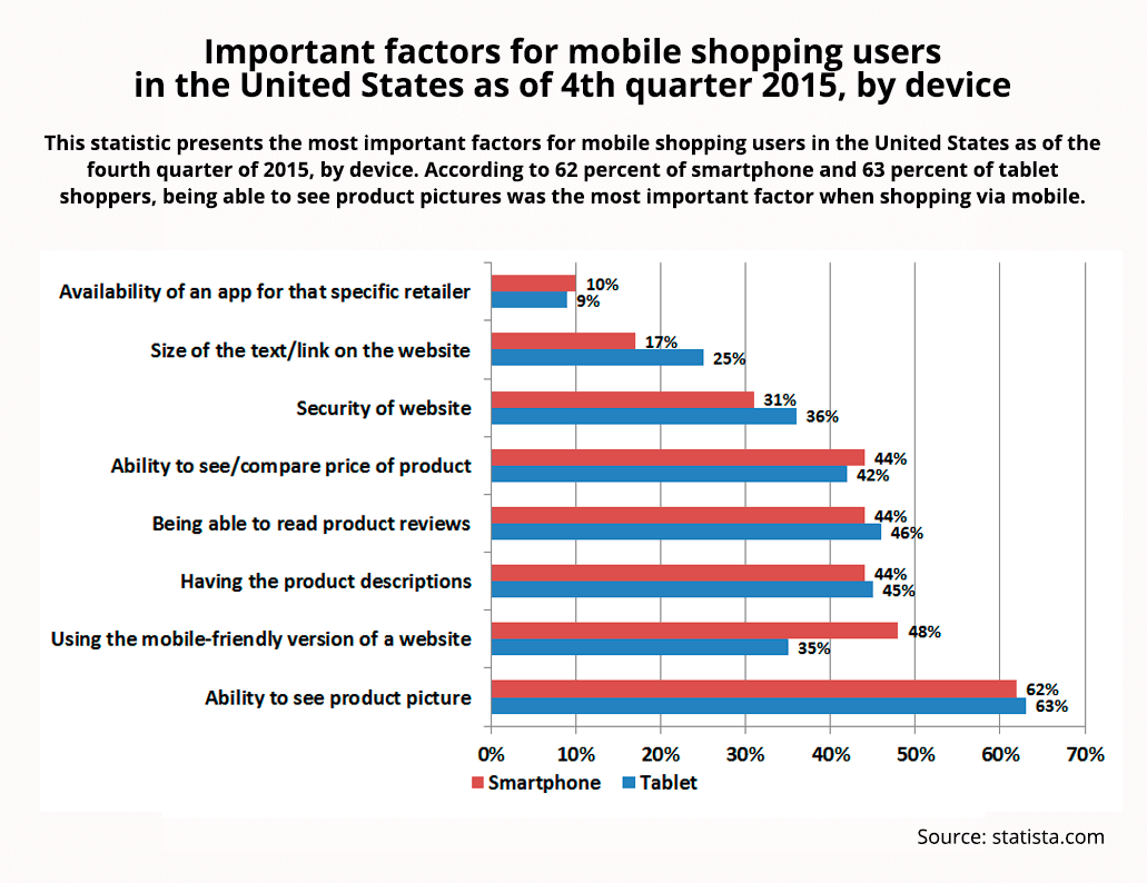
These are not all of the possible aspects that need to be considered in the analysis of mobile viewers. The chart below shows the analytical information by the degree of importance of various elements for mobile users.
The mobile version may be considered as a separate store or a branch of your company, which requires special attention. The main thing is to test all the innovations before implementation and to analyze the behavior of consumers all the time. Real users are those who know all the answers – what works perfectly and what requires improvement.


