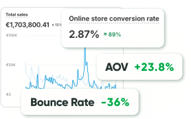
UI/UX sits behind every click that turns traffic into revenue. Marketing teams spend enormous effort bringing people to a website. Advertising campaigns run across search engines, social media platforms, and content networks. SEO strategies target competitive keywords. Content teams publish guides and articles designed to attract organic traffic.
However, visitor numbers alone rarely translate into revenue.
A store can attract steady traffic while sales remain inconsistent. People arrive, explore a few pages, and leave without completing a purchase. In many cases, the products are competitive, and the pricing strategy makes sense. Marketing performs well, yet conversion still remains lower than expected.
The difference often lies in user experience. Navigation clarity, page structure, and information hierarchy influence whether visitors feel confident enough to continue exploring. Even subtle design choices affect the moment when a user decides to stay on a website or move to another option.
The way content is presented also affects the user experience. Product catalogs, guides, brochures, and other business materials are often shared as PDFs, but they can be difficult to browse online. Converting these files into flipping books makes them easier for people to browse, click through, and find what they’re looking for.
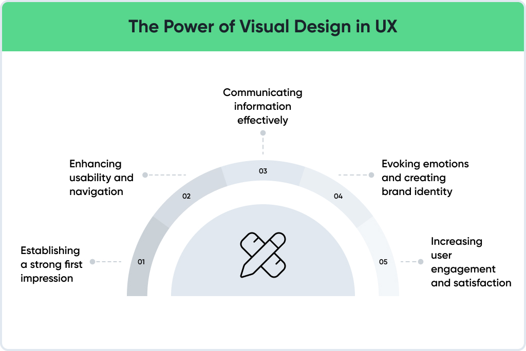
Research from the Stanford Web Credibility Project highlights the importance of visual experience. According to the study, 75% of users judge a company’s credibility based on the design of its website. Visitors form an impression about reliability long before reading product descriptions or comparing prices.
Why Traffic Often Fails to Convert
Increasing traffic may appear to be the most logical way to grow an online business. More visitors should lead to more customers.
Reality often looks different.
Many ecommerce stores experience stable traffic growth while conversion rates remain almost unchanged. Visitors browse the site, yet the number of completed purchases does not increase proportionally.
The explanation often appears inside the user journey.
Visitors arriving on a website immediately begin scanning the interface. The brain looks for signals that help answer several questions:
Where am I?
What can I do here?
Where should I go next?
When those answers appear clearly, exploration continues. When navigation feels confusing, attention quickly fades.
Small obstacles frequently interrupt the journey:
- unclear product categories
• dense product pages
• hidden calls to action
• complicated checkout processes
Each obstacle creates a moment of hesitation. Hesitation often leads to abandonment. Conversion-focused design attempts to remove those moments entirely.
A Short Comparison: Two Stores
Imagine two ecommerce websites selling the same product.
The first store contains several promotional banners, multiple menu sections, and long paragraphs describing product features. Important information appears scattered across the layout. Visitors must scroll through multiple sections before locating price and purchase options.
The second store feels simpler.
Product images appear clearly. Pricing sits near the title. Key benefits appear in short sections. The purchase button stands out naturally.
Both stores offer identical products.
Yet customers tend to buy from the second store. User experience shapes the difference between curiosity and conversion.
The First Few Seconds Matter
User behavior research consistently shows that visitors evaluate a website within seconds. During those first moments, the brain scans visual elements rapidly rather than reading detailed information.
Several signals receive immediate attention:
- product imagery
- layout structure
- headline clarity
- visible pricing
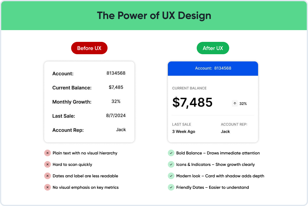
A clear hierarchy allows the eye to move across the page smoothly. Large elements attract attention first, followed by supporting information.
Poor hierarchy forces visitors to search for meaning within the layout. Scanning becomes difficult, and attention decreases.
Effective design supports the way people naturally process information online.
Trust and UX Design for Sales
Every online purchase involves some risk from the customer’s perspective. Buyers share payment details and expect products to arrive as promised.
Before completing a purchase, visitors subconsciously evaluate whether the store appears reliable.
Design strongly influences that evaluation. Professional layout communicates stability. Consistent spacing and typography create visual order. Clear navigation signals that the store understands customer needs.
Confusing interfaces produce the opposite effect. Even small inconsistencies can reduce trust. Poor alignment, unclear navigation, or missing product details create uncertainty.
For that reason, UX design for sales focuses on building credibility through structure and clarity.
Conversion Focused Design: Core Principles
Conversion-focused UX does not rely on dramatic visual effects. Instead, structure guides the visitor toward a decision.
Several principles commonly appear in high-performing e-commerce interfaces.
Clear visual hierarchy
Important elements appear first. Product imagery, title, and price become immediately visible.
Structured information flow
Supporting information appears in logical order. Benefits come before technical specifications.
Strong calls to action
Purchase buttons stand out without competing visual elements.
Predictable navigation
Users always understand location within the site and how to return to previous pages.
Those principles form the foundation of conversion-focused design.
Real Example: Navigation That Improves Conversion
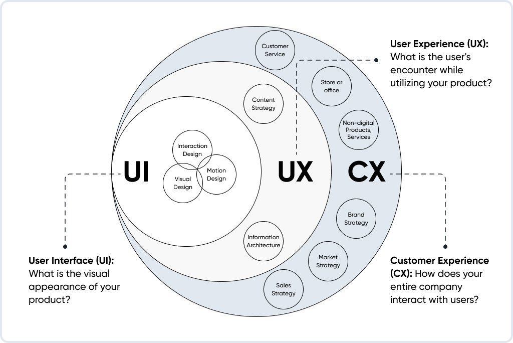
Large product catalogs often create discovery challenges.
An automotive parts retailer faced exactly that issue. Thousands of products existed in the catalog, and visitors frequently struggled to locate components compatible with their vehicles.
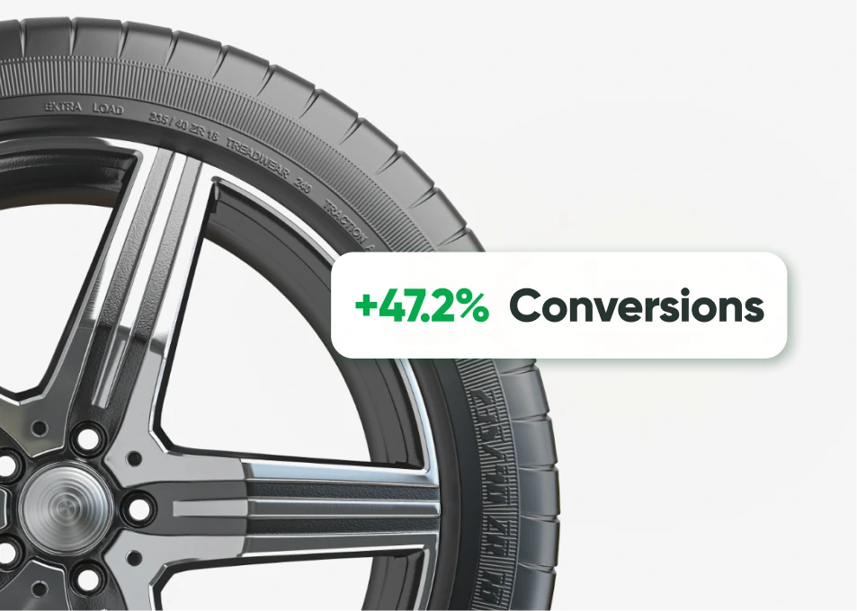
- +47.2% conversion rate from paid traffic
- –25% product page exits
- +30.3% user reviews, enhancing trust
Navigation restructuring simplified the process. Category hierarchy became clearer, and filtering options improved product discovery.
Customers could narrow results by vehicle type and specifications, rather than browsing long lists of unrelated products.
The redesign significantly reduced friction during product discovery. Better navigation allowed visitors to reach purchasing decisions faster.
UI/UX Tips to Improve Conversion Rate
Conversion improvements often begin with small adjustments rather than complete redesigns.
Several practical changes frequently produce noticeable results.
- highlight the main purchase action clearly
- remove unnecessary promotional banners
- simplify product descriptions
- reduce checkout steps
- maintain consistent navigation across pages
Each adjustment reduces friction in the purchasing journey.
Such improvements represent practical UI UX tips to improve conversion rate.
The Psychology Behind Conversion-Focused Design
Human decision-making follows recognizable patterns.
People prefer environments that feel predictable. Familiar layout structures allow users to navigate without conscious effort.
Several psychological principles influence conversion behavior.
Visual hierarchy guides attention
The eye naturally moves toward larger or high-contrast elements.
Consistency builds confidence
Predictable navigation reduces cognitive effort.
Feedback reinforces actions
Confirmation messages and microinteractions reassure users that interactions succeeded.
Understanding those patterns forms the basis of CRO design.
Product Pages: The Conversion Engine
Product pages often represent the most important conversion point in ecommerce.
Visitors frequently arrive directly on those pages from search results or advertising campaigns. Product pages must therefore communicate value quickly.
High-performing product pages usually contain:
- clear product imagery
• concise descriptions
• visible pricing
• customer reviews
• accessible purchase actions
Such a structure allows visitors to evaluate products quickly without scanning dense blocks of text.
Ways UX Design Increases Customer Retention
Conversion represents only the first stage of customer value. Retention determines long-term revenue. User experience strongly influences whether customers return to a store.
Clear navigation and organized product categories create familiarity. Returning visitors can locate products quickly without learning the interface again.
A redesign for an ecommerce brand selling herbal supplements illustrates the effect. Improved layout structure simplified product browsing and made information easier to scan.

- +37.8% mobile conversions
- +28.4% product discovery efficiency
- +22% longer session duration
Visitors explored more products and returned more frequently. Improved UX frequently strengthens long-term customer relationships.
Best UI UX Practices for Ecommerce Conversions
- High-performing e-commerce websites often share several common characteristics.
- Navigation remains consistent throughout the site.
- Product pages emphasize clarity rather than decoration.
- Checkout processes remain simple and efficient.
- Information appears in structured sections rather than long paragraphs.
Applying best UI/UX practices for ecommerce conversions helps transform traffic into revenue.
Quick UX Diagnostic
A short review of the user journey can reveal potential conversion barriers.
Consider several questions:
- Can visitors locate products within two or three clicks?
- Does the purchase button stand out clearly?
- Are product descriptions easy to scan?
- Does checkout require minimal steps?
Negative answers often indicate opportunities for UX improvement.
Why UI/UX Strategy Drives Growth
Many organizations treat UX as a visual design discipline.
However, interface design directly influences several business metrics.
Improved UX often leads to:
- higher conversion rates
- longer browsing sessions
- stronger customer loyalty
- increased repeat purchases
For that reason, many companies now treat UI UX strategy as an essential part of digital growth planning. Traffic attracts visitors. Experience converts visitors into customers.
Final Thoughts
Attracting visitors represents only the first step in building a successful digital business. Real growth occurs when those visitors become customers.
Clear navigation, structured product pages, and intuitive checkout flows support confident purchasing decisions.
Organizations seeking stronger results from UI/UX conversion optimization often explore specialized design expertise.
Effective interfaces rarely demand attention. Instead, they quietly guide visitors through the journey from interest to purchase.
That quiet guidance represents the hidden power of thoughtful UI and UX design.
FAQ
In most cases, sales improve when the buying process becomes easier. Visitors should immediately understand where to look and what to do next. Clear product pages, visible pricing, and strong purchase buttons reduce hesitation. When users do not need to search for information, decisions happen faster.
The idea is simple: improve the interface so more visitors complete an action. For ecommerce stores, the main goal is usually a purchase.
Instead of focusing only on traffic, teams analyze the journey from landing page to checkout. Points where visitors hesitate often reveal design problems.
Online shopping works differently from physical retail. Customers cannot touch products or ask questions directly.
The website becomes the store environment. If navigation feels confusing or product information appears difficult to read, visitors rarely spend much time exploring.
During UX audits, several issues appear repeatedly.
-hidden purchase buttons
-overloaded product pages
-inconsistent navigation
-checkout processes with too many steps
None of those problems seems dramatic individually. Together, they often reduce conversion significantly.
Trust usually forms within seconds. Visitors look at the layout and immediately decide whether the store appears reliable.
Professional spacing, consistent typography, and organized product pages communicate stability. Poor structure often creates doubt before a user even reads the product description.
UX strategy connects design decisions with business results.
Better interfaces often lead to higher engagement, longer browsing sessions, and stronger conversion performance. Companies that treat UX as part of their growth strategy tend to improve both sales and customer retention.
Many visitors land directly on product pages from search results or ads.
Those pages must explain the product quickly. Customers usually look for three things first:
-image
-price
-main benefit
When that information appears immediately, decision-making becomes easier.
Successful ecommerce sites usually follow a few simple principles.
-Navigation remains predictable.
-Product pages are easy to scan.
-Checkout flows contain minimal steps.
Removing unnecessary friction tends to improve conversion rates over time.
Yes. Even small changes can influence thousands of sessions.
For example, simplifying checkout fields or improving product page readability often increases completed purchases. When every visitor interacts with the same interface, small improvements scale quickly.
A comfortable shopping experience encourages customers to return.
When a website feels easy to navigate, users remember that convenience. Familiar layouts and clear product categories reduce effort during future visits.