Most people land on a website, look around for a few seconds, and leave. That’s why a landing page can make or break your chances of turning a visit into something meaningful. It’s your one shot to grab attention, deliver the message clearly, and guide someone toward taking action.
Unlike a homepage that tries to do a bit of everything, landing pages for CRO are focused on one thing: conversion. Whether it’s making a purchase, signing up, or downloading something, every element on the page is there to support that one goal.
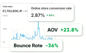
The stakes are high. According to Statista, the average website conversion rate across selected industries is just over 2%. If your site is hitting 3%, you’re actually ahead of the curve. Surprised? That number is low for a reason — getting people to act is hard. That’s exactly why conversion rate optimization matters, and why your landing pages deserve more attention than ever.
The Relationship Between CRO and Landing Pages
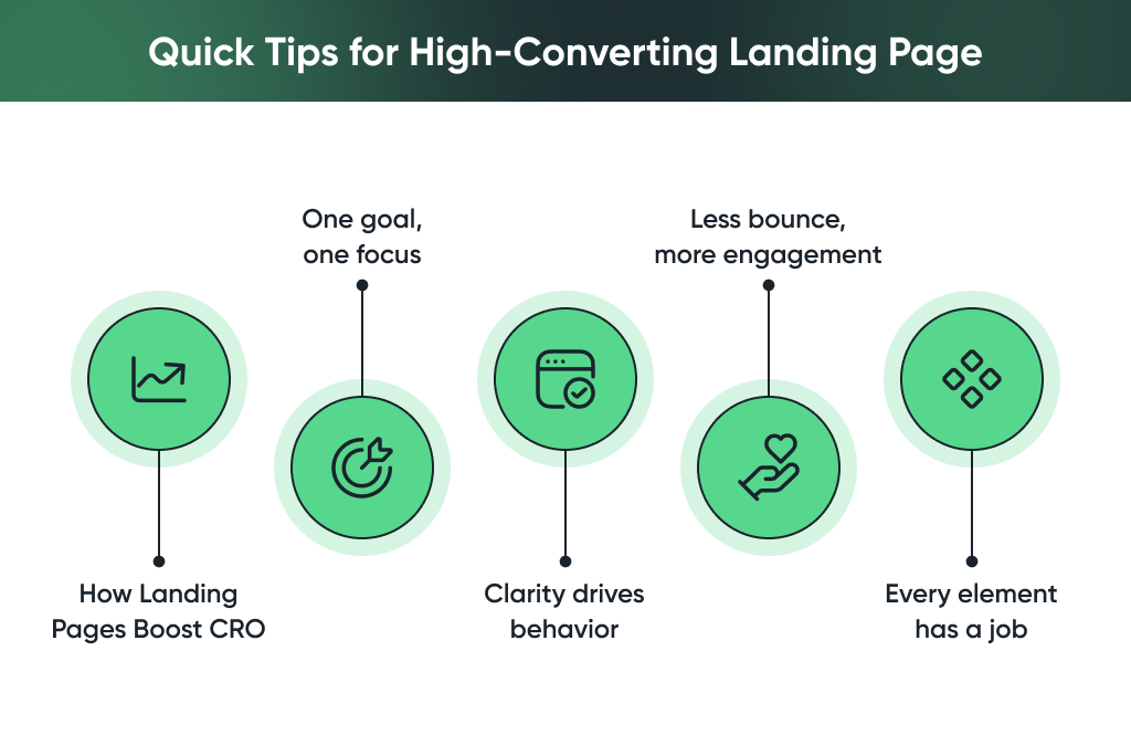
Landing pages play a big role in whether someone clicks away or takes action. Here’s how they fit into the bigger picture of conversion rate optimization, and why they matter so much:
-
Landing pages give CRO a clear focus
Unlike your homepage, which might try to do everything at once, a landing page is built around one specific goal. Whether it’s getting someone to sign up, buy, or download something, every element on the page works toward that one action.
-
Clarity improves user behavior
When a page has a clear purpose, people move through it more easily. There’s less confusion, fewer distractions, and a higher chance they’ll do what you want them to do. That’s the core of the CRO and landing page relationship — less noise, more action.
-
Optimized landing pages reduce bounce
A well-designed page that matches the visitor’s intent makes them more likely to stay. The more relevant and focused your message, the more likely users are to stick around and convert. That’s where smart landing page optimization really pays off.
-
Everything supports the action
From the headline to the CTA button, every part of the page should move the user forward. When you remove anything unnecessary, you create a smoother experience — and that often leads to better results.
A good landing page doesn’t just look nice. It works in sync with your CRO goals to keep people engaged and guide them toward action — without making them think twice.
Key Elements of High-Converting Landing Pages
When someone lands on your page, you have seconds — maybe less — to show them they’re in the right place. That’s why the best landing pages don’t try to do too much. They’re focused, clear, and built to make taking the next step feel easy.
If you want to improve landing page conversion, these are the things you really can’t skip:
-
How important is a clear headline for landing page success?
No fluff. No guessing games. Just a clear sentence that tells people what this is and why they should care. Your headline is your first impression, it should say “Here’s what you’re getting” in the most straightforward way possible.
-
A subheading that gives them a reason to keep reading
Think of your subheading as the part that connects. This is where landing page copywriting for conversions starts to kick in. Use this space to speak directly to a need or pain point, and show how your product or offer helps. Keep it human, not salesy.
-
Proof that you’re legit
People are skeptical, and that’s fair. They want to know if they can trust you. That’s where testimonials, reviews, guarantees, or even simple client logos come in. A short quote from a happy customer or a “30-day money-back” message can go a long way.
-
A call-to-action that feels natural and stands out
Your CTA shouldn’t feel pushy — but it should be clear. Use a button that says exactly what will happen next: “Get started,” “See pricing,” or “Download now.” Make it easy to spot. Place it where it makes sense. And if the page is long, repeat it.
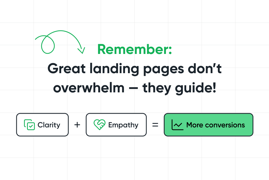
When you write and design with clarity, empathy, and purpose, you make it much easier for people to say yes. And that’s how you truly improve landing page conversion — by guiding, not forcing.
UX and Design Tips That Influence CRO
Design can make or break your landing page. Even if your message is spot-on, poor layout or cluttered visuals can quietly turn people away. If your goal is to convert visitors, how your page feels, and how easy it is to move through — matters just as much as what it says.
Here are a few things to keep in mind when it comes to landing page optimization through UX and design.
-
Keep things clean with white space
White space isn’t “empty” space — it gives your content room to breathe. A cluttered page feels overwhelming. A clean layout, on the other hand, lets visitors focus on what matters most. Good use of white space helps people move through the page without friction.
-
Guide the eye with strong visual hierarchy
Not everything on your page should have equal weight. Use font size, color, spacing, and placement to guide attention from the headline down to the CTA. Visitors should always know where to look next. On well-designed landing pages for CRO, the most important info is always easy to find, even on a quick scroll.
-
Don’t try to say everything at once
This is a common mistake. When you try to pack in every feature, every detail, and every benefit, the result is usually confusion. Stick to one main message per section, and lead people through your page with intention. Less really is more when it comes to clarity and conversions.
-
Watch out for slow load times and poor mobile experience
Design isn’t just about how it looks — it’s about how it works. If your landing page takes too long to load, or doesn’t display well on a phone, people will bounce before they even read your offer. Make sure your layout is mobile-responsive and fast.
At the end of the day, the best landing pages for CRO feel effortless. They look clean, flow naturally, and never leave people wondering what to do next. Design should support the message, not get in the way of it.
Mobile-Responsive Landing Pages for CRO
Let’s face it — most people will see your landing page on their phone. Whether they’re browsing on the couch, standing in line, or sneaking a look during a meeting, mobile is where first impressions happen.
That’s why mobile-first design isn’t optional anymore, it’s critical if you want people to stick around and convert. The best mobile responsive landing pages for CRO feel just as smooth and intentional on a small screen as they do on desktop.
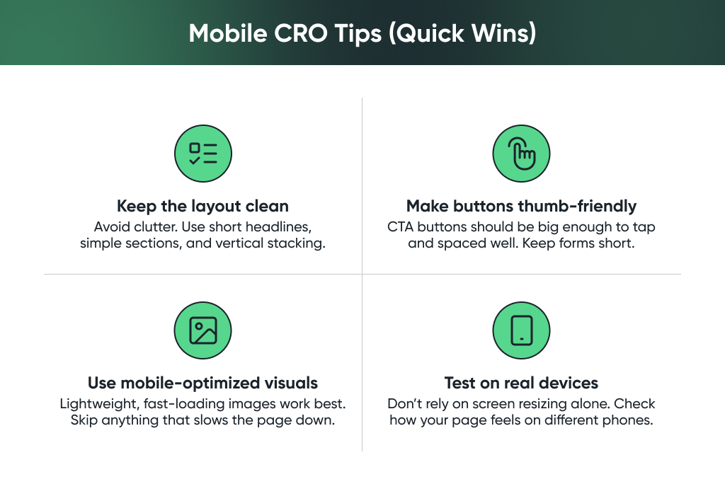
Great mobile responsive landing pages for CRO aren’t just smaller versions of desktop — they’re thoughtfully designed for mobile from the start. When your page feels easy to use in the real world, people are far more likely to stick around, engage, and convert.
Best Practices for Designing Landing Pages That Convert
A great landing page doesn’t have to be fancy — it just has to make it really easy for someone to say “yes.” Whether you’re driving traffic from an ad, a newsletter, or social media, a few small details can make a big difference in how people respond.
Here’s what we’ve found works best when it comes to CRO landing pages that actually convert:
- Keep it focused on one goal: If your page is trying to do too many things, chances are people will do nothing. Want them to sign up? Book a call? Download something? Pick one clear goal, and make sure everything on the page supports it. That kind of clarity helps improve landing page conversion more than you might think.
- Make the page match the message: Think about where people are coming from. If they clicked an ad or email with a specific message, your landing page should feel like a seamless next step. The visuals, wording, and tone should all feel connected. This kind of consistency builds trust and is a big part of smart landing page optimization.
- Test small things, often: You don’t need to overhaul the whole page to make progress. Sometimes, just changing a headline, moving a CTA, or tweaking the copy can lead to a noticeable lift. A/B testing doesn’t have to be complex — just try one change at a time, and see what clicks with your audience.
Final Thoughts
The best-performing pages are the ones that get reviewed, refined, and tested regularly. User behavior shifts. Offers change. What worked last quarter might not work tomorrow. So it’s worth checking in now and then: Is the message still clear? Does the page still feel easy to use? Are people converting the way you hoped?
If you’re not sure where to start — or you’ve got traffic, but it’s just not turning into action—we’re here to help. At GoMage, we work with brands every day to optimize landing pages, fine-tune messaging, and boost conversion rates with proven CRO strategies and tools.
Sometimes all it takes is a fresh perspective and a few smart tweaks to unlock what’s already working. Let’s make your landing pages do more.