E-commerce user experience (UX) has become the real playing field where brands win or lose. In this game, design choices define whether users stay, browse, and buy, or bounce within seconds.
Most e-commerce websites don’t fail because of bad products, they fail because the user experience makes people want to scream into a pillow or just click away. Your metrics look good, traffic, clicks, even email open rates, but conversions remain flat, plateaued, or just painfully slow.
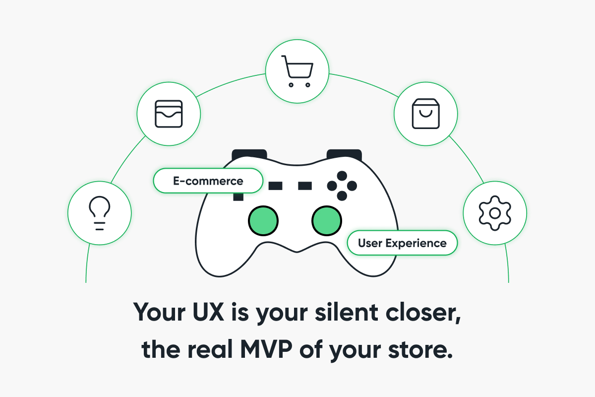
That’s where your real problem lies: you don’t need a fancy redesign, you need to treat your UX like your top-performing salesperson, because that’s what it is, the silent closer, the conversion engine, the real Most Valuable Player (MVP) behind the scenes.
Let’s talk about real e-commerce website design strategies that move the needle, not ideas pulled from a portfolio template, but actual UX principles for online stores that work for humans with short attention spans, infinite options, and no patience, while advancing e-commerce UX design and e-commerce navigation best practices that improve e-commerce user experience.
Key UX Design Principles for E-Commerce Websites
Here’s an interesting stat: 88% of users won’t return to your site after a bad experience, and “bad” doesn’t always mean broken; sometimes it means friction, confusion, and slowness.
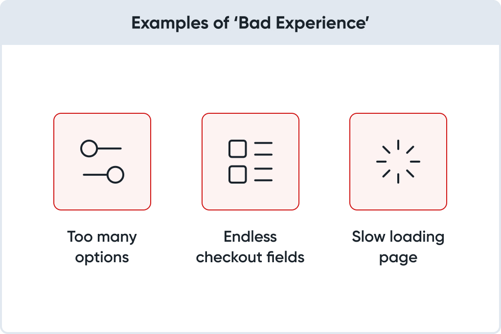
A “bad experience” can be as simple as:
- A filter menu that feels like a maze;
- A checkout that asks for your dog’s birthday;
- Or a page that loads slower than your Wi-Fi on vacation.
Great e-commerce UX design is invisible; that’s the point, it removes every unnecessary decision, obstacle, or doubt, so buying becomes the obvious, effortless action.
It doesn’t mean your site has to win awards; it just has to win trust through fast-loading e-commerce websites, a personalized shopping experience UX, and clear flows that support the online store user journey.
E-Commerce Navigation Best Practices
If users are getting lost, they’re not converting. Navigation is where most UX disasters begin, because if people can’t find what they need, they’ll find someone else who makes it easier.
Here’s what works:
- Clear, literal labels, don’t try to be clever, “Cookware” beats “Kitchen Magic”;
- Smart search, searchers are buyers, give them auto-suggestions, spellcheck, and natural language matching;
- Filters that matter, let users filter by size, stock, delivery speed, color, occasion, or best-selling items. The more relevant the filters, the faster they move from browse to buy.
Pro tip? Use behavior-based filters, like “Only Show Items Available for Delivery This Week,” and support them by using analytics to optimize e-commerce UX so that your choices reflect the best UX strategies for e-commerce growth and UX design tips for increasing online sales.
The best e-commerce navigation best practices are boring, and that’s exactly why they work.
Optimizing Mobile UX for Growing Mobile Shoppers
Mobile-first design is not a suggestion anymore; it’s a survival.
More than 70% of your customers are shopping on mobile. And yet, too many brands still treat it as a “scaled-down” version of desktop.
You know the symptoms:
- Giant hero banners pushing CTAs below the fold.
- Menus are nested six levels deep.
- Pop-ups you can’t close without tiny finger acrobatics.
Want to convert on mobile?
- Design for thumbs: Tap targets should be big. CTAs should be sticky.
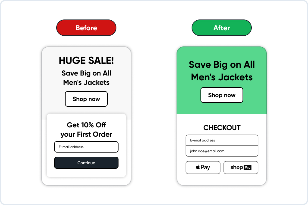
- Simplify checkout: Autofill everything. Use Apple Pay, Shop Pay, and Google Pay.
- Speed matters: Compress images. Eliminate render-blocking scripts. Audit your third-party apps regularly.
One brand we worked with reduced their mobile load time by just under a second. That simple tweak alone led to an 18% boost in conversions in three weeks. That’s physics at work.
The road to high-performing, fast loading e-commerce websites is paved with discipline, not design trends, because consistent performance builds trust and loyalty.
UX Is Behavior, Not Just Aesthetics
A visually appealing website that confuses users is nothing more than a polished failure. E-commerce UX design begins with psychology, not aesthetics.
To improve e-commerce user experience, map your store experience to these emotional questions:
- Can I trust this store?
- Is this product right for me?
- Will it arrive on time?
- What if I hate it?
Those questions are friction points. Your job is to answer them (visually, functionally, and contextually) before they’re asked.
That’s what defines a strong online store user journey: building trust before asking for the sale.
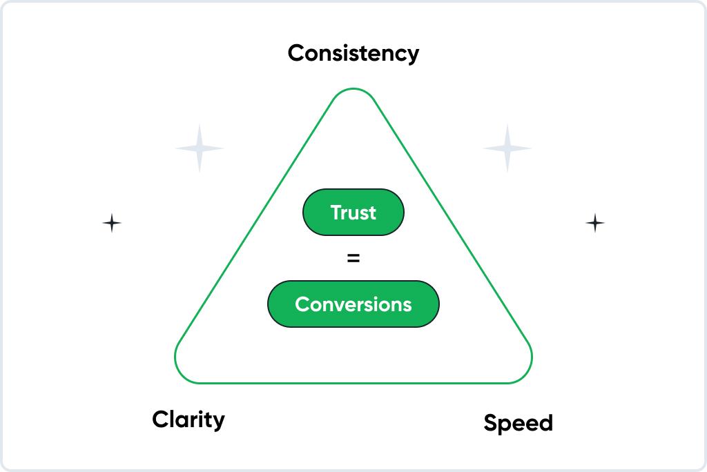
Using Data and User Feedback to Continuously Improve E-Commerce UX
UX is an investigation based on data. Effective e-commerce website design strategies depend on evidence, not instinct, and that means reviewing your analytics dashboards daily.
Whether it’s GA4, Hotjar, Microsoft Clarity, or Shopify’s funnel reports, the insights are there.
Look at:
- Scroll depth: Are users reaching the CTA?
- Exit rates: Where do they drop off?
- Session replays: Are they hesitating before clicking “Add to Cart”?
That’s the power of using analytics to optimize e-commerce UX: decisions rooted in data, not assumptions, leading to measurable improvements in user satisfaction and higher conversions that sustain long-term e-commerce growth.
The Real Deal with Personalized Shopping Experience UX
True personalization in e-commerce UX design is context-aware, not invasive or overwhelming. Show users what they want when they want it, remind them what they viewed, and suggest what fits them, not everyone else.
Tools like Rebuy, Klaviyo, and Nosto allow Shopify brands to:
- Show recently viewed items;
- Recommend bundles based on cart content;
- Surface product variants are most clicked by similar shoppers.
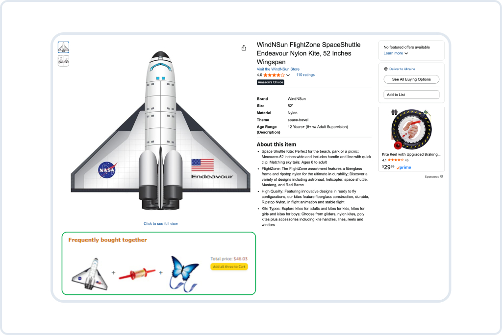
Here’s the measurable return on investment (ROI): in a recent campaign, personalized product pages outperformed generic ones with a 35% higher average order value. That statistic underscores why personalized shopping experience UX isn’t fluff; it’s a focus. When applied strategically, it turns browsing into belonging and clicks into conversions.
How to Build an Effortless Online Store UX (Without Redesigning Everything)
You don’t need a massive overhaul to achieve results, only thoughtful, data-driven iteration guided by UX principles for online stores.
- Watch users scroll and click. Don’t assume.
- Start with your best-selling product pages.
- Simplify the checkout experience, ideally to one page.
- Remove every unnecessary field.
- Test variations of CTA language, image order, and review placement.
These micro-optimizations represent the best UX strategies for e-commerce growth; they scale over time.
The Checkout Zone: Where UX Wins or Wrecks You
This is the battlefield, the final click, and it’s where too many online stores lose their customers. A four-step checkout process isn’t a journey; it’s a gauntlet that tests patience instead of rewarding intent.
To optimize conversions and improve e-commerce user experience, you need to:
- Allow guest checkout;
- Offer one-click payments;
- Show shipping costs upfront;
- Pre-fill everything you can.
One direct-to-consumer (DTC) brand cut its cart abandonment rate from 68% to 39% simply by transforming four separate pages into one unified checkout flow. That improvement wasn’t luck; it was empathy translated into e-commerce UX design efficiency.
Microcopy and UX Writing: Your Invisible Salesperson
Words shape action. Your microcopy (those tiny bits of language) either builds trust or creates confusion.
- Instead of the cold “Submit”? Try “Get My Free Sample”.
- Replace “Sold Out” with “Restocking Soon (Want Early Access?)”.
- Turn “Shipping Info” into “When Will I Get It?”.
Good UX writing doesn’t try to impress; it strives to clarify. Each phrase should answer a user’s question before it’s asked, reinforcing trust and smoothing the online store user journey from curiosity to checkout. Strong, simple language is one of the most effective e-commerce website design strategies because it quietly drives conversions where visuals alone cannot.
Post-Purchase UX: The Most Forgotten Goldmine
The easiest sale to make is the second one, yet most e-commerce brands leave customers in silence after checkout.
The post-purchase phase is one of the most overlooked parts of e-commerce UX design, even though it directly impacts loyalty and lifetime value.
- Make your thank-you page useful: suggest add-ons or bundles;
- Send a confirmation email with warmth and a story, not just a receipt;
- Share shipping status with visuals and personality.
Instead of “Your order has shipped,” try: “Your handmade leather bag just left our workshop in [your city], hand-stitched and wrapped with care”.
That’s not just an update, that’s brand-building, emotional connection, and proof of authenticity within your online store user journey.
UX Is a Feedback Loop
Think of your store as a living system that constantly evolves. If you’re not refining, you’re falling behind. Use this data-driven toolkit to continuously improve e-commerce user experience:
- Google Analytics 4 (GA4) for user flow and event tracking;
- Hotjar for detecting frustration signals like rage clicks and analyzing heatmaps;
- Microsoft Clarity for identifying scroll drop-offs and session insights;
- Klaviyo for behavior-based email flows;
- Shopify Analytics for visualizing sales funnels and conversion points.
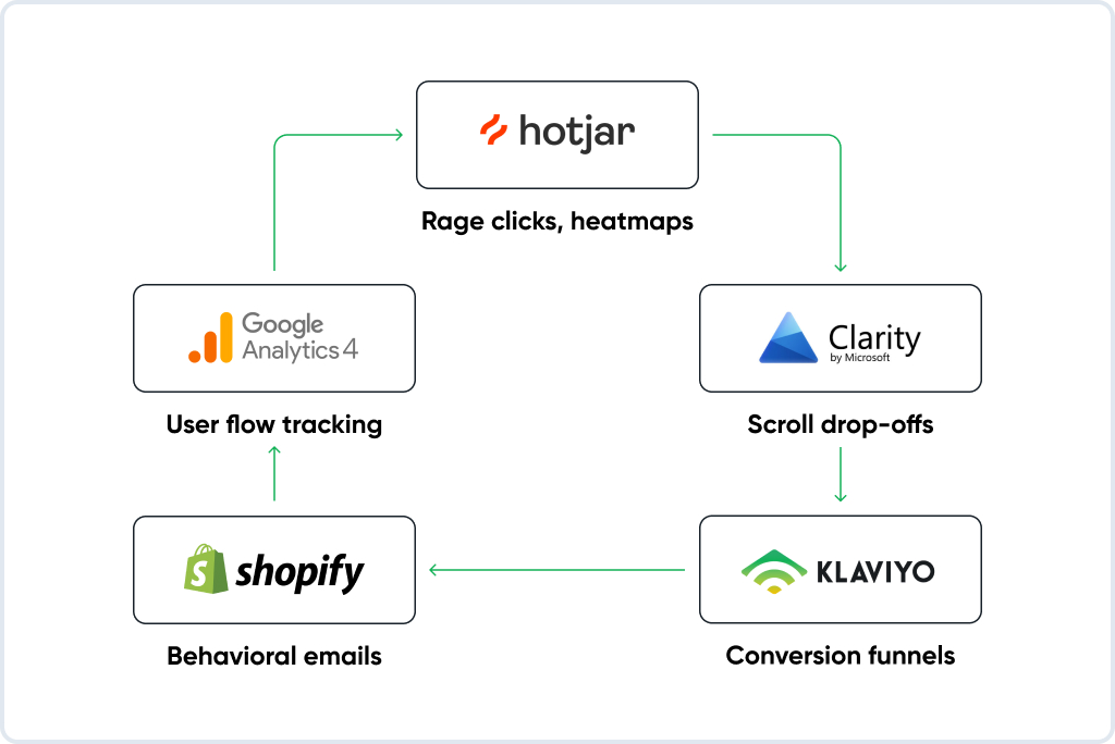
Your UX design tips for increasing online sales should never be static; they should evolve alongside the customer, guided by insights rather than assumptions. Using analytics to optimize e-commerce UX ensures your strategy adapts in real time, keeping both engagement and conversion high.
Unexpected UX Extras That Actually Work
Add some flair without the fluff:
- Live chat on product pages for high-AOV items;
- Delivery timers like “Order within 2 hours for Friday delivery”;
- AI product finders to match needs with SKUs;
- Progress bars in checkout to reduce dropout anxiety.
These little additions make a big emotional difference.
UX Red Flags to Fix ASAP
Here’s your instant audit:
- Mobile header hides CTA? Fix it.
- Product images load in >2s? Optimize.
- You’re asking for a phone number for no reason? Explain or remove.
- Shipping info takes 3 clicks to find? Move it.
- Popups before page scroll? Delay them.
Fixing these builds trust, and trust converts.
Final Thoughts
Great eCommerce UX feels simple and natural. It removes clutter, shortens the path to checkout, and quietly turns clicks into revenue without your customers even thinking about it. The brands that win are those with fast sites, clear messaging, and journeys that feel human on every screen.
If you want your Magento or Shopify store to work like that, GoMage can help. We design and optimize UX that reduces friction, improves conversions, and keeps your customers coming back.
FAQ
First impressions are everything. People don’t wait for your site to explain itself; they judge in seconds. E-commerce UX design builds trust, answers questions early, and clears the path to conversion.
Start small. Look at drop-off points, simplify your checkout, and bring key info closer to the surface. These tweaks do more than a flashy rebrand. They make shopping smoother and more human, which is exactly what users want.
Use GA4 for behavior flows, Hotjar for heatmaps, and Shopify for funnel insights. Watch how users move, not just where they land. Using analytics to optimize e-commerce UX helps you fix what’s broken, not guess what might be.
Yes, speed builds trust. If your site drags, users bounce. A fast experience feels reliable, polished, and professional. That’s why load time affects everything from conversion to search ranking.
It’s quiet and helpful. Show users what they need based on real behavior. Remind them of what they browsed, and recommend what fits. Personalized shopping experience UX should feel like good service, not surveillance.
Most mobile sites aren’t truly mobile-first. Deep menus, small buttons, and pop-ups ruin the flow. Optimizing mobile UX for growing mobile shoppers means designing for thumbs, speed, and movement, not just shrinking desktop layouts.
The post-purchase moment. That’s where loyalty begins. Useful emails, updates with personality, and clear shipping info show that your care didn’t end with the transaction.
Move your CTA up, cut form fields, surface pricing, and ship early. These are not radical ideas; they’re UX design tips for increasing online sales that work because they remove friction.
Slow-loading images, hidden CTAs on mobile, unclear shipping, and pop-ups that appear too soon all hurt trust. Clean up what confuses or annoys; e-commerce navigation best practices always reward clarity over cleverness.