

E-commerce market has intense competition and the reality is that competitive companies are just one click away. Moreover, the situation is changing so fast that weak online stores may become more powerful in the short run.
So if a merchant wants their store to survive they must always “keep an eye on the ball”. One faultless way to keep the market share and not to lose customers is to carefully enhance the usability of online store solutions and make it as comfortable for purchasing online as possible. In this article, we will look at a few tips that can be easily implemented for improving the situation.
Online Store Solutions to Enhance Usability
Even if you are able to provide a wide range of quality products and your prices are very competitive, there is still no guarantee that visitors will make purchases in your online store. GoMage has been working in the e-commerce market since 2010, and in our practice, we have seen a lot of stores with very low and attractive prices and with a very high percent of bounce rate.
The matter of usability is very topical for e-commerce because in most cases visitors are left to their own devices during the purchase process, which means that it is impossible to influence their behavior. Let’s take a closer look.
“Join” / “Register” /”Sign Up”/ “Log in” Button
Registered visitors are very valuable for any online store because they leave some information about themselves so it is possible to communicate with them and build a loyalty program. So, the first strict rule is that ‘register’ button must be easy to find.
How you call the button is also important. “Join” is more associated with a club or community. You join an organization. “Register” button is used when a user needs to enter some data into the system for future access.
For example, you need to register in order to place comments.
“Sign up” button means that a visitor agrees to be a participant of something, it is like “sign up for the military”, or “sign up for the seminar”.
“Log in/out” button is perceived more technically than “sign in/out”, but the value is approximately the same.
It is up to you what names you choose and how many buttons you need, but sometimes it is better to ask the audience about what is clearer to them. You also have to create the appropriate button design which includes color, font, size, and wording. The button should be clearly visible but it has to fit in with the corporate style of the store.
Avoid mandatory registration with online store solutions
Visitors hate mandatory registration that is why it is better not to make the difference between registered and guest users. Both categories of visitors must have the same rights and opportunities.
Registration or “sing up” is needed if the user is going to buy something. Take into account that a long and complex sign-up process can push customers away. You can also allow guest visitors to go through checkout without registration, and after this suggest that they sign up in order to make their next purchase in your online store easier.
For more information concerning checkout and registration processes.
Provide comfortable search functionality
Navigation or search features allow visitors to find desired products in the store. In the first step, it is necessary to understand the search criteria that potential customers use. There are clear and obvious criteria such as prices, brands, models, colors and so on. But some users prefer to use specific search criteria.
For example, women may search by unusual color names: terracotta, cherry, lemon color. Some users search by the product dimensions or products with reviews. The best way to identify the non-standard search criteria is to ask visitors of your online store what is important for them and what words, names, and terms they prefer to use.
Magento ® provides very flexible layered navigation functionality. Layered Navigation has categories and attributes and it is important to be familiar with some specific features to be able to set them correctly, because it is not so easy to make changes in the operating store, and in some cases, it is not possible to make changes at all.
Other elements of an online store
LOGO is a visible element of the online store and it is not only a brand identity. If you click on the logo on most websites you know where you will be forwarded to. The Logo leads to the home page regardless of how deep into the online store you are.
SEO Tip. A Logo on the home page of the site should be inactive, because circular reference which leads to the same page where it is located is unsuitable and bad for SEO, so it is better to get rid of it.
Such elements as MY ACCOUNT and MY CART should be placed in the top right corner of the page. These are generally accepted things and people are accustomed to looking for these elements there. It is rather a recommendation and, if you put these elements in a different place – make sure that users can quickly find them.
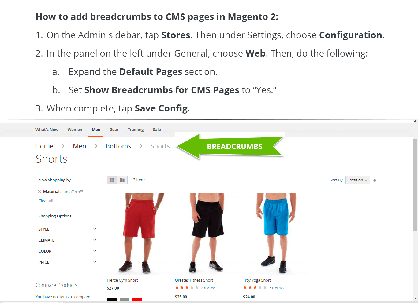
BREADCRUMBS are very convenient for users because they show the full path to the page that customers are viewing. They are usually placed horizontally across the top of the page and indicate the hierarchy of the current page of the online store in relation to the website structure. Breadcrumb navigation is very useful for SEO. Magento ® 1, as well as Magento ® 2 e-platform, offers breadcrumbs as a standard feature which can be set quickly and easily.
The FOOTER in the online store is another place where visitors look for the necessary information. It is better to put some significant elements like Terms, Privacy Policy, License Agreement and others in the footer, as those may be of interest to your customers and should be easy to find.
Provide Related Items
If you suggest related items effectively you can increase sales because of cross-selling. Related products may be bought in addition to the product the visitor is searching for. In Magento ® the Related Products block can be placed depending on the theme and page layout. For each product, you can set the related items that will be recommended to the customers.
Avoid Hidden Charges
Customers definitely leave the online store if the price on the last step of the purchase turns out to be higher than the price they saw on the product page. Be sure that you display prices, shipping charges, taxes and discounts clearly. Very often the extra charge can be shown separately and visitors don’t pay attention to this block of information.
Check twice and even do the usability test to be sure that buyers understand everything correctly when they choose the products, so that they know the final sum they have to pay for after going to check out.
We provided you with some tips to make your online store better. There are no strict instructions and rules that you would certainly need to apply. You should analyze the situation, implement changes, run tests and compare the results, as this kind of approach will show you what is right and effective for your own personal e-commerce storefront.


